Become a MacRumors Supporter for $50/year with no ads, ability to filter front page stories, and private forums.

Shirasaki

macrumors P6
Original poster
May 16, 2015
16,286
11,783
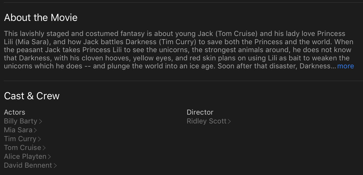
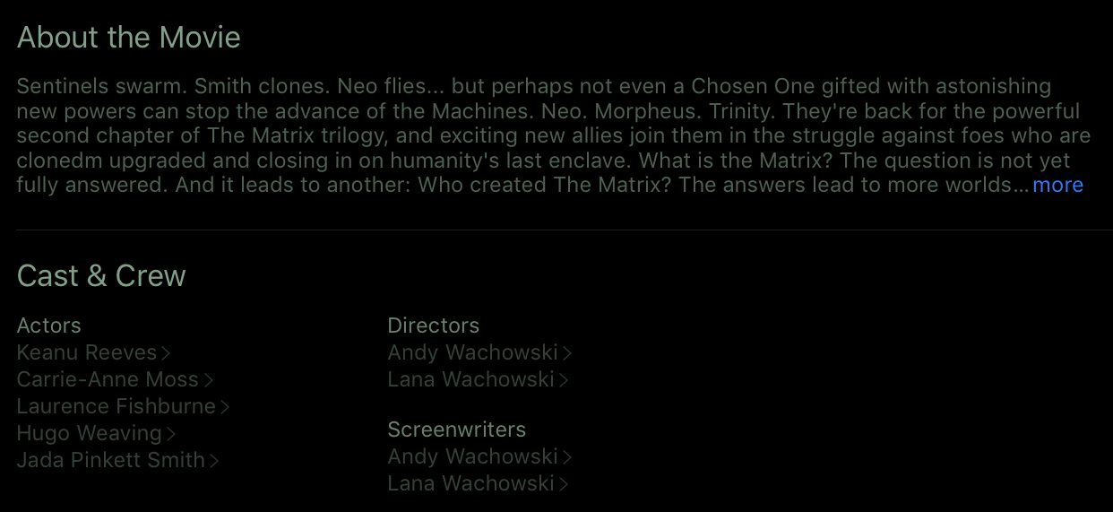
Recently I was browsing iTunes Store for some movie purchases. Then, I immediately realised something was not right. Specifically, the text Color and dark mode in iTunes Store. Here are a few examples:
42C44831-7901-43F3-8232-139752702E31.jpeg
B0A96A72-2285-4653-AA38-A74859B2DF4B.jpeg
DA867F42-E63F-4513-B287-AEF60C663411.jpeg
8ED0A5D2-38FE-4FCF-B9D3-5D1A9F732951.jpeg

Since iTunes Store music section is white background, the dark to light transition hurts.
I have seen quite a few posts and different people claiming dark mode can save battery but watch this:
7CE814C3-B8FE-4815-A25C-BB7A5F9F2629.png

(Source: https://www.howtogeek.com/397982/how-dark-mode-can-extend-battery-life-on-oled-phones/)
When brightness is 50%, dark mode saving is 14%. When brightness is 100%, dark mode saving is 60%. The thing is, nobody uses their phone at full brightness all the time. So the saving could possibly be much less than 60%, more like 20% or so. If the brightness is down to 0%, I don’t think battery saving is really tangible.

For iOS, because stupid Apple puts dark mode and light mode inconsistently across the entire system, the transition is bad for my eyes. The only time dark mode is good is it is enabled across the board, but then I may suffer readability issue because of the text color.
Here is a video for some reference:

I get it, the dark mode is requested for a long time. But it may not be that great, even for OLED.
 
I know a lot of people seem to love it and I understand the potential battery advantages, but really scratch my head at the excitement it seems to generate. Of all of the rumored enhancements coming out in iOS 13, this is the one that I yawn about the most.
 
Tried several times on my MacBook and had to go back after a few days. I found it harder to read and hard on my eyes but if some want it let it happen as option. They let people speak in a few months
 
  • Like
Reactions: TheAppleFairy
Tried several times on my MacBook and had to go back after a few days. I found it harder to read and hard on my eyes but if some want it let it happen as option. They let people speak in a few months

The problem on a Mac is that it's really hard to see the frame of an app when you have multiple open on the screen at the same time. That won't be an issue on an iPad.
 
  • Like
Reactions: tsmiller
I think we should let iOS 13 come out first and then test it before we decide whether or not it sucks.
I will never understand why people judge something that hasn't even been released yet. Same goes for movies (amongst other things). My brother always says the movie is going to suck based on whether or not he liked the 30 second trailer. Irritates the hell out of me.
 
I will never understand why people judge something that hasn't even been released yet. Same goes for movies (amongst other things). My brother always says the movie is going to suck based on whether or not he liked the 30 second trailer. Irritates the hell out of me.
The thing is, iTunes Store app has this dark theme as part of the app. And text readability already suffers. I know iOS 13 will surely release a system wide dark mode, but if the name is any indication, it will look more or less like what I see in iTunes Store app or Apple watch app.
 
I will never understand why people judge something that hasn't even been released yet. Same goes for movies (amongst other things). My brother always says the movie is going to suck based on whether or not he liked the 30 second trailer. Irritates the hell out of me.

If the trailer already sucks hard, what can you expect from the movie? White ponies? I’m with your brother..
 
The thing is, iTunes Store app has this dark theme as part of the app. And text readability already suffers. I know iOS 13 will surely release a system wide dark mode, but if the name is any indication, it will look more or less like what I see in iTunes Store app or Apple watch app.

I think that's to be expected. I think we're always going to find some things that look better in Dark Mode than others and for a long time we're still going to have an odd corner of MacOS or a third party program that completely doesn't comply or work well in Dark Mode. It's just not easy to design a UI that looks just as good and clear inverted as it does the way it was originally designed.

I actually think Dark Mode works very well and am impressed at how uniform it looks for the most part. Perhaps it's because I'm always working with UI's all day that I wouldn't expect something like this to be perfect. I do think it would be easier to do this well in iOS though. You've got fewer interacting elements that can come into play and create problems for certain color and brightness combinations.
 
Recently I was browsing iTunes Store for some movie purchases. Then, I immediately realised something was not right. Specifically, the text Color and dark mode in iTunes Store. Here are a few examples:
View attachment 840013 View attachment 840014 View attachment 840015 View attachment 840016
Since iTunes Store music section is white background, the dark to light transition hurts.
I have seen quite a few posts and different people claiming dark mode can save battery but watch this:
View attachment 840017
(Source: https://www.howtogeek.com/397982/how-dark-mode-can-extend-battery-life-on-oled-phones/)
When brightness is 50%, dark mode saving is 14%. When brightness is 100%, dark mode saving is 60%. The thing is, nobody uses their phone at full brightness all the time. So the saving could possibly be much less than 60%, more like 20% or so. If the brightness is down to 0%, I don’t think battery saving is really tangible.

For iOS, because stupid Apple puts dark mode and light mode inconsistently across the entire system, the transition is bad for my eyes. The only time dark mode is good is it is enabled across the board, but then I may suffer readability issue because of the text color.
Here is a video for some reference:

I get it, the dark mode is requested for a long time. But it may not be that great, even for OLED.

For devices that gets nearly 10 hours of battery time, even 20% is a significant savings. That’s 2 hours.

Although I agree with you that Dark mode is not the panacea some claim it to be, I don’t think you can judge Apple’s implementation until it’s actually implemented, and not based on what’s out there now.
 
I think it depends on what you are looking at. For example on the iPhone or iPad. Spotify has a dark theme. But you can tell that they optimized it to take advantage of the dark background. So it was very easy to read and not as jarring.

On the other hand Twitter and Reddit both have a night mode. But it looks like all it does is darken the background. It doesn’t really seem to optimize it so it won’t look as jarring at times.

So it depends on whether someone bothered to optimize the app to look less jarring. If that makes sense
 
  • Like
Reactions: Shirasaki
was one of the best features on windows phone in 2010. Dark mode was elegant because it was done in an intelligent way so the text issues you see on other platforms didn't occur on windows phone.

It was honestly one of the most seamless transitions to a dark mode ever. Since migrating from Windows Phone, even on Microsoft's desktop OS, dark mode hasn't been done well. It's sucked, frankly. Despite it being my top reason to jailbreak, dark mode implementations have its own breed of issues.

That said, I am hopeful that iOS has a more robust solution much akin to Windows Phone (almost 10 years ago).
 
  • Like
Reactions: Lopes
If the trailer already sucks hard, what can you expect from the movie? White ponies? I’m with your brother..
This is off topic. Sometimes movie trailers don't show the interesting parts intentionally, so the trailer doesn't spoil anything. That's why I stopped watching and judging trailers, they're only there to bring hype and advertise. An awesome movie could get a shitt(y) trailer as well.
 
Tried several times on my MacBook and had to go back after a few days. I found it harder to read and hard on my eyes but if some want it let it happen as option. They let people speak in a few months
I agree 100%: just to make things easier for every taste, till is possible to have the choice we are good to go.
I have hard time because of problems with my eyes, as several other people I know. Dark makes it really tough for me.
 
Never been a fan of dark mode. Tried it on my Macs but turned it off after a few days. Maybe it's reminding me of the bad old days of green text on a black background.
 
  • Like
Reactions: Shirasaki
I know a lot of people seem to love it and I understand the potential battery advantages, but really scratch my head at the excitement it seems to generate. Of all of the rumored enhancements coming out in iOS 13, this is the one that I yawn about the most.

Me too. In IOS 13 it just looks pretty much like the “invert screen” setting that was part of previous iterations of iOS.
 
Register on MacRumors! This sidebar will go away, and you'll see fewer ads.