Got a tip for us?
Let us know
Become a MacRumors Supporter for $50/year with no ads, ability to filter front page stories, and private forums.
Dock Appearance is Now an Option in 10.5.2!
- Thread starter TheSpaz
- Start date
- Sort by reaction score
You are using an out of date browser. It may not display this or other websites correctly.
You should upgrade or use an alternative browser.
You should upgrade or use an alternative browser.
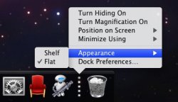
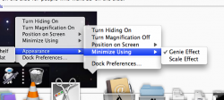
Awesome! I was hoping Apple would do this.In 10.5.2 there is now an option in the Dock divider for choosing the way the Dock looks.
Note: Also works on the side for people who want 3D on the side.
Hope 10.5.2 fixes the problem where newly-installed apps in the Applications stack have X-ed out icons (see attachment). Currently I have to open up the Terminal and execute "killall Dock" to fix the icon.
Attachments
In 10.5.2 there is now an option in the Dock divider for choosing the way the Dock looks.
Note: Also works on the side for people who want 3D on the side.
Not sure where you got that grab but thats not an option in the build I have.
Can you tell us what the menubar looks like when the 'Translucent menubar' option in System Preferences is unticked? Is it like Tiger? With rounded corners?
I have the opaque menu bar (not by choice) - it's grey (lighter than the UI grey) and the icons in it are black.
A simple fix, but nice to see, as it means Apple is no doubt taking the feedback it has been receiving seriously. Looking forward to further tweaks and improvements.
...I hope they improve the looks of the side-dock though, its not as nice as Tiger, and CandyBar can't change it...
it looks like they have changed it^^^ the white border isnt there and it looks a bit more opaque.
You guys... unfortunately a developer just PM'd me and told me that this was fake. That's a bummer, I was really looking forward to having that right in my Dock menu. I guess on the bright side though, maybe Apple will see people wanting the old Dock back and give us a UI option for switching it.
You guys... unfortunately a developer just PM'd me and told me that this was fake. That's a bummer, I was really looking forward to having that right in my Dock menu. I guess on the bright side though, maybe Apple will see people wanting the old Dock back and give us a UI option for switching it.
I agree it's fake; note the really dark blue (black?) lines at the top and bottom of the blue bar denoting the selected item. When I open my dock settings and highlight an item with this in the background they look pretty different. I don't think apple would have changed the highlight just because they added an option. I think this person did a bad job faking...
Attachments
Awesome! I was hoping Apple would do this.
Hope 10.5.2 fixes the problem where newly-installed apps in the Applications stack have X-ed out icons (see attachment). Currently I have to open up the Terminal and execute "killall Dock" to fix the icon.
I second that, I hate that newly installed apps end up with that line through the circle in Stacks, I'm sure that will be a fix from Apple soon, but why are using Terminal commands? Just log out and log back in and the icon is updated.
I agree it's fake; note the really dark blue (black?) lines at the top and bottom of the blue bar denoting the selected item. When I open my dock settings and highlight an item with this in the background they look pretty different. I don't think apple would have changed the highlight just because they added an option. I think this person did a bad job faking...
Actually, you have to click on the image to see the full resolution screenshot. Also, it wasn't done with Photoshop... it was done by simply editing the DockMenus.plist file inside the Dock.app resources. Done, next.
I second that, I hate that newly installed apps end up with that line through the circle in Stacks, I'm sure that will be a fix from Apple soon, but why are using Terminal commands? Just log out and log back in and the icon is updated.
Terminal is a lot easier, but if you're not comfortable, just remove the stack and add it again
Actually, you have to click on the image to see the full resolution screenshot. Also, it wasn't done with Photoshop... it was done by simply editing the DockMenus.plist file inside the Dock.app resources. Done, next.
how to do you do this? i know the terminal commands do switch the dock from shelf to flat but how do you add options using the dockmenus.plist?
Can you tell us what the menubar looks like when the 'Translucent menubar' option in System Preferences is unticked? Is it like Tiger? With rounded corners?
i think it will look like the menu bar when you boot into safe mode... try it
Can you tell us what the menubar looks like when the 'Translucent menubar' option in System Preferences is unticked? Is it like Tiger? With rounded corners?
~~ Nevermind, should have read the thread through completely. See richthomas's responce above ~~
Actually, you have to click on the image to see the full resolution screenshot. Also, it wasn't done with Photoshop... it was done by simply editing the DockMenus.plist file inside the Dock.app resources. Done, next.
Hmm, OK so the rational may have been a bit off, but it's still a fake and you didn't post it as such; so um I guess bring on the next faking jerk-off so I can get the method they faked it with wrong again...
Register on MacRumors! This sidebar will go away, and you'll see fewer ads.


