Become a MacRumors Supporter for $50/year with no ads, ability to filter front page stories, and private forums.

Do you use True Tone and/or Night Shift?

  • Yes of course I use True Tone

    Votes: 17 37.8%
  • Hell no I don't use True Tone or Night Shift

    Votes: 8 17.8%
  • I use Night Shift Only

    Votes: 0 0.0%
  • I use True Tone and Night Shift

    Votes: 20 44.4%

  • Total voters
    45
Does anyone actually use it?
I can't live without TrueTone anymore. It is so much easier on my eyes to not have glaring white balance issues any more.

Does it get less yellow with time? i.e. does it calibrate itself?

Or do your eyes just get used to it?

Your eyes get used to it. We are incredibly good at adjusting our mental white balance to our environment so that white always appears white to us. When you turn it on and off the shift in color is obvious, but once it's left on and you stop paying attention TrueTone should feel more natural.

There are two different systems that both play with the white balance of your display: True Tone and Night Shift. True Tone is meant to make your screen behave like paper does-- it makes white look like the ambient light in the room. Night Shift is different, it intentionally inhibits the blue to minimize sleep disruption. True tone should look natural for the room, Night Shift will make the display look warmer than its environment.

White surfaces reflect the light in the room. If you're in a room with a window, the light in the room is warmer (more yellow) at sunrise, then gets quite cold (bluer) as the day goes on particularly if the direct sunlight is blocked, then warmer again at sunset, and then takes on the color of your artificial lighting (warm white, cool white, etc). A truly white sheet of paper will be the same color as the light.

Have you ever noticed when you walk down a street at night that the rooms with TVs on all look blue? But when you're in a room watching TV it doesn't look blue at all? The TV doesn't care what time of day it is for you, it's presenting an image of the time of day in the movie and if it's daytime in the movie the image is cooler, and more blue. When you're in the room your eyes are adapted to the big TV and white on the TV looks white. If you're in the street your eyes have adapted to warmer artificial lighting and the white from the TV looks blue.

Same if you've ever taken a film photograph indoors without flash-- you'll get the photo printed and take it home some afternoon to look at and it looks yellow. It didn't feel yellow when you took the photo because your eyes were adjusted to the warm artificial light and white in the room looked white at the time. But now you're in cooler indirect sunlight and your eyes are adapted to it so the warmer light the film caught accurately looks yellow to your brain. Digital cameras tend to correct for this at least a bit, but film captured what film saw.

True Tone measures the light in the room and makes white on the screen match the color of that light so that it behaves more like paper would. With True Tone off, a white screen probably looks a bit cold and blue in a room at night, with it on it should more closely match everything else that's white. Turning it on and off your eyes will see the change, but if left on it should blend. There's some situations that can upset the system (if the sensor is looking at light that isn't truly ambient, for example sometimes I cover my Macbook camera with a yellow sticky note and that shifts the display color).

Night Shift is different, night shift pushes the color temp warmer than ambient specifically to reduce the blue in the image because blue disrupts melatonin. As melatonin accumulates in your body, it tells your body to sleep. In the morning the light (most specifically the blue light) breaks down the melatonin and you start to wake up. Blue light from screens can disrupt that melatonin production and impact your sleep cycle, so turning the blue light down helps (a bit). Since it's warmer than ambient though, your eyes will more easily perceive small screens as yellow in this case.
 
I have a couple of automations in the Shortcuts app that turn true tone off whenever I’m in a photo, video, or entertainment app and turn it on for everything else, like browsing the web
 
Absolutely, it makes the screen more natural and pleasant to look at, especially at night.
I use Night Shift at night for that. If True Tone could be configured in a schedule like that, I might give it a try. (I know it’s probably possible with Shortcut automations, but that’s too much of a hassle).
 
True Tone doesn’t look accurate (“true”) enough to my eyes, reduces contrast, and makes it difficult to judge photos. So I always turn it off.
 
I use Night Shift at night for that. If True Tone could be configured in a schedule like that, I might give it a try. (I know it’s probably possible with Shortcut automations, but that’s too much of a hassle).
Night shift is very noticeable. True Tone feels natural, and you completely forget that it’s turned on.
 
I used to use it but now I no longer use it on all my devices because it doesn't make any difference in comfort and what make sense is only night shift in the evening.
 
Night shift is very noticeable. True Tone feels natural, and you completely forget that it’s turned on.
Unlike True Tone, you can adjust the intensity of Night Shift in Settings from ”virtually undetectable” to “full-on deep yellow candlelight”. True Tone always looks off to me.
 
  • Like
Reactions: Fred Zed
I've used it since the day I bought a device that supported it. I also have night shift on sunset to sunrise at full warmth. My eyes are super sensitive, the yellow screen is much nicer on my eyes than any harsh blue light.
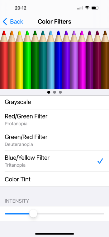
If you want to go further late at night, you can get an additional extra red tint by going into Accessibility > Display & Text Size > Color Filters > Color Tint. Play with the slider until it's as red as you'd like.

Next, go to Accessibility > Accessibility Shortcut and set it to "Color Tint".

Once you do that, triple-clicking the side button will toggle that red tint whenever you choose.

I find it's a bit much for normal use, but in bed late at night it very much takes the edge off.
 
I use True Tone for obvious reasons as brightness changes through the day depending on the level of lighting.

I don’t use Night Shift because that gives the screen a yellow tinge and I’ve always been able to get to sleep without it as True Tone adjusts the brightness to the lowest setting when I am in darkenss.
Try nightshift for one evening and let me know how you sleep that night in the morning. You’d be amazed. Try it for educational purposes.
 
  • Like
Reactions: splifingate
If you want to go further late at night, you can get an additional extra red tint by going into Accessibility > Display & Text Size > Color Filters > Color Tint. Play with the slider until it's as red as you'd like.

Next, go to Accessibility > Accessibility Shortcut and set it to "Color Tint".

Once you do that, triple-clicking the side button will toggle that red tint whenever you choose.

I find it's a bit much for normal use, but in bed late at night it very much takes the edge off.
I’m loving this setting also , colors pop like Samsungs vivid setting. Fake but nice.
 

Attachments

  • IMG_0226.png
    IMG_0226.png
    270.6 KB · Views: 64
  • Like
Reactions: ignatius345
I've tried True Tone on my 12 mini and iPhone 16. To my eyes, it looks way too yellow/orange.

Does anyone actually use it?

Does it get less yellow with time? i.e. does it calibrate itself?

Or do your eyes just get used to it?
It’s supposed to be yellow/orange, as this reduces the blue light emitted. I turn it to full and you do get used to it.
 
Try nightshift for one evening and let me know how you sleep that night in the morning. You’d be amazed. Try it for educational purposes.
Yeh, I’ll give it a go again. I did recall using night shift it when it was new around 2018. My current secondary phone, which I use to watch shows in bed, is an iPhone 8 so I’ll give it a go again and see if I want to run with it.
 
  • Like
Reactions: Fred Zed
I can't live without TrueTone anymore. It is so much easier on my eyes to not have glaring white balance issues any more.


Your eyes get used to it. We are incredibly good at adjusting our mental white balance to our environment so that white always appears white to us. When you turn it on and off the shift in color is obvious, but once it's left on and you stop paying attention TrueTone should feel more natural.

There are two different systems that both play with the white balance of your display: True Tone and Night Shift. True Tone is meant to make your screen behave like paper does-- it makes white look like the ambient light in the room. Night Shift is different, it intentionally inhibits the blue to minimize sleep disruption. True tone should look natural for the room, Night Shift will make the display look warmer than its environment.

White surfaces reflect the light in the room. If you're in a room with a window, the light in the room is warmer (more yellow) at sunrise, then gets quite cold (bluer) as the day goes on particularly if the direct sunlight is blocked, then warmer again at sunset, and then takes on the color of your artificial lighting (warm white, cool white, etc). A truly white sheet of paper will be the same color as the light.

Have you ever noticed when you walk down a street at night that the rooms with TVs on all look blue? But when you're in a room watching TV it doesn't look blue at all? The TV doesn't care what time of day it is for you, it's presenting an image of the time of day in the movie and if it's daytime in the movie the image is cooler, and more blue. When you're in the room your eyes are adapted to the big TV and white on the TV looks white. If you're in the street your eyes have adapted to warmer artificial lighting and the white from the TV looks blue.

Same if you've ever taken a film photograph indoors without flash-- you'll get the photo printed and take it home some afternoon to look at and it looks yellow. It didn't feel yellow when you took the photo because your eyes were adjusted to the warm artificial light and white in the room looked white at the time. But now you're in cooler indirect sunlight and your eyes are adapted to it so the warmer light the film caught accurately looks yellow to your brain. Digital cameras tend to correct for this at least a bit, but film captured what film saw.

True Tone measures the light in the room and makes white on the screen match the color of that light so that it behaves more like paper would. With True Tone off, a white screen probably looks a bit cold and blue in a room at night, with it on it should more closely match everything else that's white. Turning it on and off your eyes will see the change, but if left on it should blend. There's some situations that can upset the system (if the sensor is looking at light that isn't truly ambient, for example sometimes I cover my Macbook camera with a yellow sticky note and that shifts the display color).

Night Shift is different, night shift pushes the color temp warmer than ambient specifically to reduce the blue in the image because blue disrupts melatonin. As melatonin accumulates in your body, it tells your body to sleep. In the morning the light (most specifically the blue light) breaks down the melatonin and you start to wake up. Blue light from screens can disrupt that melatonin production and impact your sleep cycle, so turning the blue light down helps (a bit). Since it's warmer than ambient though, your eyes will more easily perceive small screens as yellow in this case.
Thank you for the extremely detailed response. I will try True Tone for a few days and see if I get used to it.
 
I use a combo of True Tone, Night Shift and Reduce White Point set to 25% (iPad) and 50% (iPhone), works great for me. My eyes are light sensitive, so too much glare without it.
 
I don’t use True Tone or Night Shift. Both make Photos look odd, at least to me.
For True Tone I don’t understand wanting the iPad screen to look like a piece of paper based on room lighting. My brain expects it to look like an iPad. It saddens me to turn off any feature but I have really tried liking them.
 
I hate it so much lol. Turn it off immediately on all my phones..... I prefer to browse my phone without a layer of yellow piss on the screen, thank you!
 
I've tried True Tone on my 12 mini and iPhone 16. To my eyes, it looks way too yellow/orange.

Does anyone actually use it?

Does it get less yellow with time? i.e. does it calibrate itself?

Or do your eyes just get used to it?

I am with you and the many others...one of the first things I turn off. The screen is wayyyy to yellow with TrueTone on!

:apple:
 
Register on MacRumors! This sidebar will go away, and you'll see fewer ads.