Become a MacRumors Supporter for $50/year with no ads, ability to filter front page stories, and private forums.

NotMyName

macrumors member
Original poster
Nov 21, 2016
62
9
I know 'good' can mean 101 things to 101 people so it's not really a question that can be answered without knowing a little more than the initial question i guess.

I'm toying between sticking with Apple (have had an iPhone since 2010, no smart watch of any description ever) and moving to Android. I fancy a change yet at the same time i have my reservations. If i move to Android it'll likely be a Galaxy S-something and i'd end up getting the Galaxy watch. If i stay with Apple it'll possibly be the iPhone 11 (kinda annoying how the Pro is the better size yet costs way more!) and i'd be looking at the Apple watch.

I was having a look at the various faces you can get for both the Galaxy watch and the Apple watch.
I prefer digital faces, and preferable with the seconds displayed also rather than just hours and minutes. I could find all manner of faces for the Galaxy watch that i liked. I'm yet to find a face for the Apple Watch that i like.

Many 'best faces' reviews (for both) display analogue faces. I'm pretty much not interested for the most part and find that 99% of these 'best faces' do not look that great (for both).

Just wondering if you can get decent digital faces that fit [my] bill?

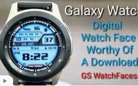
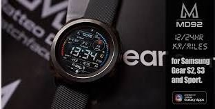
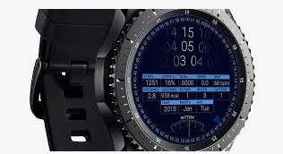
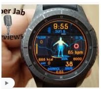
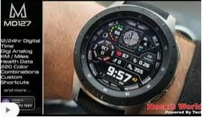
I've attached examples of ones that i quite liked for the Galaxy. These were just taken from the first page of Google images without any scrolling involved.
1.JPG 2.JPG 3.JPG 4.JPG 5.JPG
 

sjinsjca

macrumors 68020
Oct 30, 2008
2,238
555
To my eye, those faces in the photos are hard to get information from quickly. It's personal preference, but IMHO those faces are trying to do too much.

For me, what works best is different faces for different activities or phases of each day. On the Watch, switching between faces is just a swipe. My everyday go-tos:

IMG_3338.PNG
  • For sleep. Just big red numerals, time-only, no complications. This face I can read when bleary-eyed, without dazzling my night vision. I turn on Theater Mode and Do Not Disturb at night. This is my only face that doesn't have iCatcher and Phone complications.
IMG_3331.PNG
  • For working hours. An Infographic face, with complications for iCatcher, Phone, Forecast Bar weather, precipitation, calendar, solar clock, two additional time zones important to my work.
IMG_3332.PNG
  • For outdoor fun. An Infographic face, with complications for iCatcher, Phone, Forecast Bar, precipitation, compass, AllTrails, UV and air quality.
IMG_3336.PNG
  • For style. Solar dial, with complications for iCatcher, phone, sunrise/sunset, Geneva Moon app, digital clock.
IMG_3337.PNG
  • For phone-intensive use: Explorer face, which seems to be the one supporting a cell-strength "bars" complication. @ManicMarc straightens me out below. Complications: iCatcher, Phone, sunrise/sunset.
 
Last edited:

ApfelKuchen

macrumors 601
Aug 28, 2012
4,335
3,012
Between the coasts
Most Watch faces have analog-style elements.

There are several all-digital faces, some relatively clean/simple like Astronomy. Infograph Modular comes closest to what you're hoping for, but it is very different than the faces you've displayed.

I happen to dislike the faces you've displayed. They're incredibly complicated, with many squint-worthy elements. There's undoubtedly much info there that I would not care to see on a constant basis - complicated for the sake of complication.

Apple's approach is to deliver a fairly clean basic design that is highly modifiable. Each dedicates screen space for optional "complications" - tap on them to drill-down to detailed functionality. You can use every available complication and pack the face with features, or leave some areas blank for a less complicated appearance. My preferred face (which happens to be analog-style) has four complications. I've found that's as many as I need on a regular basis - Activity, Workout, Timer, and Weather. Infograph Modular has space for six complications, for what it's worth.
 
  • Like
Reactions: mgscheue

NotMyName

macrumors member
Original poster
Nov 21, 2016
62
9
Exactly what you say is what i mentioned in the OP - it's basically an each to their own scenario.
Although i can advise for someone based on what they tell me they like rather than suggesting to them what i like even if i know it is the opposite of what they like, because at the end of the day .... i know they wont like it and wont use it.


Regards the 'too much info', it depends. For the most part i'll only want the time. Aside from the shot in the bottom right that i linked, they all provide the time very clearly. So they do what they do very very well.
Where i will agree that it's 'too much' is ...... if you try and take in all the info at the same time in a split second, but then who really will be doing that? My guess is nobody. Certainly not me.

If i want to know my bpm then i know where to look on the screen. Step count i know where to look. Calories i know where to look, and time .... i know where to look.


I get the impression that such a watch face is unavailable on the Apple Watch. As a bare minimum any digital watch face on the Apple watch must provide the seconds. I will be using the watch for work and i would need the seconds displayed so anything that is just hours & minutes may be fine for home, although even then i'd prefer not, but it would be of no use for use at work so that would instantly strike off many watch faces.
 

ManicMarc

macrumors 6502
Jul 1, 2012
487
149
  • For phone-intensive use: Explorer face, which seems to be the one supporting a cell-strength "bars" complication. Complications: iCatcher, Phone, sunrise/sunset.


Pretty sure in watchOS 6 you can do this on any face now. In the UK the complication is called "Mobile Data', in the US it's "Cellular Data" I believe.
 

NotMyName

macrumors member
Original poster
Nov 21, 2016
62
9
Note to self for tomorrow ... look up this 'complication'. Such a strange term for something that doesn't sound complicated.
 

Donnation

Suspended
Nov 2, 2014
1,686
2,083
Pretty sure in watchOS 6 you can do this on any face now. In the UK the complication is called "Mobile Data', in the US it's "Cellular Data" I believe.

Nah, that’s just for toggling cellular data on and off and doesn’t show signal quality like the explorer face does.
 

sjinsjca

macrumors 68020
Oct 30, 2008
2,238
555
Note to self for tomorrow ... look up this 'complication'. Such a strange term for something that doesn't sound complicated.

It's a fun topic, with a long tradition in the mechanical-watch world. This article is a nifty introduction. I'm a bit of a watch nerd and love the artistry of them. But the functionality of smartwatches relegates my lovely mechanicals to the sock drawer, sadly.
[automerge]1583118801[/automerge]
Nah, that’s just for toggling cellular data on and off and doesn’t show signal quality like the explorer face does.

It does! To my surprise. I had to turn off my iPhone, and turn off the Watch's WiFi, for it to switch to cellular. Then the "cellular" icon was replaced with bars (dots, actually).
 
  • Like
Reactions: mgscheue

MisterSavage

macrumors 601
Nov 10, 2018
4,769
5,643
I love my Apple Watch but this really does frustrate me. Why can't I have a watch face like infograph modular where the digital time with seconds is centered in the middle with complications on top/bottom?
 
  • Like
Reactions: TonyC28 and Bill Av

FenC

macrumors 6502a
Oct 5, 2016
973
2,068
Wellington, New Zealand
As you acknowledge everyone’s tastes are their own, and I’m not going to tell you what I like, far less what I think you should like.

There is one face that shows a digital time with seconds; Activity. It also shows large activity rings as well as the digital values for each and appears to have space for a very small complication in each top corner and a long single line complication across the bottom.

There is also modular compact that has a digital time option with a ring of 60 ticks around it showing the seconds. It can hold two small complications on the left side and a large such as a graph or text with 3 lines across the bottom.

Conversely a lot of the analogue faces have a second hand.
 
Register on MacRumors! This sidebar will go away, and you'll see fewer ads.