Got a tip for us?
Let us know
Become a MacRumors Supporter for $50/year with no ads, ability to filter front page stories, and private forums.
Does the interface look dated to you?
- Thread starter iBreatheApple
- Start date
- Sort by reaction score
You are using an out of date browser. It may not display this or other websites correctly.
You should upgrade or use an alternative browser.
You should upgrade or use an alternative browser.
I like how it looks.
I take back that nice post I just quoted you!
The whole point of constructing a poll is to get other people's opinions.Noted. I was more concentrated on shying away from a hard 'yes' as that wouldn't have been my vote either;
Classic example of confirmation bias.
Does the interface look dated to you?
Sorry, but why don't we discuss the topic at hand as opposed to providing links that are actually completely taking away from the thread.
The whole point of constructing a poll is to get other people's opinions.
Classic example of confirmation bias.
Sorry, but why don't we discuss the topic at hand as opposed to providing links that are actually completely taking away from the thread.
Sorry, but why don't we discuss the topic at hand as opposed to providing links that are actually completely taking away from the thread.
Good point.
That said, the conversation was derailed from the start.
Noted. I was more concentrated on shying away from a hard 'yes' as that wouldn't have been my vote either; This is why I said 'somewhat'. Also, I don't typically use the term 'not really' in which it encompasses a subtle 'yes', so that's another reason. But really this is silly to discuss. I don't want to digress any further, haha.
So why not have choices for people who are on the fence as well.
- Yes
- Somewhat
- Not Really
- No
So why not have choices for people who are on the fence as well.
- Yes
- Somewhat
- Not Really
- No
You also need a 'Not Sure' option. The local TV stations used to use this on their polls and it was hilarious.
iOS 7
Design of the UI is somewhat strange. It looks like first iOS 7 colorful design only with black backround.
I really don't like the 3D emojis. They don't fit into iOS design at all. They should be simple - vector.
Design of the UI is somewhat strange. It looks like first iOS 7 colorful design only with black backround.
I really don't like the 3D emojis. They don't fit into iOS design at all. They should be simple - vector.
Design of the UI is somewhat strange. It looks like first iOS 7 colorful design only with black backround.
I really don't like the 3D emojis. They don't fit into iOS design at all. They should be simple - vector.
I agree, the emojis are kind of strange looking.
I take back that nice post I just quoted you!Kidding.

Lol
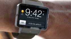
I would agree it's out dated if it was something more like this. But it's not thank god. It kinda has an iOS 8 feel to it yet it's a little different. I don't know I just like it
Attachments
They're pretty staunch on having a unique UI to suit the device, so I could see the sharing of design to be pretty minimal.
--
Don't get me wrong, I'm all for skeuomorphism! I was one of those who was sad to see it go, though not because I didn't like the flatness. But those badges, man, they're just... awful design - even in a skeuomorphic happy reality.
Yeah I'm not super crazy about the badges but if I get a Watch I probably won't be seeing them very often.
Yes! It is actually going to be 6 months old by the time it goes on sale!!!
I know. I'm so fed up with my old Apple watch I'm not even going to buy it.
What does "dated" even mean for this category of device?
Register on MacRumors! This sidebar will go away, and you'll see fewer ads.


