
Apple released the fourth beta of iOS 26 today, and the company has continued making changes to the way that Liquid Glass looks. There are also new features, including the return of Apple Intelligence Notification Summaries for news. This beta is of particular interest because it's likely the beta that public beta testers will get in the not too distant future.
Liquid Glass Changes
Liquid Glass is more translucent in beta 4, with Apple walking back some of the opacity changes that it introduced in beta 3.
Menu bars in apps like Photos, Music, and the App Store are now feature more transparency, allowing more of the background color to show through.
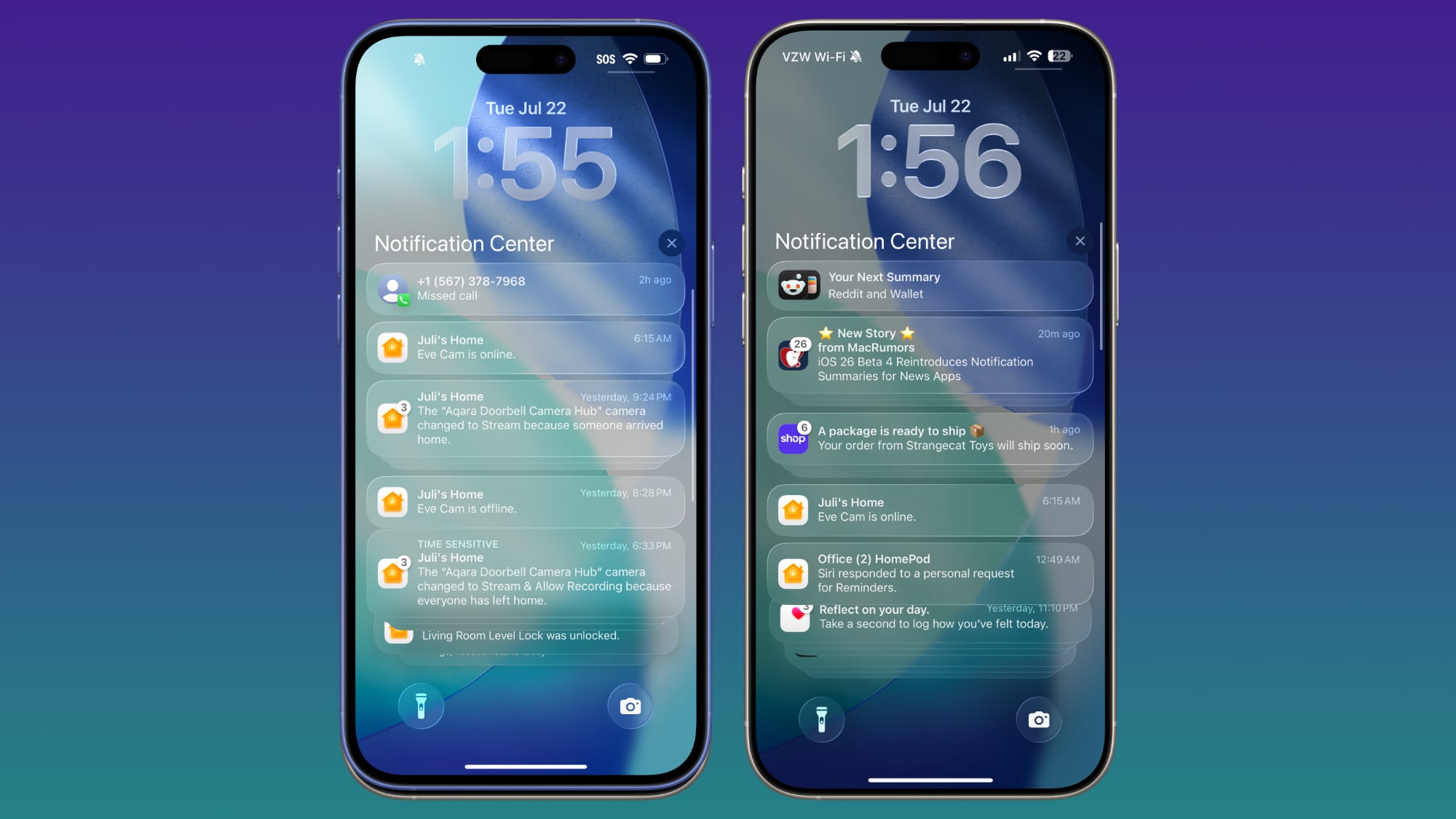
On the Lock Screen, when you scroll through notifications, the background gets darker. The darker tone improves the readability of text.
Notification Summaries
Apple Intelligence Notification Summaries are available for News and Entertainment apps again. Apple removed summaries for news articles back in January to improve the feature, and now it's ready for testing again.
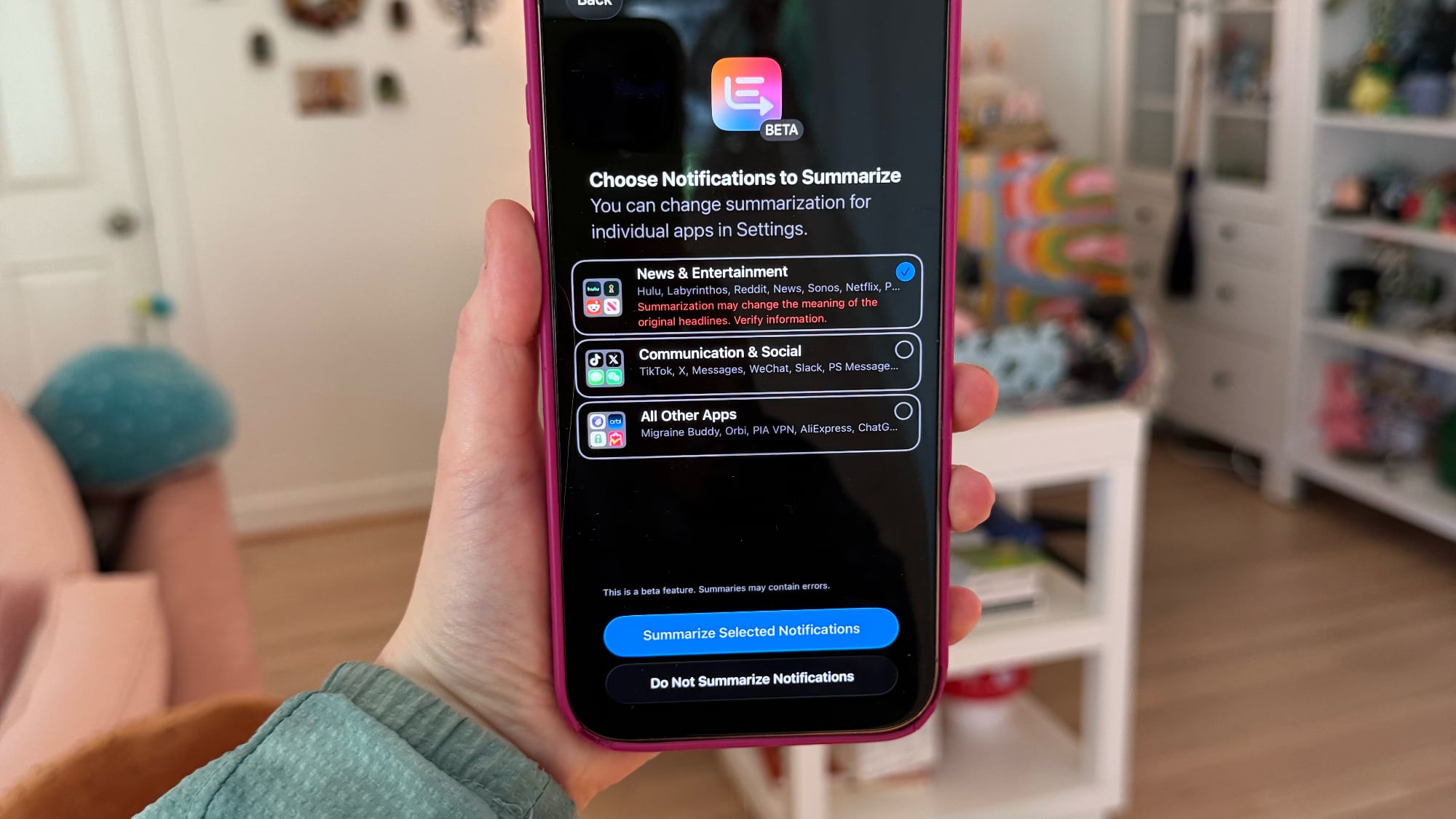
At the time, Notification Summaries were producing misleading news headlines by picking up and combining the wrong information in articles. Apple says the feature should work better now, and that testing will continue throughout the iOS 26 beta.
After updating to iOS 26, you'll see a pop up for enabling the summary feature for different app categories. You can choose to get news summaries or opt out. All notification summaries for News and Entertainment apps that are generated with Apple Intelligence will be italicized and will be annotated with a "Summarized by Apple Intelligence" notice.
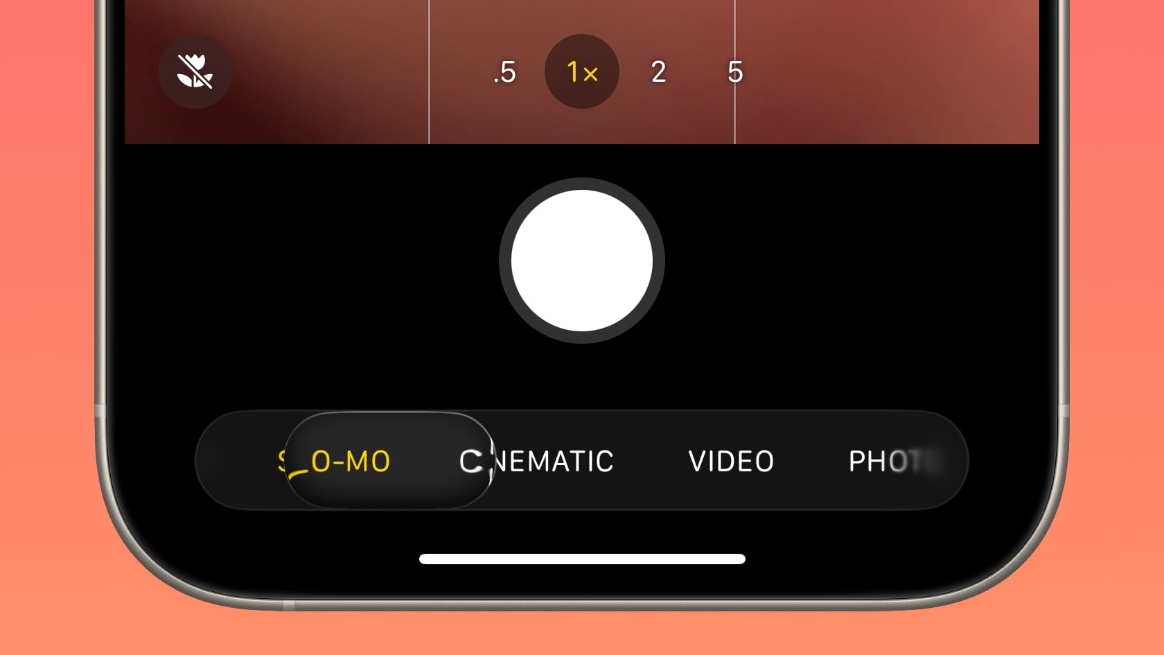
Camera App
When you swipe between modes in the Camera app, the button behavior has changed slightly. Before, the button seemed to be fixed with the background sliding back and forth, but now the button moves freely in both directions.
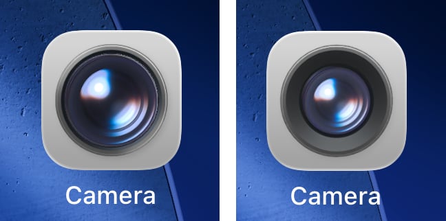
Apple also changed the icon of the Camera app on the Home Screen.
CarPlay Wallpapers
There are new CarPlay wallpapers available that match the new iOS 26 wallpaper design. The CarPlay wallpapers come in a range of colors, including blue, brown, gray, green, purple, and red. The wallpapers support both light mode and dark mode.
Apple has also removed some older CarPlay wallpapers that were introduced with earlier versions of iOS.
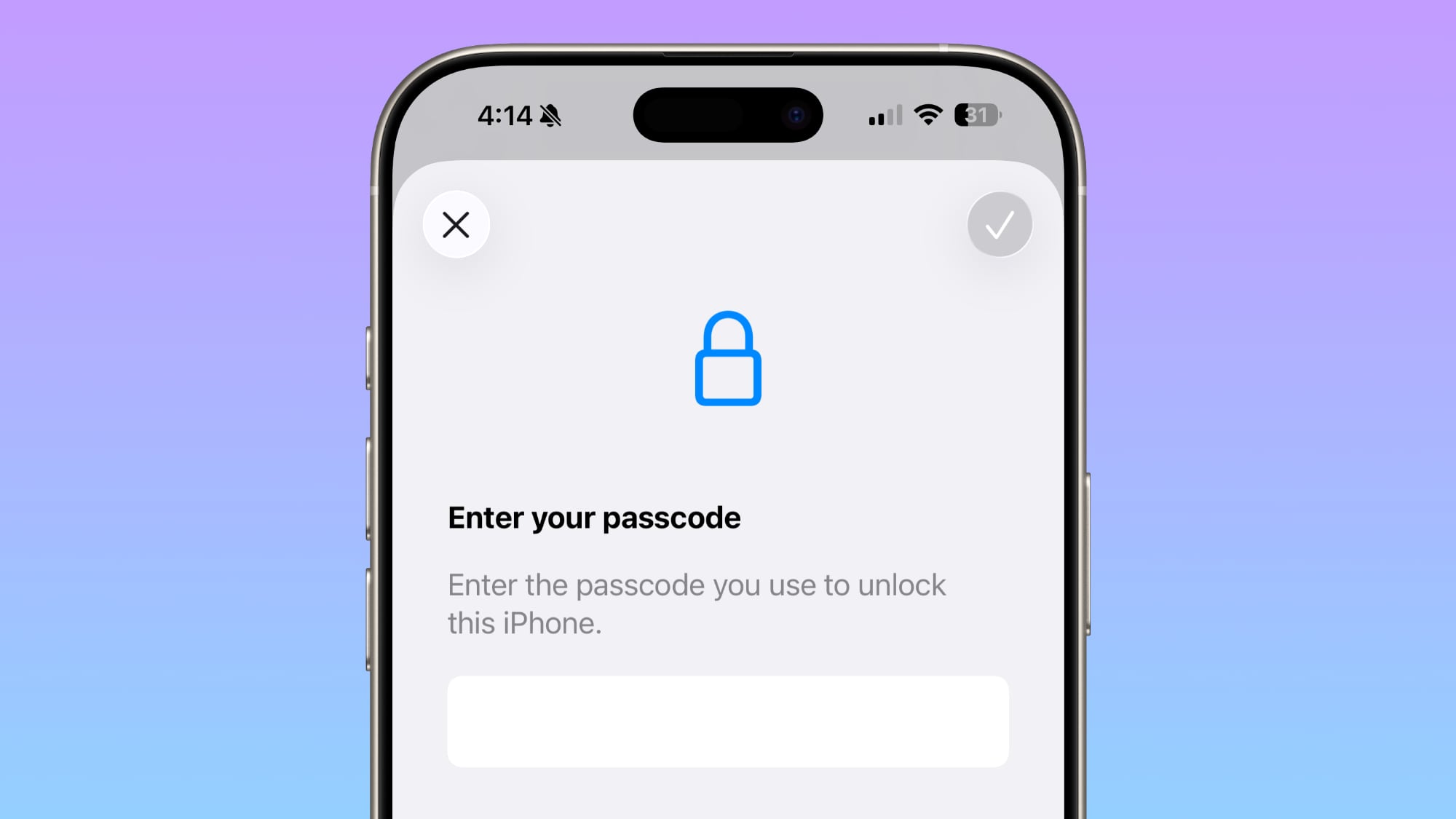
Passcode Changes
When you tap on Face ID & Passcode in the Settings app, there's an updated interface and wording that reminds you to enter the passcode you use to unlock the iPhone.
Passwords
The Passwords app has an Allow Contacting Websites option, which allows the app to contact websites to show names and icons for apps and websites and to let you know when a website supports passkeys.
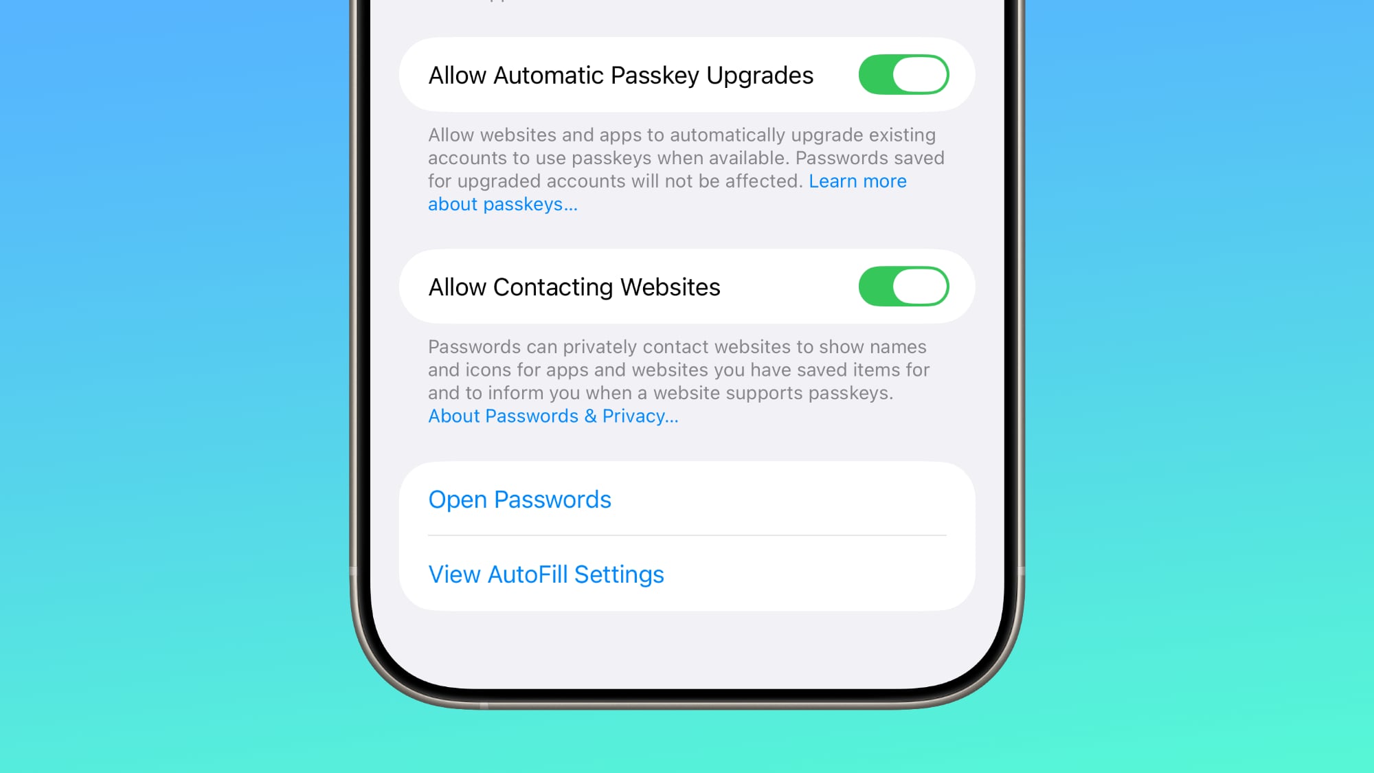
With this feature, Passwords now shows custom icons for websites automatically.
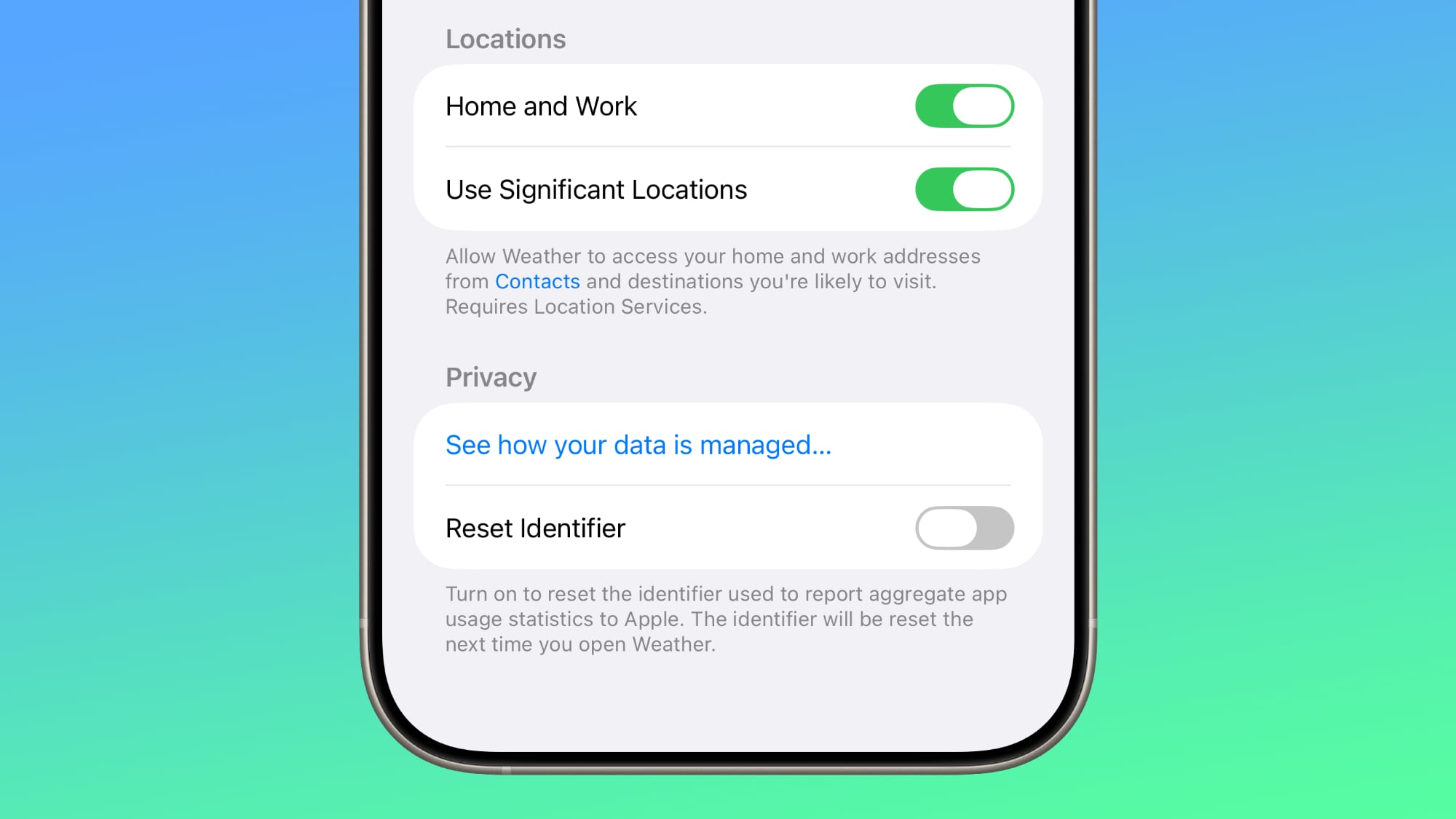
Weather
There's a new toggle in the Weather app settings that allows it to access Significant Locations. With the feature enabled, the Weather app is able to provide weather information for places that you are likely to visit.
Reduce Loud Sounds
The "Late Night Mode" option in the Sounds and Haptics section of the Settings app has been renamed to Reduce Loud Sounds, and Apple added a description.
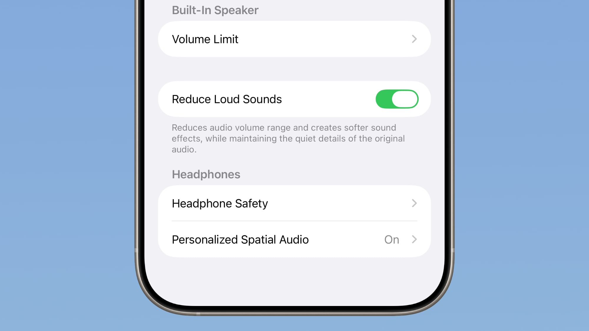
Reduces audio volume range and creates softer sound effects while maintaining the quiet details of the original audio.
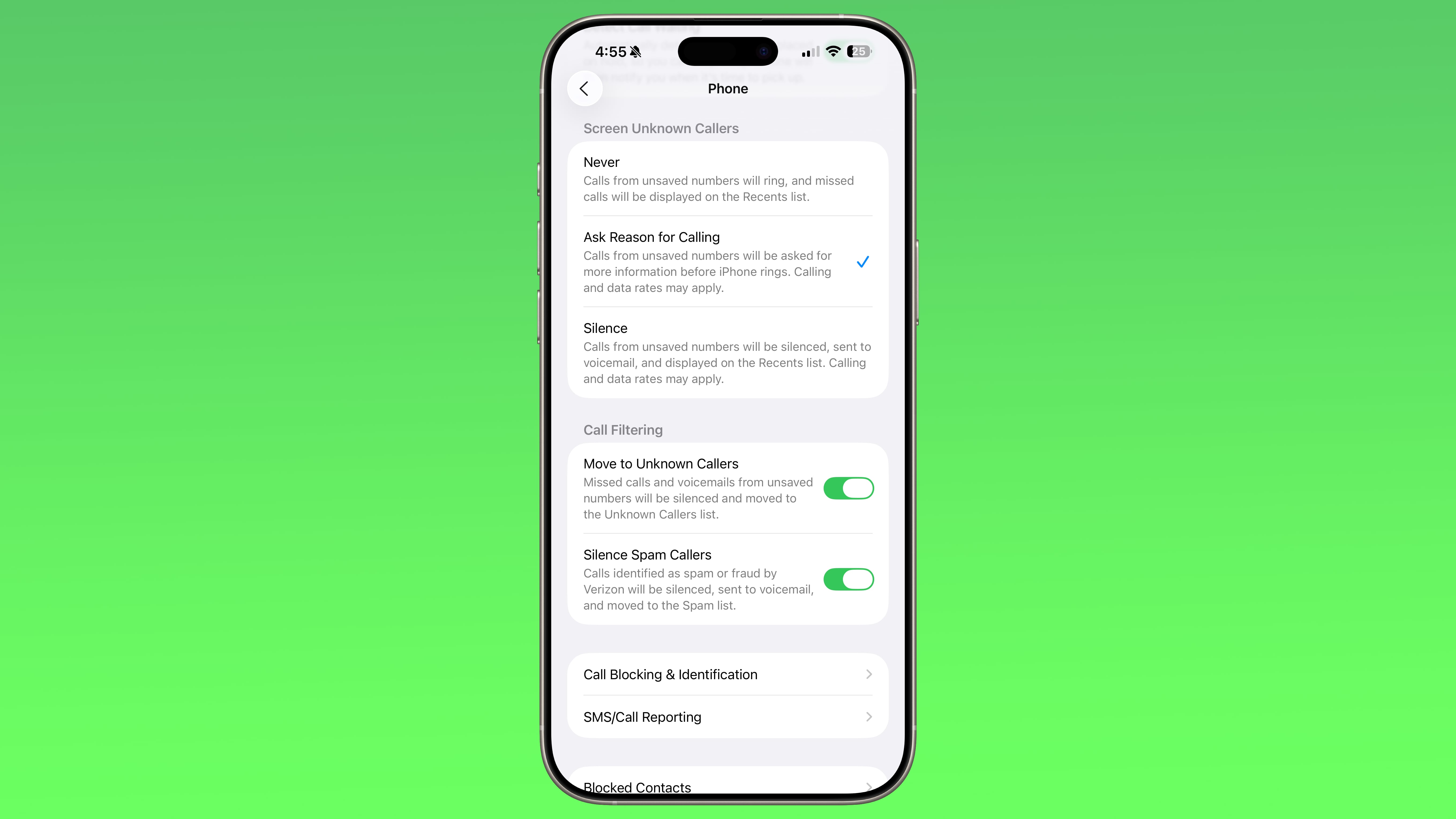
Call Screening
Apple updated the Screen Unknown Callers option to add new options. You can turn the feature off, ask unknown callers the reason why they are calling, or silence calls from unknown numbers automatically, sending them to voicemail.
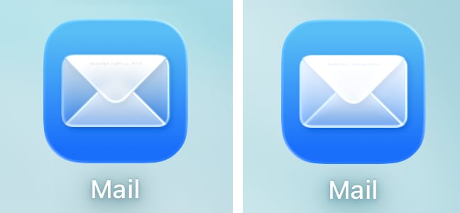
There are very subtle changes to the design of the Mail app icon.
Wallpaper
The wallpapers introduced with iOS 26 are now dynamic and will change color over the course of the day... Click here to read rest of article
Article Link: Everything New in iOS 26 Beta 4
