
Designer Sebastiaan de With has published an impressive preview of what Apple's rumored iOS redesign might look like, complete with detailed mockups and a design philosophy that he believes could reshape how users interact with their devices.
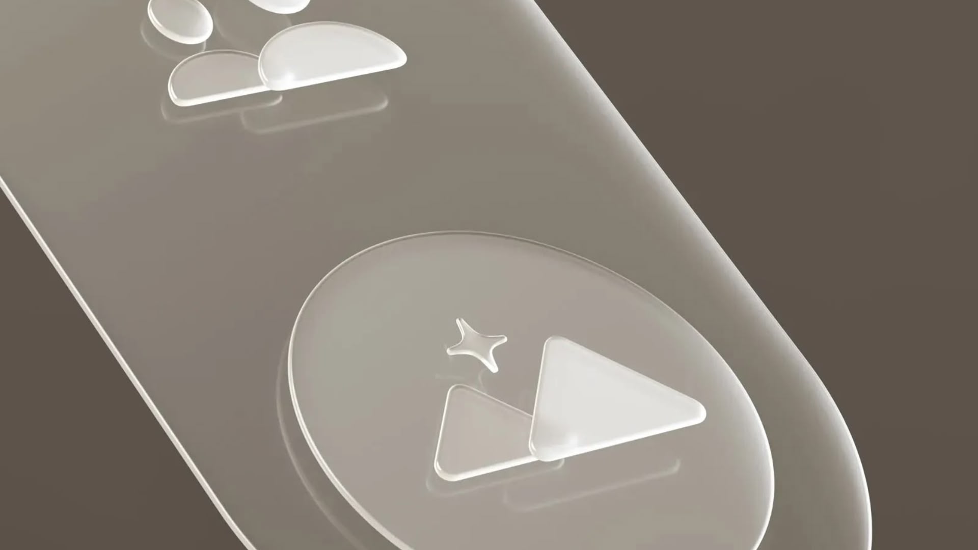
With WWDC just days away, de With – co-founder of photography app maker Lux and former Apple designer – has created what he calls "Living Glass" concepts that imagine interfaces matching the material properties of Apple's glass-screened devices.
"Philosophically, if I was Apple, I'd describe this as finally having an interface that matches the beautiful material properties of its devices," de With writes. "This brings an interface of a matching material, giving the user a feeling of the glass itself coming alive."
The designer's vision extends far beyond cosmetic changes, however. Using visionOS as a cue, De With proposes a fundamental shift toward "physicality" – interfaces that behave like real materials through dynamic lighting, reflections, and environmental responsiveness.
Tracing iOS Evolution
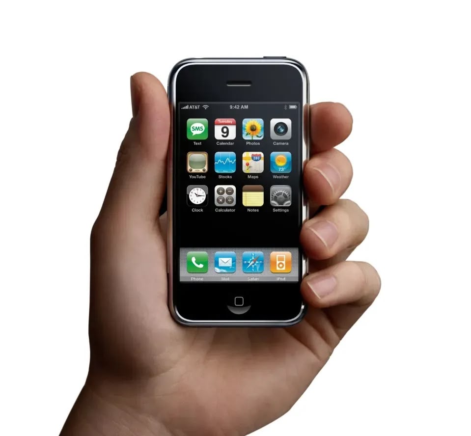
To provide historical context to his vision, De With traces iOS design through three distinct eras. He identifies the "Shaded Age," running from iPhone OS through iOS 6, that relied heavily on skeuomorphism, using realistic textures and shadows to help users transition from physical buttons to touchscreens.
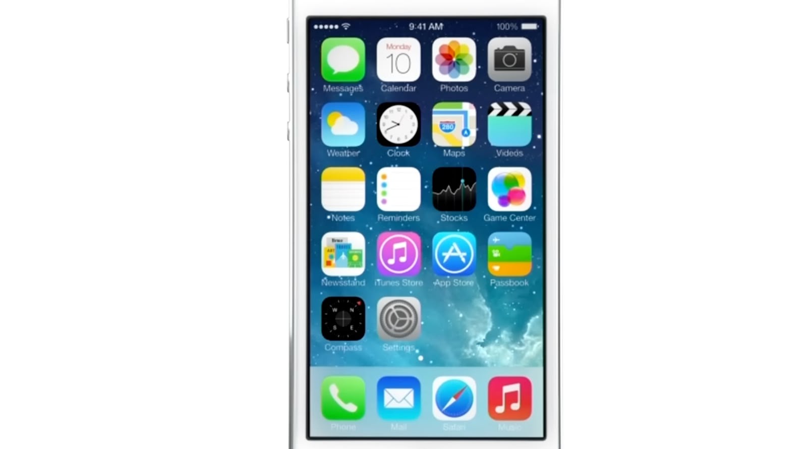
Then came the so-called "Flat Age," beginning with iOS 7's controversial redesign, which stripped away visual effects in favor of clean typography and minimal chrome. It was initially stark, but de With notes that iOS gradually regained depth through blur effects and subtle shadows over the years.
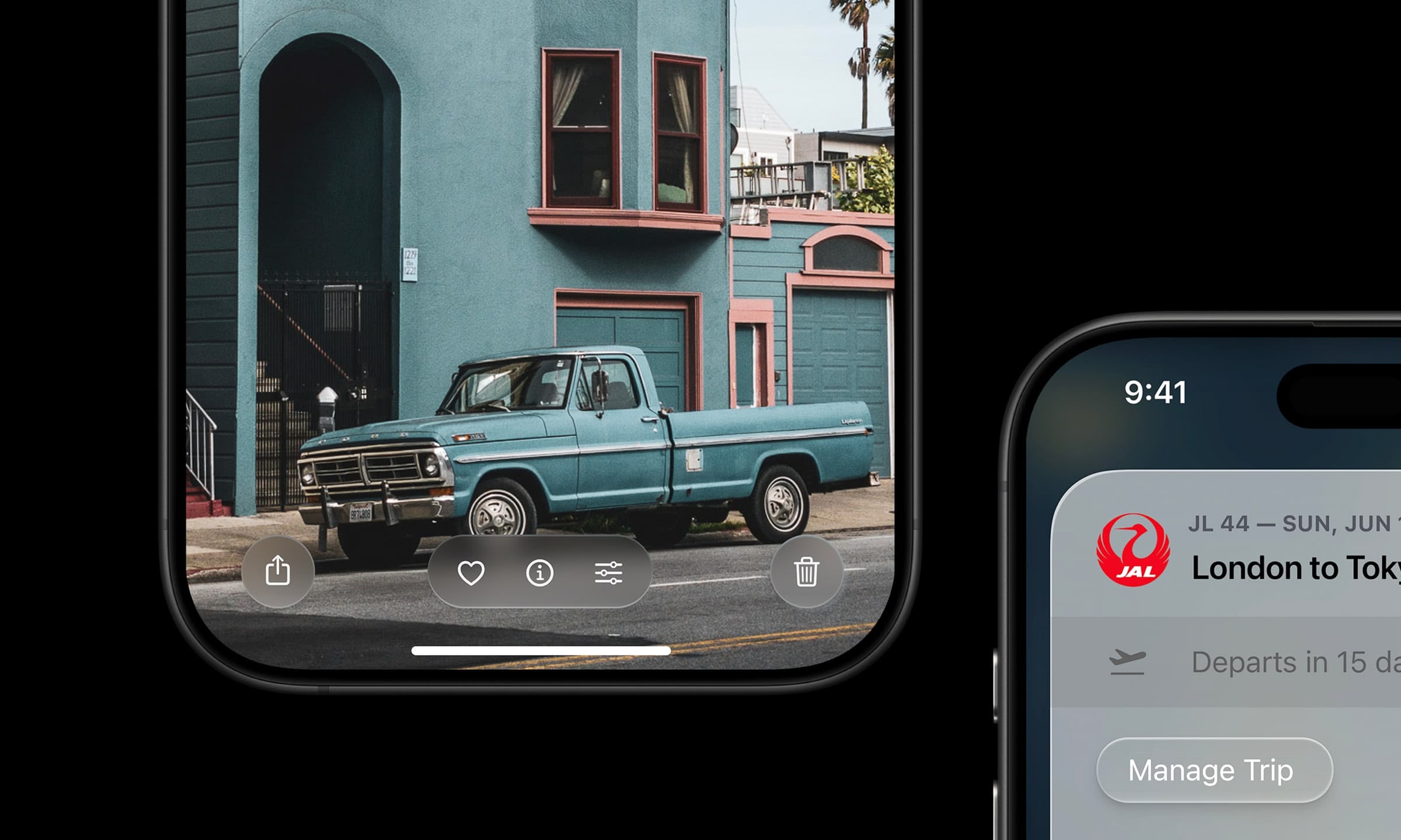
Now, de With sees hints of a third era emerging through features like Dynamic Island and the new Siri animation – elements that behave like physical materials rather than static graphics.
"We've come back, in a sense, to skeuomorphic interfaces – but this time not with a lacquer resembling a material," he explains. "Instead, the interface is clear, graphic and behaves like things we know from the real world."
Glass as Interface Material
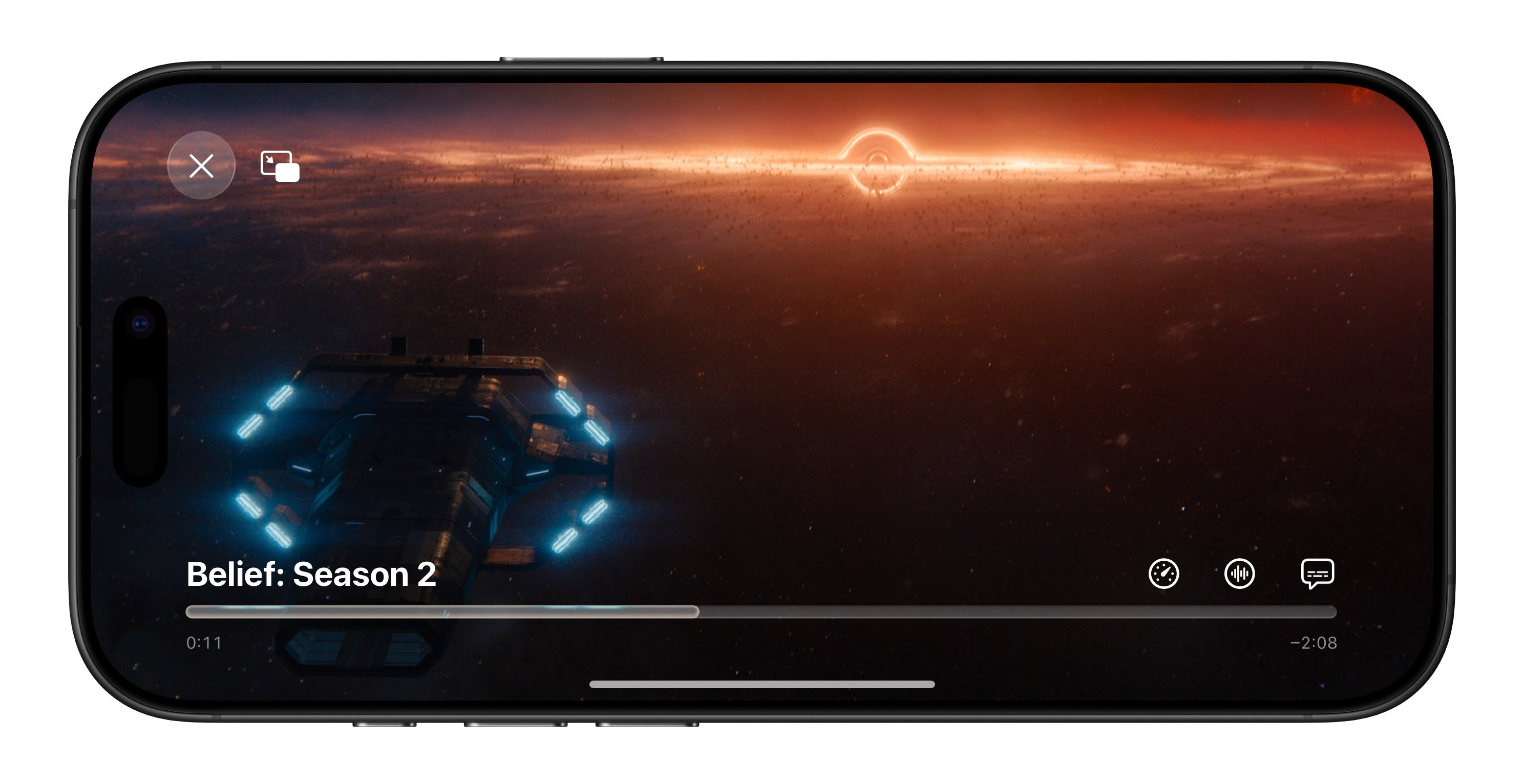
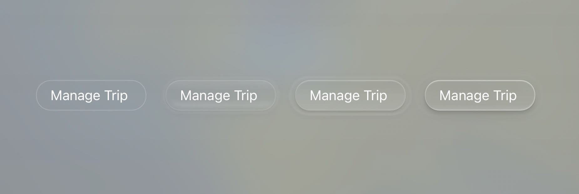
The designer's "Living Glass" concept treats all UI elements as dynamic glass surfaces that reflect, refract, and respond to their environment, so buttons cast realistic shadows, reflect bright content, and exhibit properties like surface tension when merging together.
As he sees it, the approach would create a visual hierarchy through different glass treatments, such as glossy elements for primary actions, frosted surfaces for secondary controls, and inlaid elements that appear embedded in the screen itself.
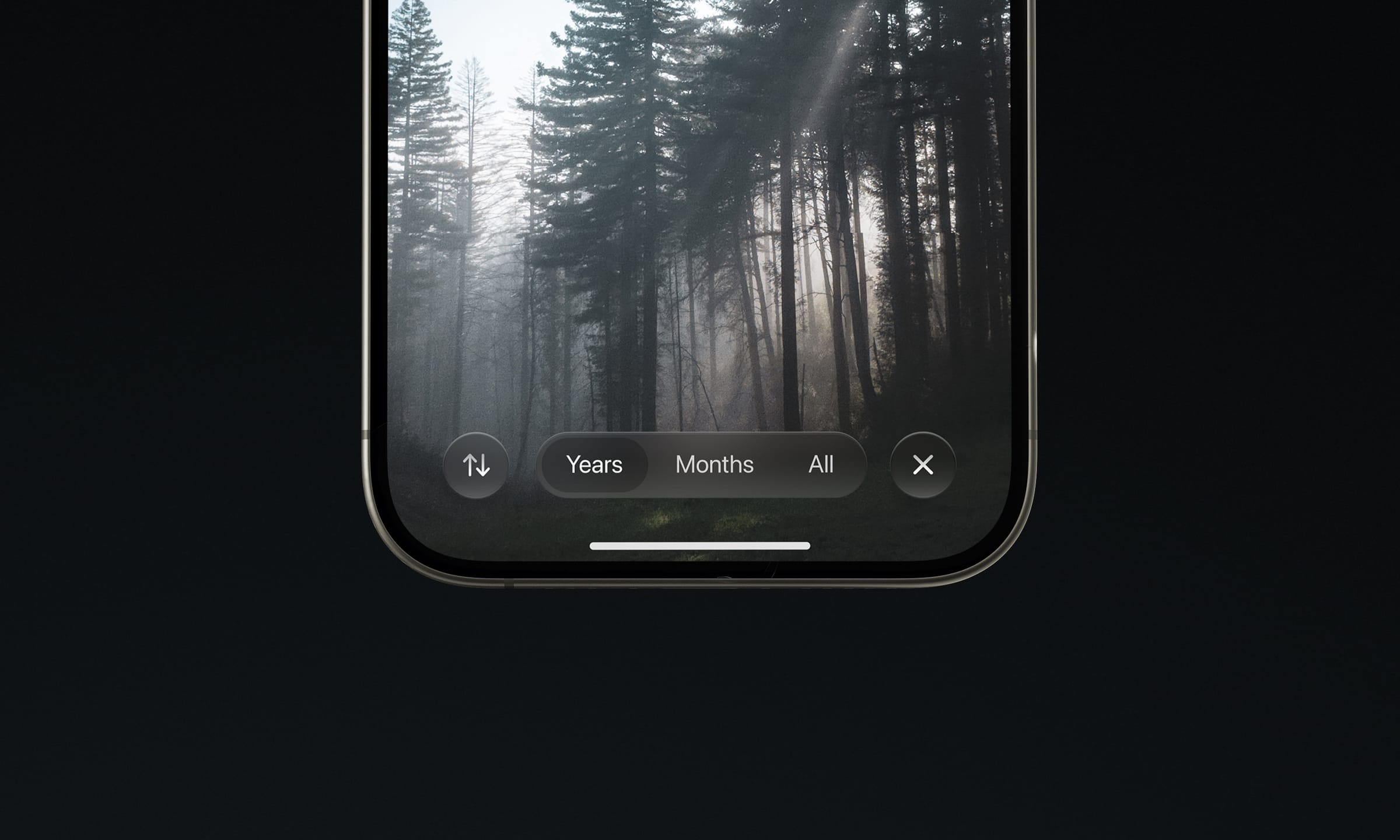
De With's mockups show tab bars floating above content, app icons with dynamic reflections, and controls that emerge from background surfaces when activated. As envisioned, the system would handle these effects automatically, ensuring consistency across all apps.
The designer points to recent changes to iOS to support his theory, such as Apple's work on automatic icon masking in iOS 18, as evidenced in Dark Mode and tinted icon effects on an identical black gradient icon backdrop. De With suggests these could be preparation for more dynamic backdrops.
Beyond Visual Polish
De With argues that current design tools like Figma are unable to create the dynamic lighting and responsive behaviors that he envisions, and that could potentially give Apple a competitive advantage if it's difficult to replicate.
His concepts also echo Apple's broader design philosophy of hardware-software integration. For example, just as early Mac OS X's translucent Aqua interface complemented colorful iMac enclosures, "Living Glass" could make software feel native to glass-screened devices.
De With isn't blind to the challenges in bringing such complexity to a platform used by millions of third-party developers, but he argues there are parallels to Apple's previous platform transitions, which ultimately raised the bar for interface design across the industry.
WWDC Expectations
Recent reports from Bloomberg's Mark Gurman describe Apple's coming redesign as featuring "glassy" effects inspired by visionOS. Apple has also tagged WWDC as its "sleek peek" event.
Whether Apple's actual plans match de With's vision remains to be seen. But his detailed reasoning should be enough to make even the most cynical Apple device users excited about what the company is set to preview next week for iOS 26 and its other operating systems.
"Only Apple can push the state of the art to a new interface that brings the glass of your screen to life," de With concludes. "We'll see at WWDC." For more insight into the design philosophy that inspired his concepts, be sure to check out De With's full write-up over at the Lux Camera website.
Apple's new iOS design is set to be unveiled at the WWDC keynote event on Monday, June 9. It starts at 10:00 a.m. and while Apple will livestream it, if you can't watch, you can follow along here on MacRumors.com or on our MacRumorsLive X account.
Article Link: Ex-Apple Designer Reveals 'Living Glass' iOS 26 Concepts
