Hello all,
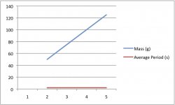
I'm currently trying to create some graphs in Excel, and the data isn't plotting as I would like it to be - not sure if there is something I am doing wrong here or if there is a setting to change.
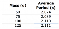
My data goes like this:
Mass (g) Average Period (s)
50 2.074
75 2.089
100 2.110
125 2.111
and I would like mass on the x-axis and average period on the y-axis.
However, my graph is placing both values on the y-axis and placing a key beside the graph.
The graph and the way I have set out the data are attached below.
If anyone can help me out it would be greatly appreciated!
Thanks.


