Become a MacRumors Supporter for $50/year with no ads, ability to filter front page stories, and private forums.
Apple should buy these icons from the designers that put these out on Dribbble.

Do you have the link to the dribble page?

----------

Agreed, and I can't stand the new design of the reminders app overall.
I so agree. Why didn't they just stick to the iOS 6 design and just made it flat? I don't get it. Everything is missing texture except notes and reminders. Why didn't they flatten those out too?
 
I like the switches for the Settings icon (I'm assuming its for Settings). The current one makes no sense to me!

The settings icon is brilliant. It looks good, fits with the theme of the OS and tells you at a glance what its function is.

Everything you need from an icon.

I wish someone would redesign Safari in the same way as, at the moment, it's a compass.
 
I prefer Louie Mantia's:

Image

Also, in before "do we really need another icon thread"—Yes, we do because I like them! :mad: Aaaargh!

they look much better than the ones apple designed.
I wish they would change them, but i doubt it:(
 
they look much better than the ones apple designed.
I wish they would change them, but i doubt it:(

You are correct, Apple WILL NOT CHANGE ICONS !!!
Can we put the stop to these pointless topics please...
Which part of "there will be no change to iOS icons" you guys don't understand?!
Reading through these forums is like looking at the bunch of 8 year old brats whinging about their missing Lego blocks... Give me a break...
How many more "icon" posts do we need?!
Do we have Moderators on this board? Time for major clean up is way overdue...
 
When it comes to these "better" icons threads, I feel like I can only appreciate (whether better or worse) the designs people made before Apple showed theirs at WWDC (were there even any?). All these post-WWDC mock ups are variants of Apple's new icons; it's a lot easier for these designers to design icons in reference to Apple's rather than creating a true mock up from scratch. Would they really come up with these seeing what Apple did first?
 
When it comes to these "better" icons threads, I feel like I can only appreciate (whether better or worse) the designs people made before Apple showed theirs at WWDC (were there even any?). All these post-WWDC mock ups are variants of Apple's new icons; it's a lot easier for these designers to design icons in reference to Apple's rather than creating a true mock up from scratch. Would they really come up with these seeing what Apple did first?

Perhaps that's the point, though. In many cases, Apple had the right idea, they just executed it poorly. Many of the alternatives we've seen are simply better versions of what Apple did. In other cases (Safari, Settings), a complete redesign is called for.
 
So can we change the icons ourselves with ifunbox or something or would we have to wait for a jailbreak? Honestly hate the ios 7 stock icons.
 
Last edited:
So can we change we change the icons ourselves with ifunbox or something or would we have to wait for a jailbreak? Honestly hate the ios 7 stock icons.

Oblivious to previous posts, are you?
If you are so desperate to change the way iOS 7 looks, get yourself Android toy and stop troll around!
Btw; Are you a developer? Do you have iOS 7 installed?
Don't like it, don't use it... Who forced you to install iOS 7 beta?!
Don't like it, revert back to iOS 6 and all your complaints will vanish ;)
 
Last edited:
Perhaps that's the point, though. In many cases, Apple had the right idea, they just executed it poorly. Many of the alternatives we've seen are simply better versions of what Apple did. In other cases (Safari, Settings), a complete redesign is called for.

This is true. If we can refine them to make them look "better" then obviously Apple can too. And maybe they will but for now it appears they'll leave them as is.
 
Apple's are distinctive. By not being "perfect" (ie. not adhering to our taste conditioned by average designs), they have their unique look. Mantia's icon are "perfect" and perfectly bland.

I'm not at all saying Apple's are perfect, but they are unique and ICONIC.
 
Oblivious to previous posts, are you?
If you are so desperate to change the way iOS 7 looks, get yourself Android toy and stop troll around!
Btw; Are you a developer? Do you have iOS 7 installed?
Don't like it, don't use it... Who forced you to install iOS 7 beta?!
Don't like it, revert back to iOS 6 and all your complaints will vanish ;)

Wow look at this baby lol
 
Do you have the link to the dribble page?

----------


I so agree. Why didn't they just stick to the iOS 6 design and just made it flat? I don't get it. Everything is missing texture except notes and reminders. Why didn't they flatten those out too?

Settings and photo icons are made by Luboš Volkov. Safari icon made by Arif Huda. Camera icon made by Matt Stenquist. Reminders icon made by Angela | Toffeenut Design. Dont remember who made the clock icon.
 
Oblivious to previous posts, are you?
If you are so desperate to change the way iOS 7 looks, get yourself Android toy and stop troll around!
Btw; Are you a developer? Do you have iOS 7 installed?
Don't like it, don't use it... Who forced you to install iOS 7 beta?!
Don't like it, revert back to iOS 6 and all your complaints will vanish ;)

Be careful on that high-horse of yours.
 
Oblivious to previous posts, are you?
If you are so desperate to change the way iOS 7 looks, get yourself Android toy and stop troll around!
Btw; Are you a developer? Do you have iOS 7 installed?
Don't like it, don't use it... Who forced you to install iOS 7 beta?!
Don't like it, revert back to iOS 6 and all your complaints will vanish ;)

You realise that you just walked into a conversation that you had no interest in and told everyone to shut up because you don't like it? These are not trolls. They are folk talking about their hobby gadget. If this thread doesn't interest you, don't come in here and post. Very simple.
 
Apple's are distinctive. By not being "perfect" (ie. not adhering to our taste conditioned by average designs), they have their unique look. Mantia's icon are "perfect" and perfectly bland.

I'm not at all saying Apple's are perfect, but they are unique and ICONIC.

People need to stop throwing around the iconic word. Apple's icons are inconsistent - this is fact, not opinion. Whether or not they are ugly is opinion-based. But many designers and artists agree that Apple has dropped the ball with these icons and they are unique in a pretty bad way.
 
People also need to realize that consistency is not the be-all, end-all goal of icon design :) many other factors like discernability also matter.
 
Oblivious to previous posts, are you?
If you are so desperate to change the way iOS 7 looks, get yourself Android toy and stop troll around!
Btw; Are you a developer? Do you have iOS 7 installed?
Don't like it, don't use it... Who forced you to install iOS 7 beta?!
Don't like it, revert back to iOS 6 and all your complaints will vanish ;)

Thank you for taking the time to tell us you don't like our thread. Your opinion is very important to us. Please stay on the line and the next available representative will assist you in finding a thread more to your liking.
 
Apple should buy these icons from the designers that put these out on Dribbble.

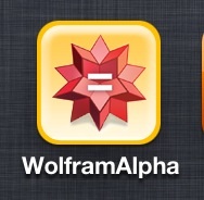
The photos icon looks like Wolfram|Alpha
 

Attachments

  • image.jpg
    image.jpg
    14.2 KB · Views: 208
Register on MacRumors! This sidebar will go away, and you'll see fewer ads.