Got a tip for us?
Let us know
Become a MacRumors Supporter for $50/year with no ads, ability to filter front page stories, and private forums.
Favorite iOS 7 wallpaper
- Thread starter sird28
- Start date
- Sort by reaction score
You are using an out of date browser. It may not display this or other websites correctly.
You should upgrade or use an alternative browser.
You should upgrade or use an alternative browser.
Thierry ba
macrumors 6502a

Looks pretty good. Can you possibly post all the new default wall papers on ios7 for those if us who aren't developers if you don't mind.
virginblue4
macrumors 68020
Unless I'm missing something, this doesn't come with iOS 7, at least not on my iPad mini....
Thierry ba
macrumors 6502a
virginblue4
macrumors 68020
This is not iOS7 wallpaper, as I said.
So why did you bother posting in a thread about iOS 7 wallpapers? It's not about ones that you have chosen to use with iOS 7, it is about the ones that come with iOS 7.
Looks pretty good. Can you possibly post all the new default wall papers on ios7 for those if us who aren't developers if you don't mind.
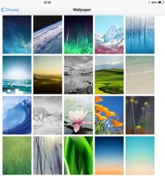
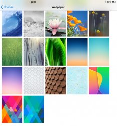
Here they are 🙂
Attachments
kmj2318
macrumors 68000
The default space wallpaper is by far my favorite. It's the right balance of not being too busy or too plain. Most wallpapers don't work well in iOS 7 because simpler wallpapers look good on the home screen (complicated wallpapers interfere with the icons), but simple wallpapers look too plain on the lock screen.
The space theme with the green aurora is nice but I don't like how it makes the dock a green block. The third ice theme one is pretty nice. All the other nature ones are so-so. I really like the gradients, especially the turquoise one. The three pattens that follow are absolutely horrible. The bright shapes are nice, but only for the lock screen. The 5C defaults are meh, I think Apple should have used the dynamic wallpapers for the 5C instead; they look nicer and would be a good way to show it off.
The space theme with the green aurora is nice but I don't like how it makes the dock a green block. The third ice theme one is pretty nice. All the other nature ones are so-so. I really like the gradients, especially the turquoise one. The three pattens that follow are absolutely horrible. The bright shapes are nice, but only for the lock screen. The 5C defaults are meh, I think Apple should have used the dynamic wallpapers for the 5C instead; they look nicer and would be a good way to show it off.
kmj2318
macrumors 68000
Looks pretty good. Can you possibly post all the new default wall papers on ios7 for those if us who aren't developers if you don't mind.
http://www.idownloadblog.com/2013/09/11/new-ios-7-wallpapers/
airbelchris
macrumors regular
KUPARA
macrumors regular
i LOVE the mountain one. i think that is in alasko or nepal
If i guess right about the same picture you are thinking, that is Matterhorn, Switzerland
Last edited:
dictoresno
macrumors 601
QuarterSwede
macrumors G4
The water one is my favorite. Goes perfectly with the new dock and it strikes the right balance with the height and a full screen of icons/folders.
So why did you bother posting in a thread about iOS 7 wallpapers? It's not about ones that you have chosen to use with iOS 7, it is about the ones that come with iOS 7.
Here they are 🙂
Thanks for the images 🙂
----------
thanks great link 🙂
Am loving the new wall papers. Cant wait to download IO7 on the 18th 🙂

Defender2010
Cancelled
AmazingGraceTx
macrumors regular
Black Magic
macrumors 68030
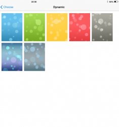
This is my favourite by far - as it matches my blue case.
+1
I keep switching up trying various colors but I keep going back to that one. It looks stunning!
Synaesthesia242
macrumors member

macbookguy
Cancelled
cristovao
macrumors 6502a
The Aurora is running on my iPhone and iPad.
Seems to be the most popular one based on these comments. I too use it on my home screen although I agree, I do not like how it turns the dock into a green colour. Personally, that's really the only design aspect of 7 that I dislike; the dock.
Not enough for me to start a thread about it to bitch though. 😉