Become a MacRumors Supporter for $50/year with no ads, ability to filter front page stories, and private forums.

PollyK

macrumors regular
Original poster
Apr 18, 2013
197
0
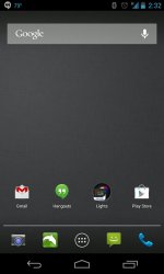
So after much consideration and looking at others customize their homescreens, I finally gave it a go myself. I couldn't be more happy with the result.

First off, my screen is 5 inches. That means I could easily have 5 row of icons. I tried 6 rows, but decided that 5 was perfect for me. Six rows looked too cluttered to me. Mind you, 6 rows on a 5 inch screen looked less cluttered than 5 rows on the iP5.
Secondly, changed my icons to a very simple look without all the fancy shine.
Lastly, decided I didn't like the divider above the dock and got rid of it.

The result to me is an extremely clean and simple looking interface that I can honestly say is better than anything out there. Yes I like it that much.

I now fully understand the first hand why all the Android users go on and on about customizing. It is truly refreshing. All this was done without rooting my phone and voiding my warranty.

The first pic is with the dock divider, and the second without. To me, the divider was just more clutter.

SS1.jpg


SS2.jpg
 

mattopotamus

macrumors G5
Jun 12, 2012
14,738
6,108
Overall I think it is nice. For me personally there are too many icons. I only put the dock and 1 row of my most used apps. Will you upload that background?

edit: and I like the one with the divider better :)
 

blitzer09x87

macrumors 6502
May 19, 2013
408
0
awesome screen...that's what i call flat and simple.
i totally agree with you, android is way superior to iOS7 because it can be customized in every way you don't have to stay with one boring UI for the smartphone's whole lifetime. i think that i should also start using these awesome launchers, thanks.:)
 

Dontazemebro

macrumors 68020
Jul 23, 2010
2,173
0
I dunno, somewhere in West Texas
Overall I think it is nice. For me personally there are too many icons. I only put the dock and 1 row of my most used apps. Will you upload that background?

edit: and I like the one with the divider better :)

Same here, I always group my icons into folders (favs, games, tools etc) with mainly just my common stock apps on the home screen (phone, mail, messages etc)

Here's what my S4 looks like now


jera7yte.jpg


ygamydyj.jpg
 

mattopotamus

macrumors G5
Jun 12, 2012
14,738
6,108
Same here, I always group my icons into folders (favs, games, tools etc) with mainly just my common stock apps on the home screen (phone, mail, messages etc)

Here's what my S4 looks like now


Image


Image

Mine is pretty simple too.
 

Attachments

  • uploadfromtaptalk1371494040600.jpg
    uploadfromtaptalk1371494040600.jpg
    56.6 KB · Views: 191

Stuntman06

macrumors 6502a
Sep 19, 2011
961
5
Metro Vancouver, B.C, Canada
First off, my screen is 5 inches. That means I could easily have 5 row of icons. I tried 6 rows, but decided that 5 was perfect for me. Six rows looked too cluttered to me.

I use six rows. I removed the dock on my home screen. For me, it doesn't make sense to have a dock. I see no need to have the same app icons on all of my home screens.
 

PollyK

macrumors regular
Original poster
Apr 18, 2013
197
0
OP, which launcher and icon pack did you use? thanks

It is Nova Launcher Prime, which is the paid version as it gives you the unread count badges for your emails, calls, and sms.
And the theme pack is the MiUi X5 HD.
In my opinion, it is by far the most polished and professional looking theme pack I have seen. There is a free version, but it's not HD like this set. I honestly think a few of the OEMs out there should hire the MiUi team to do Icons for them.
 

KentuckyHouse

macrumors 68030
Jan 29, 2010
2,723
998
Lexington, KY.
Okay, I know about:

http://mycolorscreen.com/

and its huge collection of homescreens.

I also liked the few I saw here:

http://android.appstorm.net/roundup...esome-homescreen-setups-for-your-inspiration/

Anybody else got favorite sites to look through?

Thanks!

I absolutely love looking through those sites (I didn't know about the second one so thanks for posting that!) I'm a huge fan of minimalist setups, so mycolorscreen is like crack for me. :D

My problems begin whenever a setup mentions using UCCW. I've messed with it a hundred times and no matter what I do, I can't seem to figure out exactly how to use it. It's maddening. I've also searched and searched for a good, straightforward tutorial on how to use it but I keep coming up empty. I've been using both iOS and Android for a while now, so I'm not a novice (when it comes to jailbreaking or rooting/ROMs), but for some reason, UCCW just confounds me.

Any links to a good, easy to understand tutorial would be greatly appreciated! ;)
 

AppleRobert

macrumors 603
Nov 12, 2012
5,729
1,133
For whatever reason as I am not really bored so more for fun than anything else, I have been trying different launchers, themes, and icon packs.

A question I have is how does one incorporate a replacement icon? I have an option when I press down on one I would like to change but do not know what the next step is and where do I find a replacement.

Thanks
 

Fireblade

macrumors 65816
Jan 25, 2011
1,101
321
Italy
For whatever reason as I am not really bored so more for fun than anything else, I have been trying different launchers, themes, and icon packs.

A question I have is how does one incorporate a replacement icon? I have an option when I press down on one I would like to change but do not know what the next step is and where do I find a replacement.

Thanks

Which launcher are you using?
 

AppleRobert

macrumors 603
Nov 12, 2012
5,729
1,133
Apex. I guess not all icons have custom replacements? I for example am trying to do one for bing. The current one is fugly. :)

I am using the same theme as the OP.
 
Register on MacRumors! This sidebar will go away, and you'll see fewer ads.