So far, I take it the "disjointed look" is intentional, i.e. the cracks between the various sliced graphics. If so, I like it for the artwork and originality - it's refreshing to see some design thought - high compliments for that including the perfect background color. I know you're still working on the other pages so I'll reserve comment for that.
There are a few things worth mentioning which might help you:
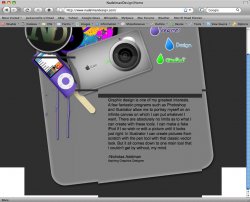
The images on the top left and top right have a border set and change colors due to the link color assignment (i.e. active, visited, etc.) - if you intended that, make the colors work with the layout. If not, set border to 0 for those images.
I really like the iPod as a dripping popsickle (awesome job there if you created it) and the iCam - but the purpose of the donut being placed just above. Of course I get it in terms of color and palette, it's just what does a donut have to do with Apple stuff other than it is edible? Ah, maybe I need to loosen up a little, I dunno. All those images together make the page fanciful, which might be your intent. The copy that is there maybe should not mention specifically that you can make a "fake iPod", rather it should be more generic and mention your "flexibility in design styles from fanciful to elegant to industrial or whatever you, the client, prefers..." to bring it all together. Just an example and my own .02, use your own adjectives/words, but do you get my drift? Tell users what you design, broadly. In the future might help to include links to sites you've done, screenshots of them, etc. to promote your past work graphically.
Your site does not validate - 6 major errors for the HTML with numerous typos in attributes you can easily fix for better cross browser compatibility.
All in all, a very original looking home page with lots of potential - awesome effort, I golf clap to show my approval, heh. Well done, so far.
-jim