Become a MacRumors Supporter for $50/year with no ads, ability to filter front page stories, and private forums.
For everyone attempting to mind-read Jonathan Ive & Co's up and coming creations, may I suggest:

1/ You don't apply for a job with ANYTHING to do with UI/UX @ Apple

2/ If you ignore #1 (and even if you don't), read:

http://developer.apple.com/library/...tual/MobileHIG/Introduction/Introduction.html

Too much white with no discernable demarcation points/cues = no good. When they say "flat", they don't mean as white as snow and as flat as A4 paper, they mean "not so rounded".
 
Hi, I figured I'd throw in my mockups along with everyone else's as the anticipation for WWDC builds. I don't really see the UI looking like this, but wondered how they could go more flat, but still retaining a classically Apple aesthetic. They're unfinished (some buttons missing), but I think you get the idea. Myriad is Apple's font used for branding, but for some reason they never use it in their UI. Maybe this would integrate the whole package together even more, considering that the packaging and device itself are written in Myriad, so why not the UI? Also, I copied GoGa's idea for the settings icons, hopefully it's ok. :D

Fabulous stuff, it does however need a change. Apparently each core app will have it's own colour scheme. So say green for messaging, baby blue for mail. Could you do a new mockup with those colours?
 
Are we getting too fixated in the whole look and feel of icons and dimension?
Yes, it needs a refresh (some might say an overhaul), but hopefully Apple will bring more features and functionality along with a re-skinning of the OS.
 
Great, but Apple's designs would have much more color, but this is certainly interesting.
 
I like the Messages one. I think its because I text so much that having a nice looking messages view gives the phone it's luxury somehow.
 
I don't like the music app because its the same non fucntional boring app, with just a new skin, but apart from that the rest looks great!
 
That's cool. I too am working on a flat design concept to submit to tons of Apple news sites. Since this is one of those threads, then I might as well share it here. So far I have the main home screen and FaceTime:

ESiHRV2.jpg


What do you guys think?
 
What font is the "2 of 24 recommendations" line? I love that clean crisp look! Awesome work. Thanks for sharing.

Definitive- your mockup is legendary! Thanks for the laugh.
 
That's cool. I too am working on a flat design concept to submit to tons of Apple news sites. Since this is one of those threads, then I might as well share it here. So far I have the main home screen and FaceTime:

Image

What do you guys think?

Spot on IMO. Finally the change I have been waiting for!
 
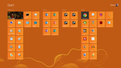
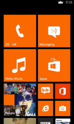
Try to avoid the use of cyan as Microsoft has made a point to go heavy with it in Windows 8.

Not really. Unlike iOS, you can choose any default colour you want in Windows (and Windows Phone) 8. I chose Orange.
 

Attachments

  • Untitled.png
    Untitled.png
    295.3 KB · Views: 163
  • wp_ss_20130606_0001.png
    wp_ss_20130606_0001.png
    146.8 KB · Views: 158
Very clean, I like it. Hopefully we will see something like this next week from Apple.
 
What font is the "2 of 24 recommendations" line? I love that clean crisp look! Awesome work. Thanks for sharing.

Definitive- your mockup is legendary! Thanks for the laugh.

Pretty sure the font is a version of Avenir, I think Avenir Light. Many iOS 7 concepts are using this, it's such a nice and crisp typeface!
 
Looks okay, but those toolbar buttons are definitely too short for Apple's human interface guidelines. 44x44pt minimum.
 
Register on MacRumors! This sidebar will go away, and you'll see fewer ads.