Got a tip for us?
Let us know
Become a MacRumors Supporter for $50/year with no ads, ability to filter front page stories, and private forums.
Flipboard hinting at iOS 7 icon design?
- Thread starter Mjmar
- Start date
- Sort by reaction score
You are using an out of date browser. It may not display this or other websites correctly.
You should upgrade or use an alternative browser.
You should upgrade or use an alternative browser.
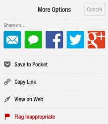
I saw this in the share menu on Flipboard and found it interesting - reminded me of all the flat design mockups. You think the mail and messages icons will look similar to this in iOS 7?
Yes.
Definitely.
No question about it!
Although, since I don't know anything at all about what iOS 7 is going to look like (in fact, nobody knows what it will look like) , it is just slightly possible that I could be wrong.

well, they do have the square and flat look, iOS7's icons will probably look like this.
yep, they do have a flat and square look, i would like see icons like that in iOS7.
well, they do have the square and flat look, iOS7's icons will probably look like this.
no, i don't think that iOS7's icons will look like that
apple will bring out something new.
It looks very clean, but I think it looks too stale for apple to implement into iOS 7.
Agreed. Those icons would fit in well on Windows Phone, but it's a far too dramatic change for iOS.
no, i don't think that iOS7's icons will look like that
apple will bring out something new.
new? spherical icons?
God, flat? Really? Like I want to go back 15+ years in design. Windows 2.1 anyone? Or maybe OS/2 2.0!
I remember the big announcements an eternity back about the 3d look to os'es, transparencies...dock, menu bars. And how beautiful is was all going to be. And now.....flat?
Give me strength! And the disco era returns!
I remember the big announcements an eternity back about the 3d look to os'es, transparencies...dock, menu bars. And how beautiful is was all going to be. And now.....flat?
Give me strength! And the disco era returns!
new? spherical icons?
Like the iPod nano ones?
http://www.apple.com/ipod-nano/
No. Please Apple, no.

well, they do have the square and flat look, iOS7's icons will probably look like this.
agreed, they do have the square and flat look, let's see what apple will bring out on june 10th.

This is an example of great design. I want to take the icons out of the screen and chomp chomp!
Apple won't lose the rounded corners of app icons, so I say "flat & rounded corners"
I think flipboard are just applying the magic formula (Round Rect) for drawing circles with only addition to retina.
I saw this in the share menu on Flipboard and found it interesting - reminded me of all the flat design mockups. You think the mail and messages icons will look similar to this in iOS 7?
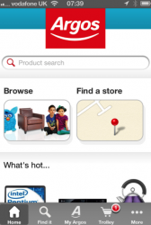
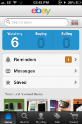
I noticed how many apps are starting to go for a very flat and simple look too.
Take a look at the Argos (UK Shopping App) and eBay apps:
Attachments
I saw this in the share menu on Flipboard and found it interesting - reminded me of all the flat design mockups. You think the mail and messages icons will look similar to this in iOS 7?
speculation and procrastination
----------
This is an example of great design. I want to take the icons out of the screen and chomp chomp!
Eat icons?
I noticed how many apps are starting to go for a very flat and simple look too.
Take a look at the Argos (UK Shopping App) and eBay apps:
I think this is just a general design trend, especially given how many of these apps tend to be cross-platform. eBay knows that it needs to have an app that looks good on iOS, but also on Android... while at the same time, keeps a common design language with their web interface.
The shape and the icons won't change, look and the iPhone and the ipads home button shape. the shape i representing the icons on the home screen.
the same with the new nano look at the home button shape and the icons the same shape, not gonna change.
the same with the new nano look at the home button shape and the icons the same shape, not gonna change.
I saw this in the share menu on Flipboard and found it interesting - reminded me of all the flat design mockups. You think the mail and messages icons will look similar to this in iOS 7?
It looks like Google's current iOS design style.
Register on MacRumors! This sidebar will go away, and you'll see fewer ads.