None of these things are "malicious". Purposeful, yes.
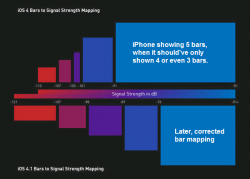
Having worked on handheld signal strength display algorithms myself, and studied those of other companies, I can tell you without a doubt that the Apple version was deliberately designed to show more bars than it should. Heck, even a non-engineer should be able to look at the chart and see that it had no dB linearity.
The only question is the same as with the Samsung benchmark code -- which is, was the code something that a (few) developer(s) did on their own, or was it mandated from much higher up?
From experience, I tend to think it's the lower levels that come up with this stuff on their own.
PS. Here's a text chart I made of the bar levels for the iPhone 4, the updated levels for the iPhone 4, and then the levels for a Blackberry.
Code:
         -110      -100       -90       -80    dBm
      |----|----|----|----|----|----|----|-----|

iOS4    1.....2...3.4.........5.................
iOS4x 1.......2........3..........4...........5.
BB      0......1......2......3.....4.........5..
Note that even the "improved" iPhone 4x algorithm shows more bars than a BB does up until around 4 bars.
(Bear in mind that each 3dB loss is a halving of the signal level.)


