Become a MacRumors Supporter for $50/year with no ads, ability to filter front page stories, and private forums.

AxisOfBeagles

macrumors 6502
Original poster
Apr 22, 2008
441
112
Top of the South
The purpose of the Challenge is to provide a venue where photographers of all skill levels can work to improve their craft by shooting along a common topic for two weeks - one fortnight. Helpful comments and critiques are key to reaching the intended goal - better photography.

About Your Photos

Shoot for the topics listed on the schedule. You may shoot for upcoming topics, but post photos only to their matching Challenges.

You may post as many photos as you wish for any one Challenge.

About Your Comments

Comments are critical to the success of the Challenge. If you post a photo, add a comment to another one. If you are only viewing, please add your comments, too.

Comments should be meaningful, something that the photographer can use to improve his/her work. Explain why you like or dislike a photo. Spend a moment looking at a photo before commenting on it. Try to answer the question "I like this photo because…" It really helps the photographer.

The Topic Schedule

this is the last of the three topics we previously agreed upon. Would someone care to open a new poll in a separate thread to get us working on the next 3 topics?
 
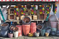
A detail of a planter at a produce shop in Tacoma.


EXIF Summary: 1/500s f/5.6 ISO100 Tamron 28-75@55mm

Dale

I like the detail work shown here. I'm a big fan of up close details of something much larger.

I think what is missing, which is a problem we had with the nature theme, is why is it unexpected? Without your text we wouldn't know where the planter is. Sorry, but that's what immediately struck me when putting the picture in context of the challenge.

Regardless the challenge context, I love the picture.

I see the "nature" in the flower bud patterns of the planter. However, the bottoms are cut of by the bottom of the frame and the bottom right hand corner. A nice rosette pattern along the bottom frame would enhance the photo, IMO. ? take a half step back? I do like the earthy tones of the composition as well.
 
Thanks for the comments. Remember that we are out of Nature in Expected Places and in Beauty in Unexpected Places. :)

I have a version of this with the rosettes more fully included, but I didn't like the circles they formed at the base. The image seemed more solid to me with a flat bottom.

I can reshoot this within the Challenge. At least "they" tell me that the rain will stop for a moment or two...

Here is the setting that I found it in. It's not in this group, but you get the idea. The one on "wheels" is here too. This one and the one I posted to open the Challenge need a tripod and greater DOF.

Dale
 

Attachments

  • origin kinda.jpg
    origin kinda.jpg
    364.2 KB · Views: 109
  • origin kinda2.jpg
    origin kinda2.jpg
    232.9 KB · Views: 117
I found it. Challenge over. Next one please. :)

Actually, I'm was surprised how not boring this picture is. I saw the sign while at the mall for lunch today and was certainly not expecting it. I took the picture with my iPhone and framed to get the wording in just right (it's a Disney store ad) and ignored what was in the rest of it. When I got home and looked at the picture I found the lighting and lines rather interesting looking. All processing has been done using Camera+ on my iPhone 4. It could stand a little noise reduction, but otherwise I'm rather pleased with the outcome.

 
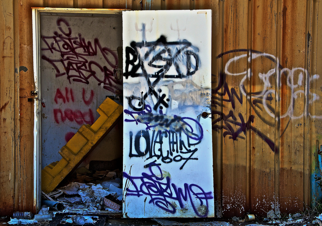
I have posted this in the photo of the day before, but I think it fits the brief pretty well. Maybe not beauty, but I find it quite striking.

 
A detail of a planter at a produce shop in Tacoma.


EXIF Summary: 1/500s f/5.6 ISO100 Tamron 28-75@55mm

Dale

I like it, punchy colours and interesting variety of shape, line and tone.
Like Keleko mentions, I think it's interesting to capture and represent your surrounding up close in a way not normally seen.
 
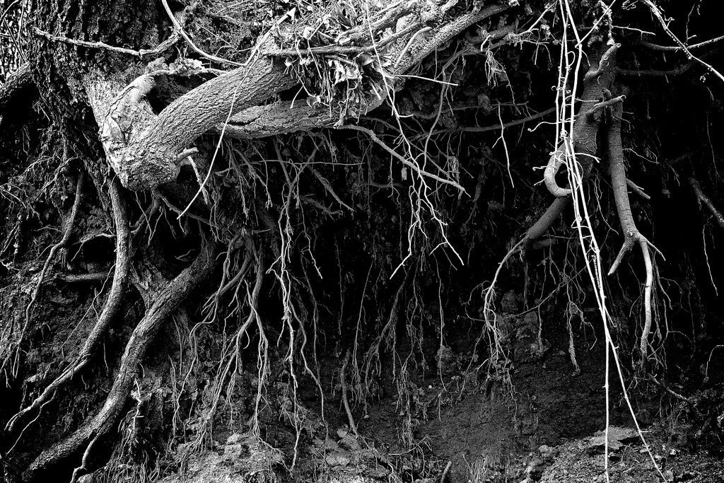
This was also my daily photo for today. I really liked how the roots really stand out after I darkened the reds and use mostly blues for the B&W conversion. The original shot was ugly red clay. I found the beauty by de-emphasizing the clay.

 
I have posted this in the photo of the day before, but I think it fits the brief pretty well. Maybe not beauty, but I find it quite striking.


It is very striking indeed. Graffiti has it's own sense of beauty to me. I took some graffiti shots last weekend at an abandoned industrial site myself.
 
I found it. Challenge over. Next one please. :)

Actually, I'm was surprised how not boring this picture is. I saw the sign while at the mall for lunch today and was certainly not expecting it. I took the picture with my iPhone and framed to get the wording in just right (it's a Disney store ad) and ignored what was in the rest of it. When I got home and looked at the picture I found the lighting and lines rather interesting looking. All processing has been done using Camera+ on my iPhone 4. It could stand a little noise reduction, but otherwise I'm rather pleased with the outcome.

I really like these expected photos. You have something mundane in mind and snap the shutter, then load it up and something pops out on it's own and changes the photo completely. Great shot.

I have posted this in the photo of the day before, but I think it fits the brief pretty well. Maybe not beauty, but I find it quite striking.

The lighting makes this quite striking. Is that a natural effect or a filter/post processing effect?

This was also my daily photo for today. I really liked how the roots really stand out after I darkened the reds and use mostly blues for the B&W conversion. The original shot was ugly red clay. I found the beauty by de-emphasizing the clay.

Great to see a touch of B&W in here. The roots of the tree create interesting lines with the contrast offered by B&W. This would not hold together in color. Nice choice.


Another pot photo. This has been seen before.


Dale
 
Ikea knives, look almost like fish or waves. Put a blue filter over my desk lamp to get the cast.
 

Attachments

  • DSC_2590.JPG
    DSC_2590.JPG
    711.6 KB · Views: 227
I found it. Challenge over. Next one please. :)

Actually, I'm was surprised how not boring this picture is. I saw the sign while at the mall for lunch today and was certainly not expecting it. I took the picture with my iPhone and framed to get the wording in just right (it's a Disney store ad) and ignored what was in the rest of it. When I got home and looked at the picture I found the lighting and lines rather interesting looking. All processing has been done using Camera+ on my iPhone 4. It could stand a little noise reduction, but otherwise I'm rather pleased with the outcome.


I think you composed it quite well. The ceiling and the round lights really make it work for me. I actually don't mind the graininess. I don't think it detracts from the shot at all.
 
Ikea knives, look almost like fish or waves. Put a blue filter over my desk lamp to get the cast.

That's very cool and a great idea. Why did you position the knives on the far left in the opposite direction. I'd like to think it may be stronger visually if they were all in the same direction. Perhaps the handles start to get in the way?
 
That's very cool and a great idea. Why did you position the knives on the far left in the opposite direction. I'd like to think it may be stronger visually if they were all in the same direction. Perhaps the handles start to get in the way?

I put them backwards because it didn't quite stack up for balance when i put them facing in the same direction. I'd tried all kinds of arrangements but feel this came out best in terms of total composition.
 
Another pot photo. This has been seen before.


Dale

I remember it. I really like the vibrant blue around the edge. It still looks like it can be liquid at the bottom edge, too. If I had one wish it's that the background above the blue of the pot was not so bright. It is brighter than the in focus pot. Is it worth trying to apply a burn to that area?

Ikea knives, look almost like fish or waves. Put a blue filter over my desk lamp to get the cast.

I really like it. The blue really gives it a interesting cast. Did you try a composition of them angled from bottom left to upper right? I'd like to see that version to compare.


Cracked LCD.

This is a pretty good take on the unexpected beauty theme. I like the abstractness of it. I'd like to see the colors a bit more vibrant, though. They're a little dim for me (at least on my screen). I know that's probably how they are on the LCD itself. That's just my preference, of course.
 
I'm going to add one more from an abandoned concrete business site. I just noticed I need to adjust for lens distortion to straighten out the vertical lines...

 
One of my older slides, a restauration project in Athens, Greece :

SCAN0043-1.jpg


I like the green cast in the toilet photo. Normally I should give the advice to set the white balance of your camera to tungsten light but in that specific shot it adds a certain atmosphere to the picture.
 
Salt On Sea

4905032005_f368d83de8_b.jpg


Photoshoot at Salton Sea in California. We found an abandoned mobile home, and we wanted to contrast the decay with some beauty.
 
I missed the DOF on this one a bit, but I kind of like it. Been way to busy these past few weeks.
 

Attachments

  • _DSC1193.jpg
    _DSC1193.jpg
    390.6 KB · Views: 87
Register on MacRumors! This sidebar will go away, and you'll see fewer ads.