Most definitely. 👍
As a follow-up to theming, it would be nice if background transparency/opacity could be set in detail view. The "Minimal" theme does a very good job at not distracting from the single image, with only minimal transparency. Whereas the Greece Wedding theme shows a bit too much of gallery in the background for my liking. But this will of course depend on individual taste, and it's an advanced feature, to be fair. Otherwise...
What I like:
- It's simple
- It worked for me
- HTML looks decently sane to me
- Initial welcome emphasises simplicity
What I do not like:
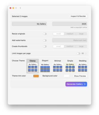
- The initial welcome screen ("Drag & Drop a folder or image or select from your photo library") and the "Inspect & Reorder" windows should not be different windows/dialogue. The should be one and the same. Adding and ordering should happen in the same window.
- To reiterate: I absolutely expect to be able to add pictures in the "Inspect & Reorder" window, not only remove them. As I see it, I'd have to start from scratch, if I forgot just one image (could be a title card or something)
Further suggestions and considerations:
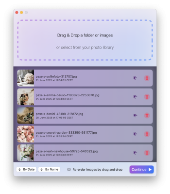
- Pictures should be orderable by creation date (hint: In the order that the pictures were taken on the date of the event, if such metadata is available - not necessarily when they were last modified).
- If I could also remove pictures by simply dragging out of the "Inspect & Reorder" windows, that would be nifty (along with a "whoosh" sound or something), rather than having to click the small "Remove" button (the floating "Remove" button when dragging in fact suggests to me I could remove by dragging out of the windows). Definitely not a must have though.
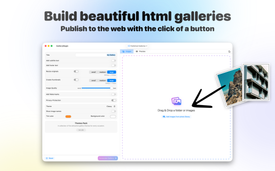
- Nothing wrong with the app icon - but contrary to most (albeit not all - looking at you, VLC 👀) apps installed on my Mac, it does not convey what the app actually does (creating photo galleries). Not a gripe really, just a suggestion for better marketability
- Make the footer text ("All rights reserved. Generated by GalleryMagic.") customisable too. And let me remove the "Generated by" attribution to your app. Sure, I could simply remove it from source code, but I'm lazy. (hint: this could be a small one-time in-app purchase 💸 as a token of support).
Wow, that's very valuable feedback. Thank you for taking the time, much appreciated!
> "Inspect & Reorder" windows should
not be different windows/dialogue.
It somehow did not occur to me in testing and neither did any of the beta testers mention it, but once you said it it became obvious to me as well that your suggestion is the way to go. You can see in the screenshot attached how it looks/works now, this change already shipped to the App Store as version 1.6.
> Pictures should be orderable by creation date (hint: In the order that the pictures were taken on the date of the event, if such metadata is available - not necessarily when they were last modified).
Yes, this was always on the TODO list, I just hadn't gotten to it yet. It's now also part of the just release 1.6. Image creation dates / EXIF Metadata and the such are quite a rabbit hole ...
> If I could also remove pictures by simply dragging out of the "Inspect & Reorder" windows
Yeah I understand the desire, but neither experimenting nor with research did any way occur on how one could implement this using apples official APIs. Not sure, maybe someday I'll stumble across something, for now this has to take a back seat haha.
> Not a gripe really, just a suggestion for better marketability
Thanks as well for the feedback. Yeah, the icon is what it is, design is hard and designers are expensive lol.
> Make the footer text ("All rights reserved. Generated by
GalleryMagic.") customisable too
Also a no-brainer, yes. The entire footer text is now customisable. Apart from the "Generated by ..." still. I had the idea for removing that via an IAP as well, so far I'll invest into other thing I guess.
Again, _massive_ thank you for the feedback!