Got a tip for us?
Let us know
Become a MacRumors Supporter for $50/year with no ads, ability to filter front page stories, and private forums.
Game Website Critique
- Thread starter kingthias
- Start date
- Sort by reaction score
You are using an out of date browser. It may not display this or other websites correctly.
You should upgrade or use an alternative browser.
You should upgrade or use an alternative browser.
Youre using google ads to make money.
Thats a thumbs down in my book.
The layout makes little to no sense...what is this site supposed to be again? Its not clear at all. You put the "about" link as an anchor tag to some paragraph at the very bottom of a very long list.
I think you need to try to get your site into a more easily digestible format with a more discernible goal and menu.
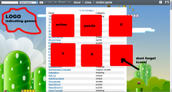
Things I liked
Mario World background.
Colour scheme.
Things I didn't like
Way too much stuff. It'd takes too much time to browse.
Only flash games.
Obtrusive adverts.
Had no idea what I was looking at or what the site was for.
Background is visible a small section then theres a whole load of brown.
Mario World background.
Colour scheme.
Things I didn't like
Way too much stuff. It'd takes too much time to browse.
Only flash games.
Obtrusive adverts.
Had no idea what I was looking at or what the site was for.
Background is visible a small section then theres a whole load of brown.
I put the paragraph on the homepage to try to help google recognize what my website is about. Does google check all of your pages?The layout makes little to no sense...what is this site supposed to be again? Its not clear at all. You put the "about" link as an anchor tag to some paragraph at the very bottom of a very long list.
I definitely agree that it needs a branding of some sort but I have yet to decide on anything. For now it is a site for my friends to go to at school so they already know the purpose.I think you need to try to get your site into a more easily digestible format with a more discernible goal and menu.
I look forward to making it seem more "legit" in the future.
Thanks!Things I liked
Mario World background.
Colour scheme.
Would thumbnails help? Did you think the categories helped browse?Things I didn't like
Way too much stuff. It'd takes too much time to browse.
What is the better alternative? Java?Only flash games.
How can I make them less annoying?Obtrusive adverts.
I'm working on declaring a purpose for the site via banner, logo, tagline etc.Had no idea what I was looking at or what the site was for.
Background is visible a small section then theres a whole load of brown.
How do you recommend I maintain the graphic throughout a long page? Should I have blue and then graphic rather than graphic then brown?
Thank you for your input!
Try HTML/Javascript, fully cross platform without any plugins.What is the better alternative? Java?
Perhaps instead of offering Flash games(which many sites already do) you instead offer your website to developers wanting to put up javascript games that your site can offer from mobile phones to computers and televisions.
http://www.kesiev.com/akihabara/
Cabbit gave an excellent idea. That's a good differentiation.
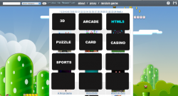
I don't like the long brown area. Make the website less longer by making sections (3d, car games, strategy, puzzle, etc). Instead of a list with 1600 items, it will be a little above 100. And if you want to split a little more, you can make more sections with 0-A B-G H-M .... Try to see how it goes.
With so many games, you have to guess how the game is by playing it. Using thumbnails make searching a lot easier. Just like the example above (Akihabara)
Nice website btw") .
.
I don't like the long brown area. Make the website less longer by making sections (3d, car games, strategy, puzzle, etc). Instead of a list with 1600 items, it will be a little above 100. And if you want to split a little more, you can make more sections with 0-A B-G H-M .... Try to see how it goes.
With so many games, you have to guess how the game is by playing it. Using thumbnails make searching a lot easier. Just like the example above (Akihabara)
Nice website btw
.Attachments
I like the idea. If i did this I could offer something unique. My only dilemma is whether to maintain the current selection for my loyal viewers (around a hundred come back everyday) or should I start from scratch?Try HTML/Javascript, fully cross platform without any plugins.
http://www.kesiev.com/akihabara/
I'll definitely try this.Make the website less longer by making sections (3d, car games, strategy, puzzle, etc). Instead of a list with 1600 items, it will be a little above 100.
I like the idea, I already have thumbnails for 90% of them! Would you recommend no full site search at all or just no full site browsing?With so many games, you have to guess how the game is by playing it. Using thumbnails make searching a lot easier. Just like the example above (Akihabara)
Thanks!Nice website btw
Are you saying each category should have a description or each game should have a description?Categories with descriptions ... no one wants to search through an alphabetical list
Do you think I should not have full site browsing of games?
I'm not sure what you're saying.
Are you saying each category should have a description or each game should have a description?
Do you think I should not have full site browsing of games?
I'm not sure what you're saying.
break them down into categories ... like action, arcade, card, racing etc. etc. Then a brief description listed with each game.
Look at other Game sites ... they all have something like this.
Good Luck
I like the idea. If i did this I could offer something unique. My only dilemma is whether to maintain the current selection for my loyal viewers (around a hundred come back everyday) or should I start from scratch?
Just add another section called HTML5 (or whatever suits better)
. Make it stand from the others (maybe by placing it first).Added thumbnails! I have yet to change the homepage to a category view or get a logo etc. but I'll keep working on it.
Logo is not that important (urgent). Just add the sections in the homepage (like the screenshot/example example below). When you click the section, just put a title (so the visitor knows in which section he's in). There you show the thumbnails.
Good luck with your website.
Attachments
Thanks!Its already starting to look much better.
I've been thinking the same thing about the background but the thumbnails seem to, in my experience, load pretty fast. I don't know if it actually affects the loading time but I find that separating the images into subdirectories can speed it up.Though be careful with you load times the amount of images your using and insanely large mario image can take a wee wile to render try being a little more aggressive with your compression.
Cabbit gave an excellent idea. That's a good differentiation.
I don't like the long brown area. Make the website less longer by making sections (3d, car games, strategy, puzzle, etc). Instead of a list with 1600 items, it will be a little above 100. And if you want to split a little more, you can make more sections with 0-A B-G H-M .... Try to see how it goes.
With so many games, you have to guess how the game is by playing it. Using thumbnails make searching a lot easier. Just like the example above (Akihabara)
Nice website btw
Also, try putting the body in a scrollable DIV, so the the games section only scrolls but the background stays where it is. This should be in addition to the sections you'll be adding
Also needs some sort of banner/logo/branding etc to give some idea of what's going on.
I know this isn't the right forum for a logo design but since it's been suggested I add a logo I was wondering what you guys thought about this.

Looks like a mutant jelly fish thing with a game controller thing.
I know this isn't the right forum for a logo design but since it's been suggested I add a logo I was wondering what you guys thought about this.
What's it supposed to be?
The site is mneary.info so the logo has MN (my initials) in it. And then the rest is an N64 controller because its a game site. Is it to hard to see?What's it supposed to be?
The site is mneary.info so the logo has MN (my initials) in it. And then the rest is an N64 controller because its a game site. Is it to hard to see?
I preferred when it was a mutant jellyfish. Logo's have to be really clear about what they represent, logic is sound but implementation is way off. If you like the N64 maybe base your logo more on the N64 logo style or look to Nintendo's logos for inspiration.
Register on MacRumors! This sidebar will go away, and you'll see fewer ads.