Become a MacRumors Supporter for $50/year with no ads, ability to filter front page stories, and private forums.
I like everything I've seen so far. September can't come soon enough!

I'm so happy to see Control Center. It's a similar to a feature I miss the most from my jailbreaking days.

The changes to multitasking look wonderful. Closing apps with an upward swipe is much better than holding until things wiggle.

Airdrop seems cool. No need to bump phones is a huge plus.

Siri improvements are yet to be seen but if it lives up to what's been announced I'll use it far more than I do now.

I couldn't believe a 3D like perspective when tilting the screen was added to iOS 7. Another JB tweak realized through Apple. :)

The new font is beautiful.

Can't wait!
 
I really like the overall functionality and UI of iOS 7.

But they did a bad job with the icons, like really? Even I can do a better job at designing Flat UI icons. What were they thinking?

The icons that i cannot stand are:

-Photos
-Camera
-Reminders
-Stocks
-Newsstand
-Settings
-Safari

Also, did anyone else feel like the back arrow button in the UI was too big compared to the text?

These icons look like they were done years ago. Nothing modern about it. It's very much possible to make a modern looking minimal flat UI.

I beg every single developer to complain to Apple about the icons! Please share this with any developers you know who feel the same!

---

Also, are the wallpapers live? Like the Nexus ones? And what features will the iPhone 4S not receive?
 
I still couldnt get the beta but from the pictures, I dont think the transparency makes text difficult to read. Why did you think that?

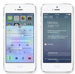
Look at the attachment. Nearly all text on the control center screen takes effort to read while the notification center example is simple.

And what are the icons at the bottom for? What's their purpose? Wait, let's back up. What does the current crop of icons even represent? From left to right it's: No idea, Timer?, Calculator, Camera.

The entire control center execution is puzzling. :confused::confused::confused:
 

Attachments

  • Untitled.png
    Untitled.png
    319.7 KB · Views: 215
Look at the attachment. Nearly all text on the control center screen takes effort to read while the notification center example is simple.

And what are the icons at the bottom for? What's their purpose? Wait, let's back up. What does the current crop of icons even represent? From left to right it's: No idea, Timer?, Calculator, Camera.

The entire control center execution is puzzling. :confused::confused::confused:

That screenshot has been scaled down a great deal, of course the text will be harder to read. In real life it'll be far more legible.

You've correctly deduced what three of the four icons represent. The first is a flashlight. The icons provide quick access to those functions.
 
I am a huge fan of the new design. I was skeptical with Jony Ive heading up the design aspect of the new iOS, but I'm truly blown away.

I personally think the whole background moving around as you move the device around is a bit of a gimmick.

I really look forward to trying it out!

I have a feeling that if they implement wear-able tech, that will be a key feature. Perhaps it's a bit of foreshadowing?
 
at first glance = my god that's awful.... and then it starts to grow on me... looking at the galleries, knowing the background of the design with jony video... and looked at my iphone 5 ios 6, it looks dated.. and this one... fresh!!...

well, maybe this is the type of change that you will like with time.... not at first glance... just imo :cool:
 
so apparently this is the new iphone now

ios7-130610-3.jpg


hmmmmmmmmmmmmmmm

it looks kinda like

pTRU1-14843565reg.jpg


I hate that Safari icon with a passion. Also Game Center, Settings. And if Newstand could get any worse.

My god what did they do.
 
Just wish they change the icons… the UI is good, but the icons =X

Is it possible to send feedback to them about this?
 
When I first saw it during the keynote, I thought that only the app icons were bad, but now after seeing some install/usage screens posted on other Mac news sites, it just looks very rushed and unfinished. The previous iOS was unified across all apps and elements of the system. This one draws on several different design styles, which makes it look like whoever is working on it isn't familiar with UI design.
 
Love it... thumbs up! I could NOT stand the cheesy old style: while I appreciated the detail, it started to get in the way. The leather look, the wood look... it reminds me of the worst of the 80s.

I'm not sure about the other posters here, but the control center looks like... a control center. Seems straightforward enough to me. ;)
 
It's really beautiful. When I first saw it, I thought it looked childish and expected something nicer in terms of icon design for example. But going in to the Apple site and watching those short videos on the iOS 7 page, which show what the UI looks like fitting perfectly on your screen, it looks great. Really natural and far more vibrant. Going back to my current home screen feels boring now :p

The final version can't come soon enough!
 
I will agree with people, that it does kind of look childish. Remember that iPhones are used by consumers focusing on entertainment, experiences and ease of use. While I don't think I've seen anyone in an active business setting without a Blackberry.
Apple wanted to make the UI friendly and interesting to reel in people and remember... it was released less than 12 hours ago, they've got like 3 months to tweek it. Perhaps there will be an uproar of how the Safari icon looks... it's an icon... and they'll change it. In my opinion though, I think that they'll leave it for the reason of not worth changing because it's so trivial. It doesn't hinder any function. It could look like a 3d animated pile of poop and it wouldn't matter.
 
It will be interesting to see if the design changes from iOS 7 get adopted to the Mac eventually. Are they really going to have multiple versions of stock app icons floating around; Safari for one example. An OS X UI overhaul in the near future?

I personally love the new coat of paint on iOS. Just remember when the first version was released with iPhone 1 we all thought it was God's gift to the world... even though design decisions were "rushed out" etc.

Change is good because it's controversial :apple:
 
I like it. One thing that I don't like though is the balls for signal strength. "Yeah, you must have bad signal strength on your end. I have 3-4 balls right now".
 
Love it! One thing that is actually throwing me a bit is the new keyboard colors.

Is anyone else finding it slightly difficult to type on? I can't quite put my finger on what it is, but something about the new colors seems to be throwing my brain when I type.

Also, I found that spotlight search is a pull down from anywhere other than the top of the screen (in case it hasn't been mentioned yet).

-d
 
On iPhone4, it all looks really ugly :( The translucency effects and the whole subtle 3D stuff is missing, the icons and text lack contrast and it is all just flat... I like the colourful Control Center background you guys are getting, on my iPhone4 its just gray. The icons are terrible and the way the folders look: :eek:
 
I love the new UI but I really don't understand some of the icons. They're just plain ugly. I'm hoping they change before the final release.
I'm confused by the Photos and Game Center icons, otherwise they seem fine. I don't understand the complaining here.

Edit: Actually the Newsstand and Settings also seems a bit off... The previous settings icon was very intuitive (at least to a SW Eng).
 
Register on MacRumors! This sidebar will go away, and you'll see fewer ads.