
In a new blog post titled "Bring the best of Google to your iPhone," Google is on an endeavor to convince new iPhone 13 users to transform their device’s home screen to look like Android.
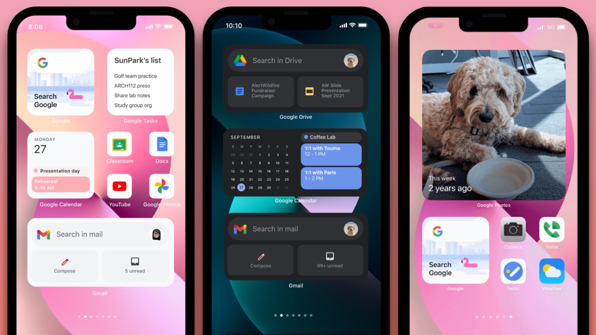
The blog post, written by Google's director for the iOS platform, features screenshots of an iPhone 13 home screen filled with Google apps and widgets. The post implies that customers should possibly consider replacing some of Apple's default iOS apps, such as Photos, Safari, Calendar, Reminders, and even Phone, with Google's equivalent of those apps, including Google Photos, Google Chrome, Google Calendar, Google Tasks, and Google Voice, respectively.
Google continued to encourage customers to utilize the wide variety of widgets its iOS apps offer. Google said that if the right Google widgets are placed on the home screen, users will "never even have to leave" their home screens to stay caught up.
According to the blog post, users can also use "Smart Stacks" to stack different Google widgets on top of each other, allowing iOS to determine which widget is most relevant to show at any one time.
Finally, Google recommends that users replace Safari with Google Chrome as the default iOS browser, allowing all system-wide links and Spotlight web suggestions to open in Chrome. Google closed by saying it hopes iPhone 13 users, who just started receiving their new iPhones last week, will consider bringing "the best of Google" to their device instead of just simply purchasing an Android smartphone or device.
Article Link: Google Basically Wants Your iPhone 13 Home Screen to Look Like Android
