Become a MacRumors Supporter for $50/year with no ads, ability to filter front page stories, and private forums.

deuxani

macrumors 6502a
Original poster
Sep 2, 2010
710
743
So I saw this great concept from Brye Kobayashi (http://www.bryeko.com/portfolio_page/iphone8/) and it totally makes sense:
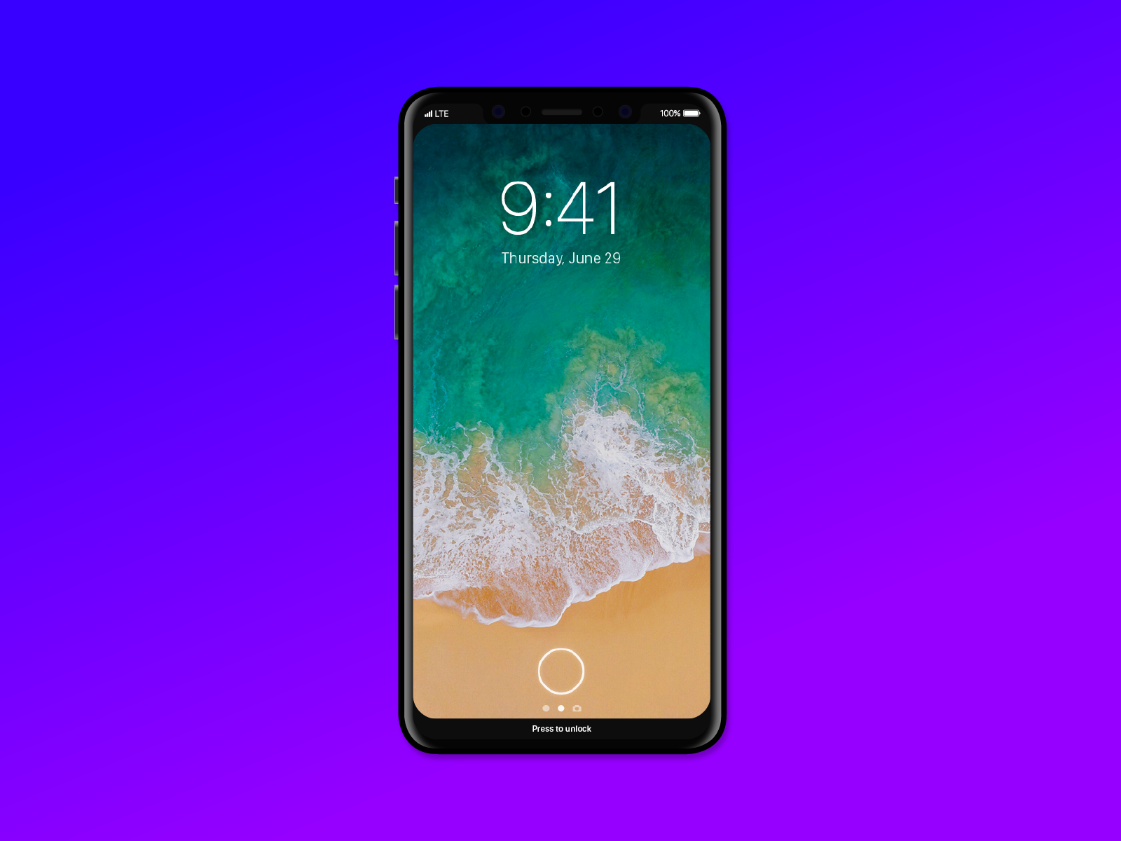
IPH-D.png


He argues that all current concepts show the cutout on top too prominently and the iPhone wasn't symmetrical in most designs because, but creating a blacked out top AND bottom part actually solves it. He came up with the great idea to show Apple Watch complications on the bottom:
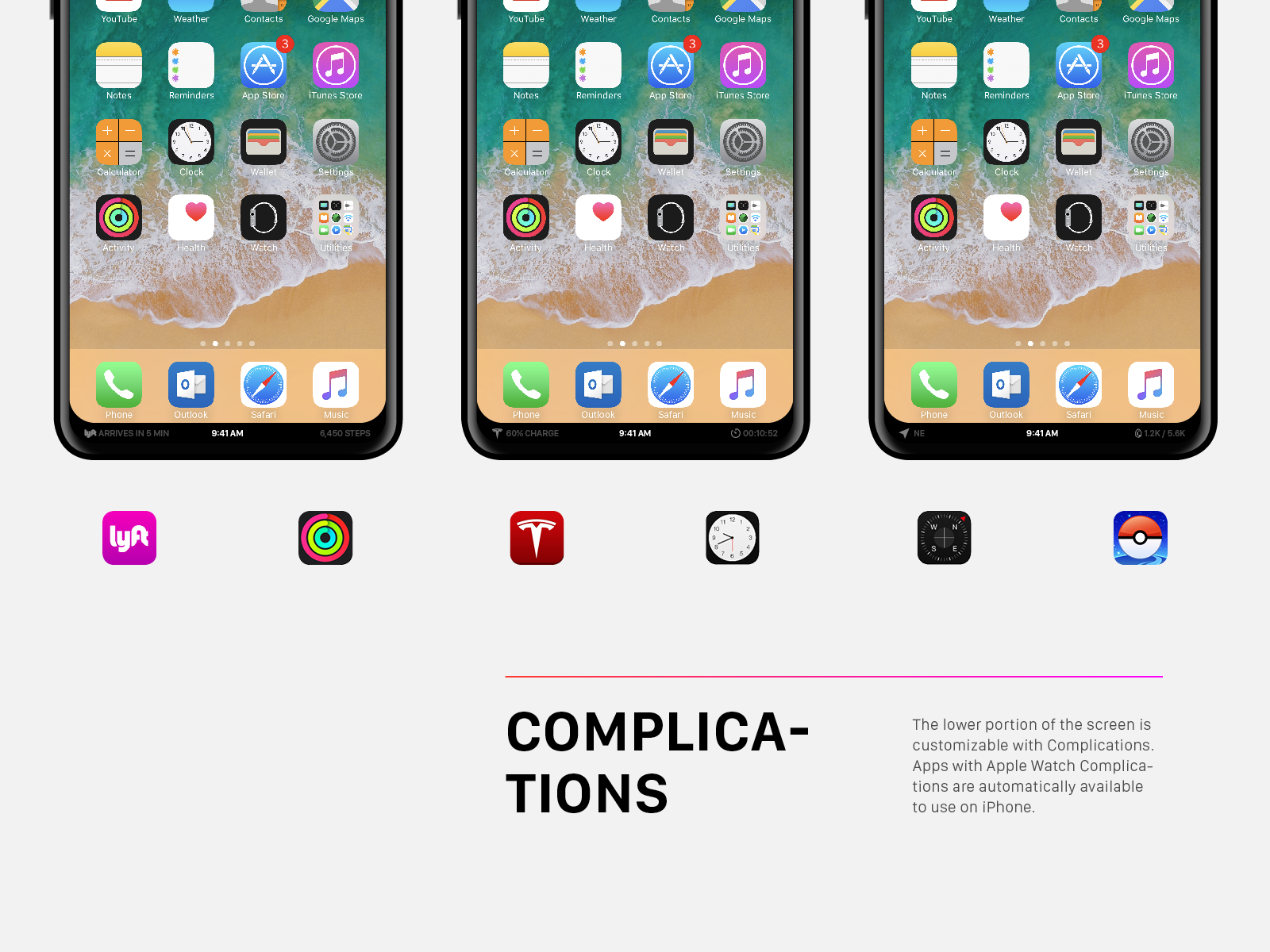
IPH4.png


I think this is a really great idea and I would love it if Apple would implement it this way. However, in the bottom screenshots there is one thing missing.... the home button! I personally think it will always show (like on the lock screen image), but the idea is still really smart and a great solution.
 
Such a small change from the other mockup, but I like this 10x better. Even with the "shoulders" up top blending in, something still felt off. This makes it so much nicer.

Would also fit the earlier rumors of a "touch bar" at the bottom.
 
  • Like
Reactions: Cayden
For the love of God please stop with the rounded corners! Seems like most Android phones did that this year and it's awful. I don't mind rounded phones, just not the displays.
 
Such a small change from the other mockup, but I like this 10x better. Even with the "shoulders" up top blending in, something still felt off. This makes it so much nicer.

Would also fit the earlier rumors of a "touch bar" at the bottom.

What such a small change can do :) Let's hope Apple has the same idea about keeping it symmetrical. I was breaking my head over how it could be done, but this is very smart. Just going back to the home screen in apps is going to be interesting to see how that will be solved. I'm a firm believer of an always present home button.

Don't you dare move the time to the bottom. Otherwise looks good.

They don't have much choice I'm afraid and if they would add Apple Watch complications on the bottom, having the time there would make a lot of sense.

That, or something like this:

24e3775c1fffb6332e45e510c702cf02.jpg
 
I'm very confident you will see nothing on the bottom. There will be a barely there 4 mm bezel in that area.

I also think you will see a virtual home button that stays static on the screen, centered on the dock, at all times. At outline of this button will remain so you can have apps open using the full screen and still know where to press to go home. I also expect tactic feedback. S8 does this.
Nope. The top and the bottom of the 2017 iPhone will be black, always. Akin to the Touchbar. The display will absolutely not have rounded corners like the OP's linked concept. Apple wouldn't dream of rounding the corners. The display itself will have rounded corners to conform with the device shape, but they will never be lit pixels.

The bottom black bar will be perpetually the 'Home Bar' or 'Smart Button'. It will be a Touchbar-type area which is about 80% off pixels at all times. There will never be a perpetual, virtual home button drawn on the Home Bar. That would be both distracting, redundant, and hideous. The concept image shows about 2/3 to 1/2 the true height that the Home Bar will take. The top area will be the status bar which will be perpetually 80% off pixels and the status bar and other elements will comprise all of the lit pixels in this area, always. The top and bottom status bar and home bar will achieve symmetry with each other, and the main display area will of course be in between them, and act identically to how it looks on your device right now, except it will be larger, and retain 16:9.
[doublepost=1498866000][/doublepost]
What such a small change can do :) Let's hope Apple has the same idea about keeping it symmetrical. I was breaking my head over how it could be done, but this is very smart. Just going back to the home screen in apps is going to be interesting to see how that will be solved. I'm a firm believer of an always present home button.


They don't have much choice I'm afraid and if they would add Apple Watch complications on the bottom, having the time there would make a lot of sense.

That, or something like this:

24e3775c1fffb6332e45e510c702cf02.jpg
Too much congestion and not enough space.

What people understandably think is that the top left and right portions will be for the status bar, but that's not really accurate. There is not enough space and if you try to make the space as you show here, there is too much congestion, and you don't even have the battery percentage up which would be multiple sets of numbers. Not good design.

The status bar will remain in a single line directly underneath the cutout. The top left and right portions will be for other information akin to complications, AND dynamic depending on the app and landscape/portrait orientations. For example, when playing a game in landscape, the status bar is of course removed and then the top left and right portions can become off-screen buttons. When watching a movie, they can become off-screen buttons.

A new notification system option could become available which has the seamless app icon pop up into the shrouded black OLED off-screen areas where it will show the app icon and a badge to indicate that you've received a notification without a banner popping up over the screen. You tap the icon and it brings up the banner or you press it and it takes you to the notification in the app. This is a system to make notification possible without distraction.
 
Nope. The top and the bottom of the 2017 iPhone will be black, always. Akin to the Touchbar. The display will absolutely not have rounded corners like the OP's linked concept. Apple wouldn't dream of rounding the corners. The display itself will have rounded corners to conform with the device shape, but they will never be lit pixels.

The bottom black bar will be perpetually the 'Home Bar' or 'Smart Button'. It will be a Touchbar-type area which is about 80% off pixels at all times. There will never be a perpetual, virtual home button drawn on the Home Bar. That would be both distracting, redundant, and hideous. The concept image shows about 2/3 to 1/2 the true height that the Home Bar will take. The top area will be the status bar which will be perpetually 80% off pixels and the status bar and other elements will comprise all of the lit pixels in this area, always. The top and bottom status bar and home bar will achieve symmetry with each other, and the main display area will of course be in between them, and act identically to how it looks on your device right now, except it will be larger, and retain 16:9.
[doublepost=1498866000][/doublepost]
Too much congestion and not enough space.

What people understandably think is that the top left and right portions will be for the status bar, but that's not really accurate. There is not enough space and if you try to make the space as you show here, there is too much congestion, and you don't even have the battery percentage up which would be multiple sets of numbers. Not good design.

The status bar will remain in a single line directly underneath the cutout. The top left and right portions will be for other information akin to complications, AND dynamic depending on the app and landscape/portrait orientations. For example, when playing a game in landscape, the status bar is of course removed and then the top left and right portions can become off-screen buttons. When watching a movie, they can become off-screen buttons.

A new notification system option could become available which has the seamless app icon pop up into the shrouded black OLED off-screen areas where it will show the app icon and a badge to indicate that you've received a notification without a banner popping up over the screen. You tap the icon and it brings up the banner or you press it and it takes you to the notification in the app. This is a system to make notification possible without distraction.
I don't agree and I find it hilarious that your tone is one as if are working on this device within Apple.
 
  • Like
Reactions: deuxani
What such a small change can do :) Let's hope Apple has the same idea about keeping it symmetrical. I was breaking my head over how it could be done, but this is very smart. Just going back to the home screen in apps is going to be interesting to see how that will be solved. I'm a firm believer of an always present home button.


They don't have much choice I'm afraid and if they would add Apple Watch complications on the bottom, having the time there would make a lot of sense.

That, or something like this:

24e3775c1fffb6332e45e510c702cf02.jpg


I believe it will be a mixture of the OP bottom “complications” bar but what if that bar can be activated like the new messages app drawer??? The transition on an oled screen makes sense on the battery side.

Thoughts?
 
I believe it will be a mixture of the OP bottom “complications” bar but what if that bar can be activated like the new messages app drawer??? The transition on an oled screen makes sense on the battery side.

Thoughts?
There will be a perpetual black bar at the bottom of the phone. Maybe 1/8" shorter than the bottom bezel is on current iPhones. This bar will be the Home Bar. It will always be there and never be a part of any app. Why? Because the Home Button must remain present and active at all times when the iPhone is turned on. The concept image the OP showed is from someone who doesn't think very hard apparently, because they completely forgot about the most important function to the iPhone: the Home Button.

All 1 billion iPhone users know the Home Button functionality intimately and it will absolutely ALWAYS remain. It is the epitome of simplistic design and it's unequivocally, fundamentally important to the device as a whole. No matter when you are in the OS or what app you're in, the Home Button functionality will remain, at the bottom of the face of the device, identically to how it has always been, with the simple adjustment of a Taptic Feedback Button now, as opposed to a physically depressive Button. The iPhone 8 button will feel virtually identical and act virtually identical to the iPhone 7 button. The only difference will be the lack of the button cutout.
 
  • Like
Reactions: deuxani
I don't like it, why would you want to put iOS system generated "virtual bezels" where there are no bezels?

I prefer to have as much screen as possible, camera cut out or not.

For those that wish to achieve this look they can choose to have a home screen with black bars at the top and bottom and combined with an OLED screen, it should look pretty similar.
 
Now that you mention it, they would make it symmetrical, though I doubt they'll move the time and stuff to the bottom. It's probably going to look something closer to this.
 

Attachments

  • iphone8-mockup.jpg
    iphone8-mockup.jpg
    322.9 KB · Views: 238
Why is nobody talking about that Apple patent for putting the camera, various sensors and even the speaker UNDER the screen (with micro-perforations in the display) ... ? It may be a long shot, but I'm hoping they were able to do that, so that the black sensor cutout at the top of the screen is actually hidden.
 
Now that you mention it, they would make it symmetrical, though I doubt they'll move the time and stuff to the bottom. It's probably going to look something closer to this.

Apple is obsessed with getting the size of buttons and icons just right. There is no way that the most important button, the home button, will become so small. There is a reason the home button has its current size and I expect an on screen home button to be exactly that size. But I understand your idea. Maybe they'll add some more black on top.


Why is nobody talking about that Apple patent for putting the camera, various sensors and even the speaker UNDER the screen (with micro-perforations in the display) ... ? It may be a long shot, but I'm hoping they were able to do that, so that the black sensor cutout at the top of the screen is actually hidden.

Because it's just a patent. It's an idea that they had 10 years ago or so. There is no tech to actually do this right now. Front facing cameras are already pretty bad, can you imagine how bad it would be if it was behind a screen. This won't happen any time soon and the design for the new iPhone is definitely final already.
 
I don't like it, why would you want to put iOS system generated "virtual bezels" where there are no bezels?

I prefer to have as much screen as possible, camera cut out or not.

For those that wish to achieve this look they can choose to have a home screen with black bars at the top and bottom and combined with an OLED screen, it should look pretty similar.

It's not really a virtual bezel if it contains information. And you know Apple, they are mostly not about giving the user a choice. They are about finding the solution that they think is best for us and stick with it.
 
It's not really a virtual bezel if it contains information. And you know Apple, they are mostly not about giving the user a choice. They are about finding the solution that they think is best for us and stick with it.

I agree that Apple don't really give users options, so if they decided to employ operating system generated black bars at the top (and even bottom as some have suggested) I wouldn't have a choice about that.

That's one of the reasons I'm against it because the "virtual bezel" look can be easily achieved with the right wallpaper – so what's the point?

As I say, I prefer as much screen as possible, even with the cut out at the top, so I would much rather it looked like the picture below.

This picture shows white text in the information at the top, but that's only because of the background. As iOS does currently, if you had a light background, it would show black text.

iPhone-X-iDrop-News-11.jpg
That concept is embarrassingly bad and something Apple would obviously never do. It takes 2 seconds of critical thought to know that the cutout at the top will be surrounded by perpetually black display in the top right and left corners, which is achieved specifically thanks to OLED black levels. As for the bottom of the display......remember there is a Home Button on iPhones. When you have a virtual button, there is no reason to drawn content behind it like the concept shows. That will confuse users. Moreover, Apple would never have lit corners be rounded.

Believe me I FULLY understand the desire of everyone to have as much of the face of the device be display area that can be used by all apps essentially just making the display larger, but it simply isn't feasible with intelligent design. There will be a black top area and black bottom area. Status bar and Home Bar, respectively. Always.

Now, in 10-15 years when iPhones are controlled by thoughts with brainwave-analytics from a separate head-worn device, then you can get rid of the home button and push the display further down the face of the device, but that's not happening soon.

This will be the design for a long time to come.
[doublepost=1499023506][/doublepost]
Now that you mention it, they would make it symmetrical, though I doubt they'll move the time and stuff to the bottom. It's probably going to look something closer to this.
Thank you! Exactly what I have been saying. Your far right image is 99% what the 2017 iPhone will look like. That far right mockup you did is hands-down the most accurate depiction created by anyone, I guarantee it. Of course the GUI elements of the status bar and home bar will vary but that's it.
 
I agree that Apple don't really give users options, so if they decided to employ operating system generated black bars at the top (and even bottom as some have suggested) I wouldn't have a choice about that.

That's one of the reasons I'm against it because the "virtual bezel" look can be easily achieved with the right wallpaper – so what's the point?

As I say, I prefer as much screen as possible, even with the cut out at the top, so I would much rather it looked like the picture below.

This picture shows white text in the information at the top, but that's only because of the background. As iOS does currently, if you had a light background, it would show black text.

iPhone-X-iDrop-News-11.jpg

The problem with extending the display fully into the cutout's corners is that it would be rather pointless and accentuate the cutout. If they truly do go with those corners, it would serve literally only one purpose: to move some of the status bar icons up there. Even then, it's such a small amount of space. If all content was extended up there, it would look rather poorly optimized.

Imagine watching a video and having one side of the screen constantly, partially blocked off. Or loading a webpage and only being able to view the left and right side of the top of the page due to the cutout. It just doesn't make sense for the sole purpose of having "as much screen as possible".

I'm sure there could be some other use cases for it, but overall it's just more functional and aesthetically pleasing to keep it black with the status icons.
 
. . . If they truly do go with those corners, it would serve literally only one purpose: to move some of the status bar icons up there. Even then, it's such a small amount of space. If all content was extended up there, it would look rather poorly optimized . . .

In terms of the space aspect, at the moment iPhones have one line of status information at the top of the screen, but there is no reason why we can't have two lines either side of the cutout.

For example, Cellular Signal Strength Bars and Wi-Fi on the top line on the left of the cutout, with the Service Provider and Wi-Fi Calling indicator underneath.

On the right Location Tracking Triangle, Bluetooth and Battery Status with a Clock underneath.
In theory, that could work. I think I’d need to see it in person though. I wouldn’t want everything to be smoothed into the corners or shrunk down to minuscule sizes just to fit. I worry that it’ll be too cluttered either way.

Though, I don’t like the idea of the screen “shoulders” to begin with. Even if they did use it JUST for the status icons, I don’t get why. I don’t think anyone has complained that the icons were obstructing the view of the screen, and apps can already make them disappear if wanted.
 
  • Like
Reactions: KeanosMagicHat
In theory, that could work. I think I’d need to see it in person though. I wouldn’t want everything to be smoothed into the corners or shrunk down to minuscule sizes just to fit. I worry that it’ll be too cluttered either way.

Though, I don’t like the idea of the screen “shoulders” to begin with. Even if they did use it JUST for the status icons, I don’t get why. I don’t think anyone has complained that the icons were obstructing the view of the screen, and apps can already make them disappear if wanted.
What are you talking about? The status bar takes up about an 8th of an inch of screen real estate in most apps in most points in the UI. Putting it up there gains useable space. Now I don't think it's going up there but it's very obviously a great thing if it did. The shoulders will be used for other useful info areas which otherwise would not be there. It's called using the face as much as possible.
 
What are you talking about? The status bar takes up about an 8th of an inch of screen real estate in most apps in most points in the UI. Putting it up there gains useable space. Now I don't think it's going up there but it's very obviously a great thing if it did. The shoulders will be used for other useful info areas which otherwise would not be there. It's called using the face as much as possible.

I thought I was pretty clear. If an app developer wants to use that space today, they can just make the status bar disappear. The only true benefit of moving the status icons up there would be to have always-on status icons, which I don't think is very useful but I digress.

There just doesn't seem like a whole lot of use case scenarios where those shoulders are, well, useful. I'd actually rather see shoulders on the bottom, surrounding the home button. That way the "back" button could be moved down instead of annoyingly way in the top left corner.
There are so many use cases I can't type them all.

Buttons that are off the main display area when in landscape playing games or pop up when you are watching a movie instead of over the screen. Other useful things would be jumping to previous app or showing current temp etc etc. so many useful things that have nothing to do with the status bar. Now, everyone wants the status bar. You don't want the status bar to go away except when playing a game or watching a movie, and 99% of apps keep it. You gain 1/8" of screen if it went to the corners, but again, it won't.
 
Register on MacRumors! This sidebar will go away, and you'll see fewer ads.