Become a MacRumors Supporter for $50/year with no ads, ability to filter front page stories, and private forums.

tsmacman

macrumors member
Original poster
May 24, 2010
71
0
NC
Hey guys,
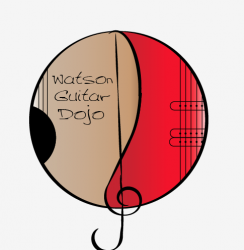
I am a freshman in highschool, and was hired to make a logo in illustrator. I have the skeleton of the logo completed, however am not sure how to go about the coloring of it. the logo involves 2 guitars, both of which need a gradient, one an acoustic (wood grain) and the second a glossy color, (red, blue, or two tone). If any one here has and advice to give on how to make the gradient, or has one that they have made that I could use, it would be greatly appreciated.

Thank You,

Tristin

Gradients should be under the paintbucket

ddwgm.png
 
I understand how to make a gradient, however i am not sure how to go about making this particular gradient/ was wondering if there was anyone out there who would be willing to share a gradient that they had already made.
 
here it is
 

Attachments

  • Screen Shot 2012-03-05 at 1.10.41 PM.png
    Screen Shot 2012-03-05 at 1.10.41 PM.png
    35.7 KB · Views: 121
Gradient

It's not good practice to include a gradient in a logo this is just a good graphic design practice but if you insist to do so or if your client does. This is what I think what your looking for for the look for a glossy paint on the electric guitar, this is achieved easily by creating a "shinny reflection", the back ground can be a flat color (no gradient) just create a object or shape then fill with a gradient of white to white set the angle to 0 on the left side set the opacity to something in between 65 to 80 and on the right side to 0 an you should have the glossy look I attached an example so you can get the idea this can be as refined as you want but I think this will point you in the right direction.
 

Attachments

  • guitar.jpg
    guitar.jpg
    62.8 KB · Views: 132
Were you able to use the gradient I attached?

YES!!!... thank you very much!

To the poster b4, i didn't quite understand how to make that gloss look, that is almost exactly what i was looking for, if you could give a little detail to how you did that, it would be greatly appreciated.

Also what do you guys think of the Logo, words are not in a permanent place, it is for a guitar teacher.
 
YES!!!... thank you very much!

To the poster b4, i didn't quite understand how to make that gloss look, that is almost exactly what i was looking for ...

It's a shame, because even though LE0n4RD0 was very helpful in getting you where you think you want to go, it doesn't do anything to make your logo better.

You had a good idea to begin with ... using the two guitar bodies to imply the variety of services offered your client. But then you got lost in detail, instead of refining the concept.

The clef symbol is superfluous. They guitars already indicate that music is part of the business.

Work on the graphic and the type first. Add gradients only at the end, and only when their use is appropriate.

I agree with you that the logo could use some work and is pretty rough at the moment. However it is still important for Tristin to understand how to create and use gradients. Not that he ever has to use them though. :)
 
Last edited:
Ok, I really appreciate the input, Two things I want to address, one, I'm a guy, and two do either of you have any ideas as to where I could go from here, like I said I am a freshman in high school, and have had no design training at all so most of this is what I think would fit. I am completely open to ideas, being that I am interested in the design field as a future occupation, I would like to learn as much as possible. Thank you for any ideas/ help that you may offer.
 
Ok, I really appreciate the input, Two things I want to address, one, I'm a guy, and two do either of you have any ideas as to where I could go from here, like I said I am a freshman in high school, and have had no design training at all so most of this is what I think would fit. I am completely open to ideas, being that I am interested in the design field as a future occupation, I would like to learn as much as possible. Thank you for any ideas/ help that you may offer.

Sorry about that! :eek:

I like the concept of the partly abstracted 2 guitars. However, I feel that the typography is weak and the icon is a bit too detailed. I would recommend sketching more designs with the 2 guitars and try to keep them as simple as possible. Reduce the lines and shapes as much as you can but still have them be easily and unmistakably viewed as guitars. Once you have settled on the one or two which you think are the most effective, I would poll people and see if they recognize that they are guitars (at a quick glance). Also try them out at different sizes to make sure they would work well all the way from a billboard to a business card. As always with initial sketches, start out in black and white only.

Experiment with bringing the type outside of the icon and placing it next to it, and making it a big larger. Play around with some sans-serif fonts such as Helvetica, Futura, Gill Sans, Univers, Frutiger...
 
logo

here it is I built the "shine" over the jpeg I saved in pdf so I can post but it would open fine in illustrator you can copy and use on you file. The wood grain you would need to make a clipping mask to your shape quick google should show you how... hope it helps
 

Attachments

  • logoguitar.pdf
    344.8 KB · Views: 295
here it is I built the "shine" over the jpeg I saved in pdf so I can post but it would open fine in illustrator you can copy and use on you file. The wood grain you would need to make a clipping mask to your shape quick google should show you how... hope it helps

That helped a ton, thank you very much, any other input is welcome
 
I like the concept too. I think you should also simplify it though and take out the clef, as others have stated, it is a bit redundant. Use a bolder, stronger text as well.

Gradients are not good to use in the foundation of a logo because they are difficult to reproduce, especially on a smaller scale and what you are suggesting will likely make the logo look rather busy imho. Sometimes less it more.
 
Last edited:
If you are really set on the gloss and textured gradient vectors, these two files should help you out a lot.

I am pretty sure they are the look you are trying to achieve.

I attached the .ai files but they are zipped. Just click on them to download and unzip, then open in illustrator. Once you open them in illustrator, you can see first hand how they achieved this look/technique or even use these same files by manipulating the shape and/or gradient colours.
 

Attachments

  • electric_guitar_vector.zip
    1.1 MB · Views: 269
  • wood_guitar_vector.jpg
    wood_guitar_vector.jpg
    421.2 KB · Views: 100
  • wood_guitar_vector.zip
    2.2 MB · Views: 214
  • electric_guitar_vector.jpg
    electric_guitar_vector.jpg
    290.8 KB · Views: 103
I like the concept too. I think you should also simplify it though and take out the clef, as others have stated, it is a bit redundant. Use a bolder, stronger text as well.

Here is something I came up with while messing around for a few minutes, feel free to use it for any inspiration if you like.

I did a take on what the Dojo floor might look like. :p

Image

The dojo is just a name we are throwing around, and it think it would be slightly confusing if you included all of the the Dojo/ Karate stuff seeing as he is a guitar teacher, Performing artist, that kind of stuff....

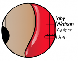
OK how about this, I remove the clef, leave a black line there, don't use a gradient on either side, however use the reflection/ (gloss) that was recommended in an earlier post, change the text and move it to the left (outside) of the logo. If you guys can visualize that let me know, if not, ill make it and post it if you want.


Yeah, sorry, my bad. I thought it was a Karate place for some reason but I get it now, it is a guitar dojo, as in a place to teach guitar...lol...I get the play on words and concept...it was late last night, sorry about that. :rolleyes:

Sure, throw your new logo up when you have a chance.
 
Yeah, sorry, my bad. I thought it was a Karate place for some reason but I get it now, it is a guitar dojo, as in a place to teach guitar...lol...I get the play on words and concept...it was late last night, sorry about that. :rolleyes:

Sure, throw your new logo up when you have a chance.

Ya exactly, hahah its ok, i understand the misconception. Ill post it in a few minutes
 
OK here is what I came up with, Font is Gill sans Italic and Gill Sans Light Italic.
 

Attachments

  • Screen Shot 2012-03-11 at 12.41.15 PM.png
    Screen Shot 2012-03-11 at 12.41.15 PM.png
    37.9 KB · Views: 104
  • Screen Shot 2012-03-11 at 12.41.25 PM.png
    Screen Shot 2012-03-11 at 12.41.25 PM.png
    45.9 KB · Views: 109
OK here is what I came up with, Font is Gill sans Italic and Gill Sans Light Italic.

I hope I don't drive you too crazy with criticism, but ...

The emphasis of the graphic vs. the type is all wrong. The most important part of this mark isn't the illustration, it's the person's name and business. The guitar symbol should be much smaller in relation to the type. It should be the accent to the word mark.

Imagine for a moment that mark on a business card. The type would be way too small. Here's a rule of thumb: size it down to one inch. If it doesn't read at that size, then it still needs work.
 
I hope I don't drive you too crazy with criticism, but ...


Here. Let me show you what I mean. Included are two low-res, black and white versions (it's always a good idea to design a logo that works in just B&W. You can always add color to it.) The fonts are Myriad Pro Bold and Light and are only meant to give you an idea of what I'm talking about. Your actual font choices should be more carefully considered. But this should give you an idea about how the graphic can accompany and enhance the type, instead of being the dominant component.
 

Attachments

  • logoExample.png
    logoExample.png
    11.2 KB · Views: 117
Here's another example, using a logo I'm actually working on. The Venn Diagram was a big thing to the client. They initially saw it as the logo. But by reducing it to a small component of the logo it's much clearer what this is all about ... the School of Business.

Insiders will understand the Venn Diagram. Those that don't understand it at least have a colorful addition to the mark to enjoy.

And to answer your question ... No. I haven't yet developed a black and white version of this. But I can and will. ;)
 

Attachments

  • sobLogo.png
    sobLogo.png
    35.2 KB · Views: 116
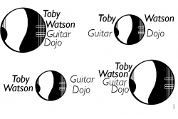
The criticism is greatly appreciated, like I said I'm a freshman in high school, I need to learn all that I can. HOw about these, they are all in black and white, but I have the color versions as well, but I need for the black and white version to work first.
 

Attachments

  • Screen Shot 2012-03-11 at 8.04.02 PM.png
    Screen Shot 2012-03-11 at 8.04.02 PM.png
    50.7 KB · Views: 120
Register on MacRumors! This sidebar will go away, and you'll see fewer ads.