I hesitate to post this request, as there is a number of threads with logos in their titles....but I dearly appreciate your thoughts.
As most of you reading this will know, doing work for yourself is "bloody hard". A sensible critique dialogue is played over in your head, and rejected, and accepted and rejected....
Things that you would instantly dismiss in the design process on other jobs, you consider and ponder....AHHHH. I am not talking about jobs for others, but the personal job that represents you! Your own mark or logo for your portfolio etc etc.
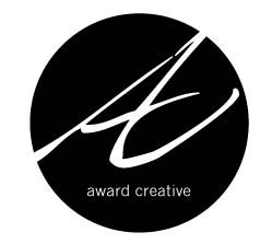
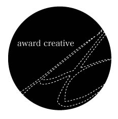
I have been working on this on and off for about month. In trying to remove the bull, I have been rejecting a serious of printouts on my fridge and think I am at last beginning to be happy with these 2 versions. Currently b/w but expecting to have lots of fun with colour variations, media etc, I would love for this to evolve in choice of media, and colours over time..with the basic structure being easily identified.
Quick background....I float between various disciplines of design...I collaborate 95% of the time...I can do the serious commercial work (my current job)....but I have the most joy in playing in print...experimenting with materials, printing techniques and wonderful printers, and I get very excited with using a hand elements in my own experimental works, and I am always trying to learn new techniques and approaches...
So please, critique away.... before I pull these of my fridge and shove them in the bin!. Thanks.")
As most of you reading this will know, doing work for yourself is "bloody hard". A sensible critique dialogue is played over in your head, and rejected, and accepted and rejected....
Things that you would instantly dismiss in the design process on other jobs, you consider and ponder....AHHHH. I am not talking about jobs for others, but the personal job that represents you! Your own mark or logo for your portfolio etc etc.
I have been working on this on and off for about month. In trying to remove the bull, I have been rejecting a serious of printouts on my fridge and think I am at last beginning to be happy with these 2 versions. Currently b/w but expecting to have lots of fun with colour variations, media etc, I would love for this to evolve in choice of media, and colours over time..with the basic structure being easily identified.
Quick background....I float between various disciplines of design...I collaborate 95% of the time...I can do the serious commercial work (my current job)....but I have the most joy in playing in print...experimenting with materials, printing techniques and wonderful printers, and I get very excited with using a hand elements in my own experimental works, and I am always trying to learn new techniques and approaches...
So please, critique away.... before I pull these of my fridge and shove them in the bin!. Thanks.