Become a MacRumors Supporter for $50/year with no ads, ability to filter front page stories, and private forums.

MacRumors

macrumors bot
Original poster
Apr 12, 2001
68,601
39,467


The second developer beta of macOS Tahoe is now available for testing, and it includes a handful of smaller new features and changes on the Mac.

macos-tahoe.jpg

Below, we recap everything new that has been found in macOS Tahoe beta 2 so far.

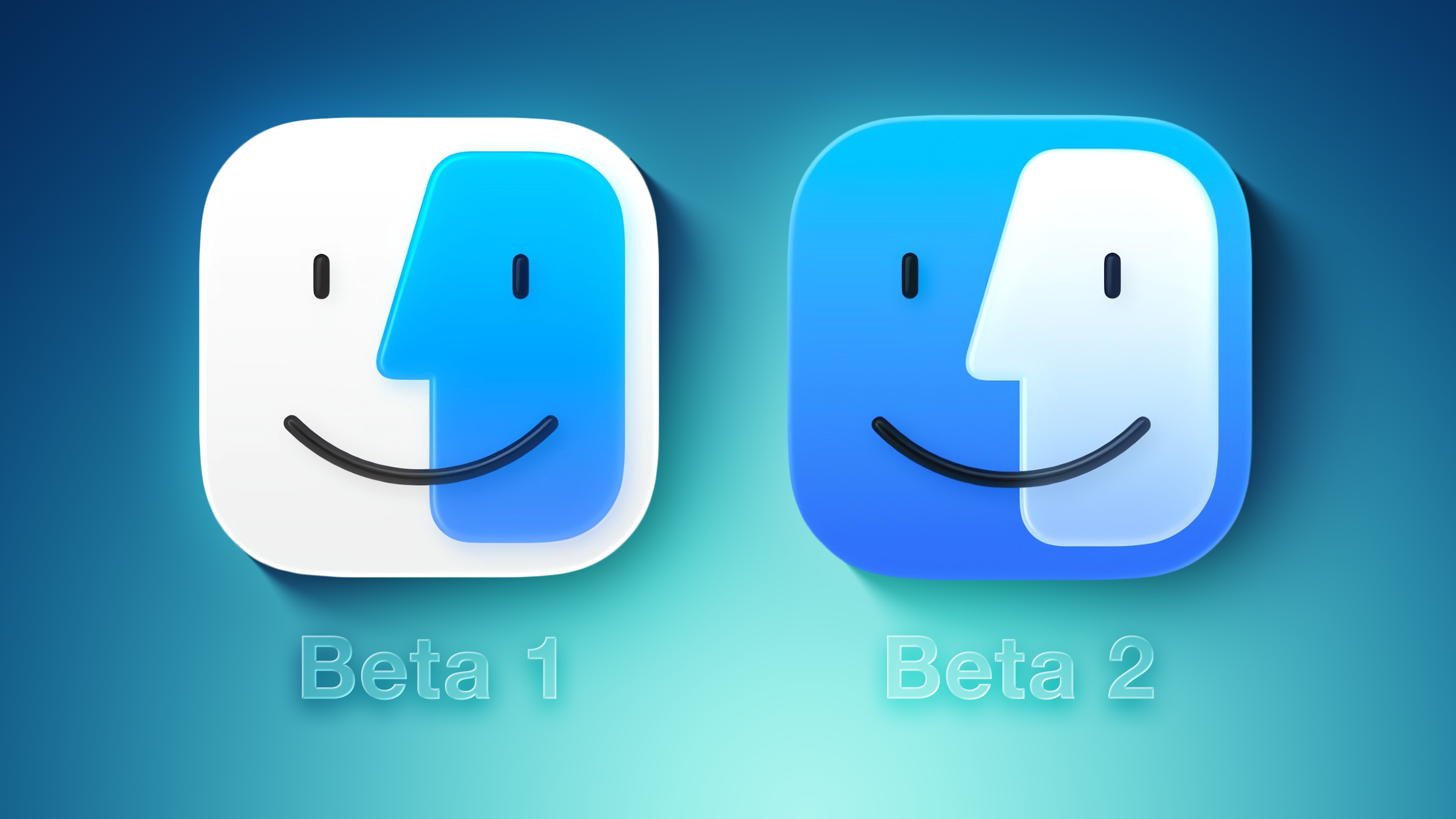
Redesigned Finder App Icon
Fi-vs-Fi.jpg

Crisis averted: Apple has restored the Finder icon's design to its former glory on the second beta.

On the first macOS Tahoe developer beta, the app icon's colors were inverted, with blue appearing on the right side and white appearing on the left side. That change disappointed some people, and Apple has evidently listened to that feedback.

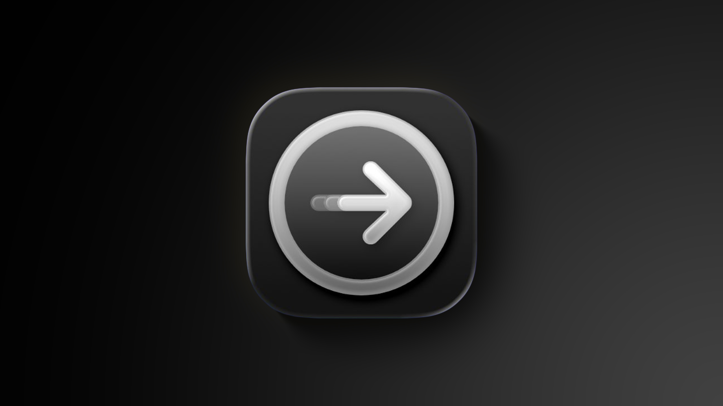
Redesigned Migration Assistant App Icon
Migration-Assistant-Feature.jpg

The second beta also gives a fresh coat of paint to the Migration Assistant app icon.

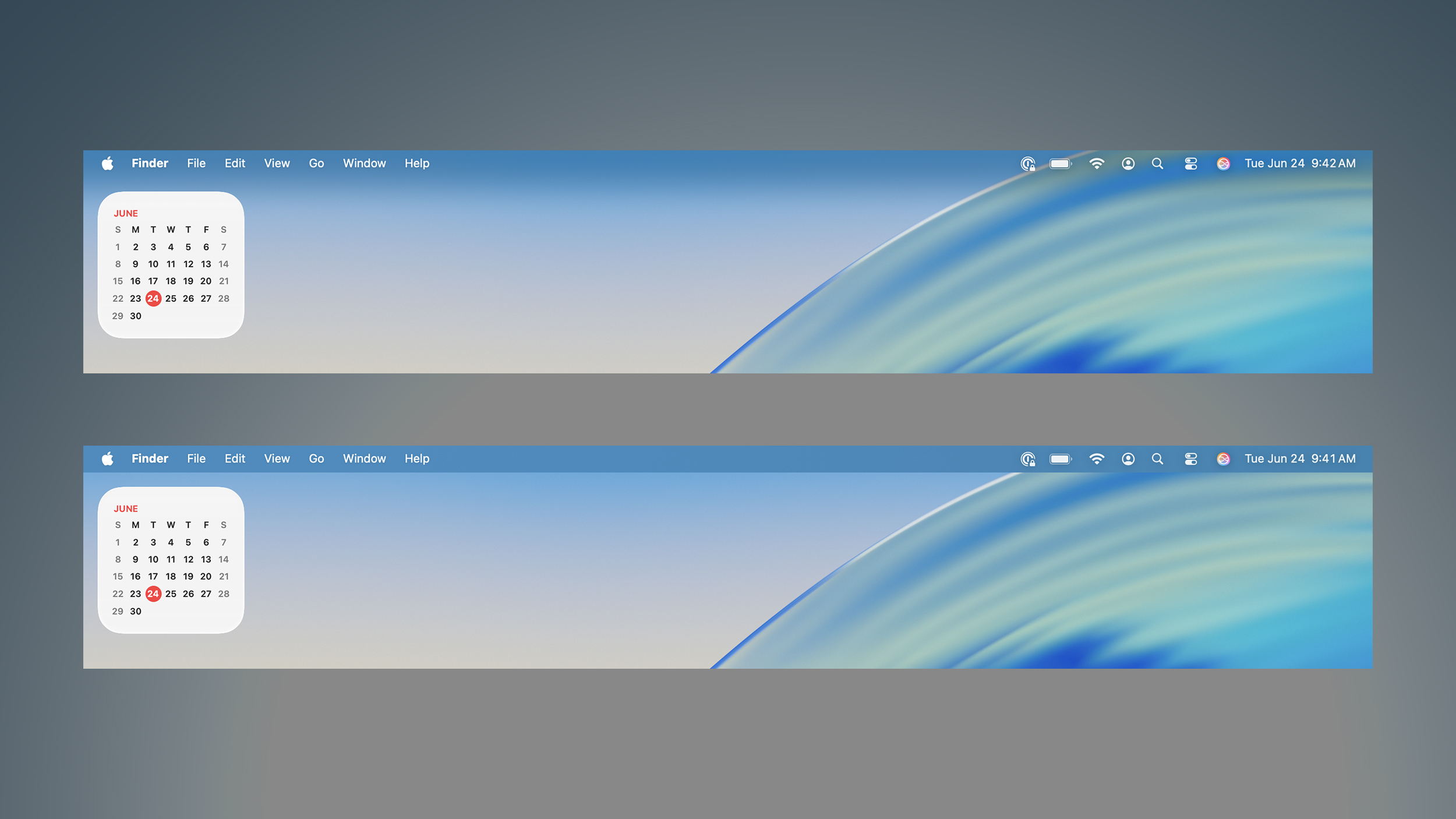
Menu Bar Background Option
Frosted-vs-Unfrosted-Menu-Bar.jpg

Apple removed the frosted background from the menu bar by default on macOS Tahoe, as part of the Liquid Glass redesign. If you miss it, though, the second beta adds a "Show menu bar background" option to the System Settings app under Menu Bar.

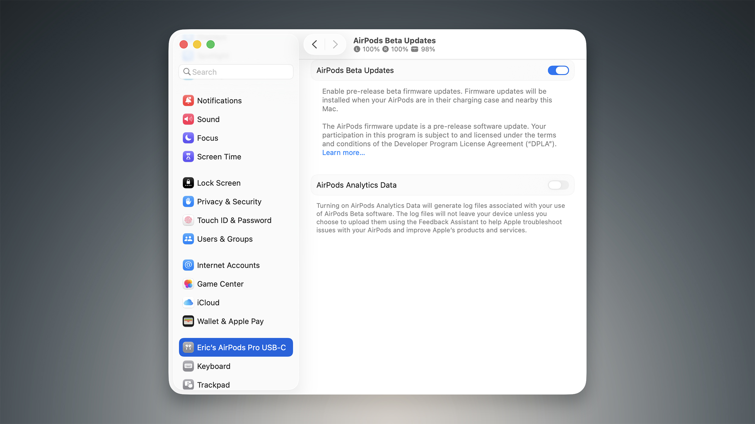
AirPods Beta Firmware
AirPods-Beta-Updates-Feature.jpg

As spotted by Federico Trevisani, the second macOS Tahoe beta lets you enroll in beta testing of AirPods firmware updates directly on a Mac.

First, connect your AirPods to your Mac. Next, open the System Settings app and click on the Bluetooth menu. Then, select the (i) symbol next to your AirPods. On the ensuing page, scroll down to the bottom and click on "AirPods Beta Updates. Finally, there is a toggle to enable beta firmware updates on your AirPods. Firmware updates will be installed when your AirPods are in their charging case and near the Мас.

Apple currently offers AirPods beta firmware updates to developers only. However, that will soon change. Apple plans to start offering public betas of AirPods firmware updates in July for the first time, beginning with the AirPods 4 and AirPods Pro 2.

The latest firmware beta for the ‌AirPods 4‌ and AirPods Pro 2 adds support for improved audio quality for phone calls and video calls, plus studio-quality audio recording for interviews, podcasts, and videos. There is also an option to use AirPods as a camera remote with the Camera app to take photos or start a video recording, and these AirPods models can automatically pause audio if it is detected that you fell asleep.

Other Changes
The first macOS Tahoe public beta will be available in July, and the update will likely be released to the general public in September.

Article Link: Here's Everything New in macOS Tahoe Beta 2
 
Last edited:
When using dark icons, the icon still uses beta1's version, but changes the light portion to dark. I feel like it should be switched so only the light portion of the beta2 icon changes to dark.
 
Sad, the biggest thing to talk about on Apple OS’s is the design language.

Least Apple could do is recognize the existence of ultra wide monitors. The top menu bar for apps is annoying on 49” monitor, always having to look to the top left. Same with ultra wide in Vision Pro. Do they actually use their own software? At a minimum the menu should have an option to center vs pin left. Better, put it on the top bar of the running app, so you don’t have to look away from what you’re doing to select a menu option.
 
Just updated my Mac and it looks pretty, but clearly is focused on making it easier for iOS users to switch to macOS
 
  • Like
Reactions: lkrupp
Did Apple say anything during WWDC about why app corners are more rounded on macOS (e.g. look at Settings in the screenshots above)?
I know they did for iOS/iPadOS but they have corresponding hardware rounded corners with their Liquid Retina displays. On Mac, there's still a mix of square edged corners and rounded corners.
 
Sad, the biggest thing to talk about on Apple OS’s is the design language.

Least Apple could do is recognize the existence of ultra wide monitors. The top menu bar for apps is annoying on 49” monitor, always having to look to the top left. Same with ultra wide in Vision Pro. Do they actually use their own software? At a minimum the menu should have an option to center vs pin left. Better, put it on the top bar of the running app, so you don’t have to look away from what you’re doing to select a menu option.
Tim should just tell the board that he's out of ideas (not that any were his anyways) -- maybe I should just say "his C-suite team" is out of ideas, so they can terminate him and move on to someone that knows what they're doing.

He's over his head now that Steve's inventions have matured. The cow has run out of milk.
 
Is there an off switch for the glass nonsense? It's a usability nightmare.
You mean low contrast mode thats been around since the start? yes.

As for nightmare most problems for reading messages and alerts and control centre on iOS have been fixed between betas 1 and 2 and it's not close to finished yet.
 
  • Like
Reactions: Sandstorm
Sad, the biggest thing to talk about on Apple OS’s is the design language.

Least Apple could do is recognize the existence of ultra wide monitors. The top menu bar for apps is annoying on 49” monitor, always having to look to the top left. Same with ultra wide in Vision Pro. Do they actually use their own software? At a minimum the menu should have an option to center vs pin left. Better, put it on the top bar of the running app, so you don’t have to look away from what you’re doing to select a menu option.
Really, I would hate having controls in the window like that, learn keyboard shortcuts for what you use or better yet use a Windows device if you want a cluttered window system.

I do NOT want the menu bar contents moved, they are in the exact correct place.
 
In both versions of the beta I’ve been unable to log in to the App Store. It looks like Find My is asking me to log in too, and for both it fails. Is anybody else getting that behaviour?
 
My Mac finally updated itself on its own. After many years of never doing so. Icons are an improvement. They are no longer fuzzy, annoying, and overly opaque. A bunch of new bugs regarding moving windows, Safari and animations in mission control. Jerky to say the least. Every time I click on the Safari window, it moves to the right and jitters. I'm not overly thrilled with this new update. I'm glad I never installed it on the iPhone. Liquid glass.... A bit of a joke. Is it just me or is the music app worse than ever?
 
Last edited:
Apple should concentrate more on Finder / Spotlight that the colors of icon pixels.
 
Sad, the biggest thing to talk about on Apple OS’s is the design language.

Least Apple could do is recognize the existence of ultra wide monitors. The top menu bar for apps is annoying on 49” monitor, always having to look to the top left. Same with ultra wide in Vision Pro. Do they actually use their own software? At a minimum the menu should have an option to center vs pin left. Better, put it on the top bar of the running app, so you don’t have to look away from what you’re doing to select a menu option.
I normally don't agree with people who say "Go use Windoze if you don't like it" - but #$%@#$% seriously?

The top menu bar is one of the BEST features of the Macintosh. There are other operating systems that do not have this AMAZING feature.

Go away. There should NEVER be an option for the menu bar to by ANYWHERE but the top of the screen, and the menus should ALWAYS start at the left edge with the Apple menu.
 
Register on MacRumors! This sidebar will go away, and you'll see fewer ads.