Become a MacRumors Supporter for $50/year with no ads, ability to filter front page stories, and private forums.
Tim should just tell the board that he's out of ideas (not that any were his anyways) -- maybe I should just say "his C-suite team" is out of ideas, so they can terminate him and move on to someone that knows what they're doing.

He's over his head now that Steve's inventions have matured. The cow has run out of milk.
still pushing the ridiculous theory that a CEO is in a room twiddling his thumbs thinking up the next idea.
wasn’t Steve, certainly wasn’t Cook.
remember, the Macintosh team existed before Steve hopped on board.
The iMac design came from Johnny and Steve hated the name, wanting to call it the “MacMan”.
The iPod happened because of Toshiba, Tony, Phil and Steve.
The iPhone was a collaboration of basically the entire company.
The idea that the CEO is sitting there coming up with ideas is just ridiculous.
 
  • Like
Reactions: sgtaylor5
As long as it’s still beautiful and glassy, like a gorgeous glass lens accentuating the buttons.
Who cares if it’s rubbish, we all want glass GLASS!
 
  • Haha
Reactions: HighwaySnowman
Option to change menu bar background to more solid one is nice. Overall small changes. Waiting to see how it will evolve as the beta testing continues.
 
  • Like
Reactions: srbNYC and mganu
They fixed several bugs that I had reported in Beta 1. yay! 🙂
Still needs a lot of work in graphics performance (Exposé stutters like hell on my M1 MBP) and the Touch Bar is hanging and almost non-functional. Let’s see what Beta 3 will do.
 
Really glad about the menubar background being readded. Just wish they'd add a way to make the corners less rounded.
 
  • Like
Reactions: yabeweb
Sad, the biggest thing to talk about on Apple OS’s is the design language.

Least Apple could do is recognize the existence of ultra wide monitors. The top menu bar for apps is annoying on 49” monitor, always having to look to the top left. Same with ultra wide in Vision Pro. Do they actually use their own software? At a minimum the menu should have an option to center vs pin left. Better, put it on the top bar of the running app, so you don’t have to look away from what you’re doing to select a menu option.
So you want it to behave like Windows?
 
  • Like
Reactions: HighwaySnowman
They can hide all they want, but now their mistake is preserved forever.
 

Attachments

  • FinderTahoeBeta1.png
    FinderTahoeBeta1.png
    496.5 KB · Views: 14
I liked the previous one, it was light and pleasant. What is your's all problem with a little change, I don't know. I'd rather have them focused on solving all the blunder with button islands, really distracting. And the Safari tabs… I loved the unified tabbar, but again, people fighting change... Now have your tabs as awful buttons with black underlines
 
  • Haha
Reactions: HighwaySnowman
still pushing the ridiculous theory that a CEO is in a room twiddling his thumbs thinking up the next idea.
wasn’t Steve, certainly wasn’t Cook.
remember, the Macintosh team existed before Steve hopped on board.
The iMac design came from Johnny and Steve hated the name, wanting to call it the “MacMan”.
The iPod happened because of Toshiba, Tony, Phil and Steve.
The iPhone was a collaboration of basically the entire company.
The idea that the CEO is sitting there coming up with ideas is just ridiculous.
 
  • Like
Reactions: johnsawyercjs
Tim should just tell the board that he's out of ideas (not that any were his anyways) -- maybe I should just say "his C-suite team" is out of ideas, so they can terminate him and move on to someone that knows what they're doing.

His only job is to ensure share holders turn a profit.

Pretty sure he’s doing that just fine.
 
  • Sad
Reactions: HighwaySnowman
I can no longer sync my music between my Mac and my iPhone. No issues at all with beta 1. Selecting Playlists does nothing.
Screenshot 2025-06-25 at 6.20.18 PM.png
 
Last edited:
Did Apple say anything during WWDC about why app corners are more rounded on macOS (e.g. look at Settings in the screenshots above)?
Don't know, but I do know that I'm uncertain about the utility or desirability of these more-rounded corners. For one thing, in effect they make a window, palette, sheet, dialog, pane, etc. a bit smaller, requiring UI elements that were close to the corners and edges of these windows, etc. to move inward a bit, though maybe not by enough to fret about. But it also gives the OS more of a cartoonish look.

What I don't like is Tahoe's new look for the System Settings window (and maybe a few others too?), in which there's a pointless rounded outline around the list of settings, like a cartouche, if you select "Increase contrast" at Accessibility > Display:
System Settings window showing cartouche.png

When "Increase contrast" is turned off, the black outline is white, and though it's still there, it looks cleaner:

System Settings cartouche, white outline.jpg


I don't see how making the outline around the list of settings black could be considered increasing its contrast. But I can live with it...somehow.

Edit: now I see that this cartouche also appears around the Sidebar in Finder windows. I guess I haven't spent enough time in the Finder recently to have noticed earlier.
 
Last edited:
  • Like
Reactions: orbital~debris
Is there an off switch for the glass nonsense? It's a usability nightmare.
The closest "off" switch so far is at Accessibility > Display > Reduce transparency. But that doesn't do the whole job--many UI elements remain partially transparent (the proper term is "translucent", but it seems Apple thought that word was too high-falutin).
 
  • Like
Reactions: AndyUnderscoreR


The second developer beta of macOS Tahoe is now available for testing, and it includes a handful of smaller new features and changes on the Mac.

macos-tahoe.jpg

Below, we recap everything new that has been found in macOS Tahoe beta 2 so far.

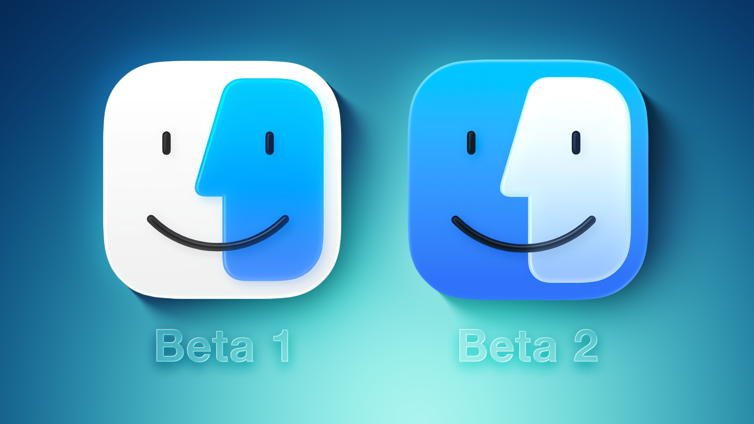
Redesigned Finder App Icon

Fi-vs-Fi.jpg

Crisis averted: Apple has restored the Finder icon's design to its former glory on the second beta.

On the first macOS Tahoe developer beta, the app icon's colors were inverted, with blue appearing on the right side and white appearing on the left side. That change disappointed some people, and Apple has evidently listened to that feedback.

Redesigned Migration Assistant App Icon

Migration-Assistant-Feature.jpg

The second beta also gives a fresh coat of paint to the Migration Assistant app icon.

Menu Bar Background Option

Frosted-vs-Unfrosted-Menu-Bar.jpg

Apple removed the frosted background from the menu bar by default on macOS Tahoe, as part of the Liquid Glass redesign. If you miss it, though, the second beta adds a "Show menu bar background" option to the System Settings app under Menu Bar.

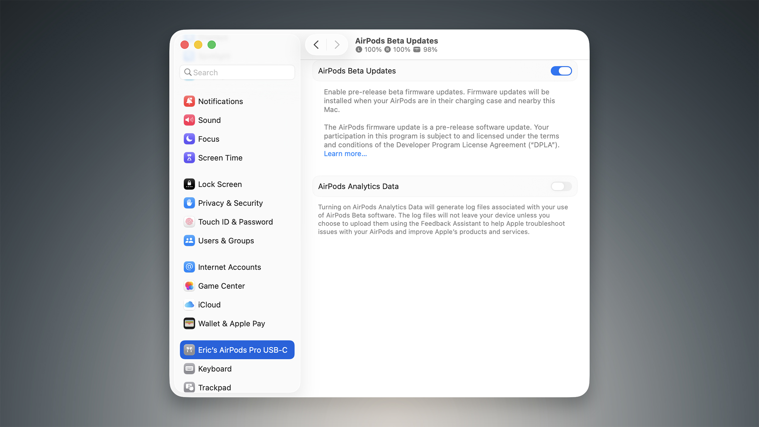
AirPods Beta Firmware

AirPods-Beta-Updates-Feature.jpg

As spotted by Federico Trevisani, the second macOS Tahoe beta lets you enroll in beta testing of AirPods firmware updates directly on a Mac.

First, connect your AirPods to your Mac. Next, open the System Settings app and click on the Bluetooth menu. Then, select the (i) symbol next to your AirPods. On the ensuing page, scroll down to the bottom and click on "AirPods Beta Updates. Finally, there is a toggle to enable beta firmware updates on your AirPods. Firmware updates will be installed when your AirPods are in their charging case and near the Мас.

Apple currently offers AirPods beta firmware updates to developers only. However, that will soon change. Apple plans to start offering public betas of AirPods firmware updates in July for the first time, beginning with the AirPods 4 and AirPods Pro 2.

The latest firmware beta for the ‌AirPods 4‌ and AirPods Pro 2 adds support for improved audio quality for phone calls and video calls, plus studio-quality audio recording for interviews, podcasts, and videos. There is also an option to use AirPods as a camera remote with the Camera app to take photos or start a video recording, and these AirPods models can automatically pause audio if it is detected that you fell asleep.

Other Changes
The first macOS Tahoe public beta will be available in July, and the update will likely be released to the general public in September.

Article Link: Here's Everything New in macOS Tahoe Beta 2
 
Register on MacRumors! This sidebar will go away, and you'll see fewer ads.