It's because it barely changed. People are reacting to what's new.
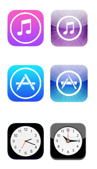
Aside from the colors, it looks like people's main problems with the new icons comes from their spacing. Every redeisgn I see changes the App Store and iTunes logos to have the same spacing as before. Yet, interestingly, they always leave Clock the same.
The new App Store and iTunes icons have the same size circle as Clock. People are just used to having the Clock icon blown out to the edges, but not for the others. The spacing is more consistent now, and people are just reacting to the change.
I've been using iOS 7 since it came out, and I must say, I've grown very comfortable with the new icons. Just as the new ones felt "wrong" at first, now it's the old ones that feel a bit off. The old iTunes logo feels too small now.
The human brain has an incredible capacity for becoming familiar to what was once foreign. And once something becomes familiar, our brains are notoriously bad at distinguishing familiarity with authenticity; something looks right only because we've seen it that way over and over again. I just hope that Apple stands its ground and keeps the designs basically the same because they are created with sound principles. Our brains have been conditioned to expect the icons to look a certain way for years, and now it has to rewire itself. It's to be expected anytime something new comes along.
Last edited:
")
