Become a MacRumors Supporter for $50/year with no ads, ability to filter front page stories, and private forums.

joelovesapple

macrumors 6502a
Original poster
Sep 25, 2006
773
56
UK
Hey everyone,

The site I am about to link to was not created by me, but I'd like some feedback as I know the designer. I have zero experience in design I hasten to add.

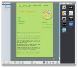
I will admit that it's not the greatest by any stretch of the imagination; heck if I had mobileme I'd use iweb or if I was someone who knew what they were doing, Dreamweaver.

Here is the link: http://tarca.org.uk/

TARCA's main aim is to help people in community housing, ie people who can't afford to buy their own place for various reasons.

I think it needs a big lift from it's 1998 look. The designer is about 70 and thinks it looks cutting edge but you only need to look at last.fm or virtually any other site out there to see that it is not.

The feedback would be much appreciated, thanks! :eek:
 
The joke page has definitely got to go. I'm surprised that an organization that is supposed to be helping out disadvantaged people is allowing sexist jokes, and jokes that make fun of an identifiable group of people.
 
The only thing I would keep from that design is the fixed-width (though wider), centered position.

Feel free to change everything else.

Please.
 
Completely and utterly agree with you both! :eek:

I'll get this sorted straight away... I dislike it as much as the two of you!

Cheers for the feedback...

PS: forgot to say that the program he uses is Serif PagePlus 11 and I've had a go at it myself and it feels overly complicated. I tried changing the colour of the main Tarca title and it just looked damn awful!

Such a shame that we're stuck with this and can't use something else instead, or somebody else more to the point. :(
 
Wow, slow page. Poorly made. I've seen better web sites in 2000.

Use Wordpress or something similar to improve the overall usability.
 
Wow, slow page. Poorly made. I've seen better web sites in 2000.

Use Wordpress or something similar to improve the overall usability.

Thanks for the tips. If you read what I wrote you'd notice that I did not design the website however I shall swiftly pass on the advice to the person responsible.
:cool:

snberk, my connection to the site is actually rather strange. It seriously started off when I was in the pub :D

And now I'm involved with the monthly meetings of this organisation which helps speak up for people who are in social housing or words to that effect. I'm supposedly on the technical team but quite frankly there is just me and the 'web designer' who hasn't a clue; I haven't got a clue how to design a website either but I was picked because I'm good with computers :p

Put it simply, it's early days yet... supposedly! Thanks for asking, perhaps I should've explained myself more clearly in the first place. :)
 
The site looks absolutely horrid! It is the most dated and ugliest website that I have visited for a few years.

I can get you something better for a grand.

EDIT:

I can actually get you something better for free in an afternoon. :)
 
Thanks for the responses so far.

To those of you who clicked on the link without reading what I wrote: I didn't design the site, it's somebody else I know.

Thanks for the constructive feedback - I knew the site would be torn apart and just wanted some evidence to show this man, who shall remain anonymous.

I have been looking into free hosting and have been playing with iWeb (yes I know, all iWeb websites look the same yada yada) but I want this site to serve its purpose, in a way that's better, more modern and is likely to have positive feedback. At the end of the day, people don't want to be looking at a site that feels as though it came from the late 90's (early even).

I'm attaching what I have been doing this evening as a little project to myself. I find iWeb a HELL of a lot more intuitive to someone like me who has absolutely NO website building experience. Please don't be so hard on the flak, this is just a 'prototype' if you will...
 

Attachments

  • Screen shot 2010-06-13 at 23.32.12.png
    Screen shot 2010-06-13 at 23.32.12.png
    704.7 KB · Views: 134
If you are looking for free web-hosting, I can recommend Doteasy (at www.doteasy.com). Its a Canadian company, but I don't think that really makes a difference even for UK sites. I've been using them for years, and their free option works well, and the only "ads" you'll see is if you use their web mail option. You can configure Mail to pick up the site's email and bypass even that ad placement.

Once you have had some fun with iWeb, look at Sandvox. It's not free, unfortunately, but it works (I think) very much like iWeb but has loads more options and themes so it won't look like iWeb. Sandvox is for designing websites by people who aren't web designers.

Perhaps if you wrote the Sandvox people they might float you a license? Doesn't hurt to ask, eh?

Good Luck.

Hey, thanks for your support. Unfortunately I tried selecting the free option but it still wanted me to pay $40.00 which is a bit tricky as I'm in England... :confused:
 
The biggest travesty to that page is the background image! It's a whopping 1.5 MB! While few people still have dial up, it still loaded far too slow even on my cable connection.
 
The biggest travesty to that page is the background image! It's a whopping 1.5 MB! While few people still have dial up, it still loaded far too slow even on my cable connection.

I'll definitely mention that then - that certainly will need changing. Cheers :)
 
Hey, thanks for your support. Unfortunately I tried selecting the free option but it still wanted me to pay $40.00 which is a bit tricky as I'm in England... :confused:

Were you looking at the hosting option (you want the Basic option, which is free) or the area where you buy your domain name (in this case the ~.org.uk)?

You will still need to pay a yearly (or every 2 or 5 years) for the right to use the domain name. You can pay a registrar there or here, and presumably TARCA has one that they have been using. Once the pages are created, they have to be put somewhere - that is the web hosting. Again, presumably TARCA currently has a web host since the pages are being served up to the internet. If you aren't paying for that web hosting, then your best bet is to leave it there (unless you have a good reason to move them) since it will cause the least disruption.

Good Luck.
 
Sometimes it is best to start from scratch when trying to fix something.

In my opinion, the web site needs a complete re-design.

However... if the gentleman who created this site thinks that it looks and functions well, then the re-design will probably not be much (any?) better.

If you can get the developer (I hate to use the word "designer"!) to educate himself on good design and *he* can identify what needs to be fixed, that would be best. Just throwing other people's ideas, no matter how good they may be, at him will probably make him defensive.

Good luck!
 
I like the site. Should be a tutorial for people who want to learn web design. Has a lot of cool features even though it's not the pretty-ist. The old mans right, it's defiantly cutting edge. They have a sweet logo.
 
I like the site. Should be a tutorial for people who want to learn web design. Has a lot of cool features even though it's not the pretty-ist. The old mans right, it's defiantly cutting edge. They have a sweet logo.

You have got to be kidding! Hardly cutting edge really - unless you think 1998 websites are state of the art... :confused: :rolleyes:
 
Just from a design perspective it makes my eye bleed. I can't even read the text in the image boxes on the top. Most of the text on the website are images which basically kills your SEO, makes the page load longer, and is unnecessary. Text should be rendered as text not an image.

I would suggest that you show the designer some examples of current design trends rather than working on his own.

The problem is that the designer/developer doesn't even know the basics. He's got all kinds of technical and visual issues that clearly show he is completely lost. The site reminds me of Geocities back in the mid-90's. When someone is that bad at even the basics, no amount of coaching on this thread is going to help. Where do you begin? There appears to be no understanding of web file compression, color palette, design, layout, type selection, best coding practices, UI, content, concept, etc... There is so much bad going on that there is nothing to salvage. If they use the same person to fix this, why would anyone expect different results?

I agree with what the other posters have said. Scrap what they have and start over from scratch with a basic template from Wordpress or maybe Joomla. I hate templates... but in this case, it would be waaaay better then what they have. So they should go that route unless they they are willing to hire a real designer. Trouble is, templates can be modified and if a person has no design sensibilities, they will manage to screw that up too unless the graphics are locked down. But anyway... say they do go with a template and manage to integrate that. Well, then they also have the issue of the content too - that would need to be redone as well. I mean come on... the joke page. Really?

And what's up with the frames on the index page?

The 70 year old gentleman that did this should consider another hobby. His aspirations are not helping anyone.

Sorry to be so harsh... but that's the reality of it. Good luck on fixing it.
 
Register on MacRumors! This sidebar will go away, and you'll see fewer ads.