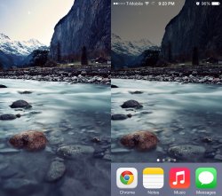
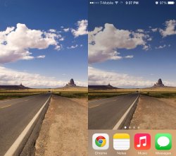
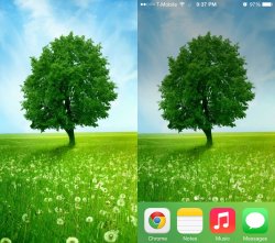
Among all the stupid design decisions (girly, pastel icons that look like they were designed by a 13 year old girl with a candy crush addiction, app tray that takes up a quarter of my screen), the one that annoys me the most is this stupid shadow effect. I don't understand why this stuff is forced on us without any ability to turn it off or make adjustments. It's as if the person who makes these decisions thinks that his/her crappy design tastes should apply to EVERYONE. I've attached some images to compare. The upper half is affected the most. There is the original image, nice and bright, then it's applied as my wallpaper, drab and dull. It actually looks like there is a storm cloud looming overhead in some of them. Thanks you wonderful designers.
Got a tip for us?
Let us know
Become a MacRumors Supporter for $50/year with no ads, ability to filter front page stories, and private forums.
How do I disable the wallpaper shadowing?
- Thread starter spacemanjupiter
- Start date
- Sort by reaction score