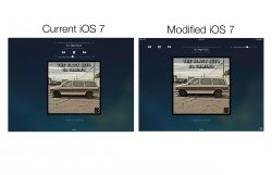
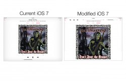
Lets face it. The now playing screens in the iPad music player/lock screen is not very good. Theres simply too much wasted space. So I took a little time to do a slight modification and I really do think its much better than what Apple has done. Larger album art, NON-CRAMPED controls that look like a blown up iPhone app. My only question is WHY THE HELL DIDNT THEY TRY A LITTLE HARDER!
Ironic since they are pushing iTunes radio like crazy and they supposedly "care" so much about music to push out something that looks so unfinished.
Ironic since they are pushing iTunes radio like crazy and they supposedly "care" so much about music to push out something that looks so unfinished.


