Hi,
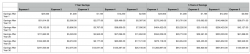
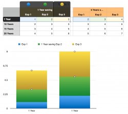
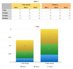
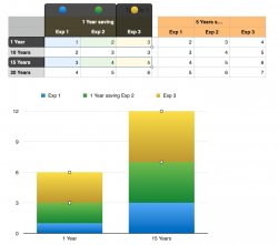
I am having some difficulty making a side by side stacked graph comparison. I have two sets of data, both using compound interest. One set shows how much the total will grow to after 1 year of cutting back on 5 different expenses. The Other set of data shows how much the total will grow to after 5 years of cutting on those same 5 expenses.
I want to show a stacked bar graph at each time interval, but am having trouble visually comparing the "savings from 1 year of expense reduction" versus the "savings from 5 years of expense reduction". Here is the data set I've been using. Any help would be great appreciated!