I can't take good landscape, even though the real-world part looks good, it just doesn't turn out well. Whats wrong?
Got a tip for us?
Let us know
Become a MacRumors Supporter for $50/year with no ads, ability to filter front page stories, and private forums.
How to take good landscape photos?
- Thread starter mrcowdude20
- Start date
- Sort by reaction score
You are using an out of date browser. It may not display this or other websites correctly.
You should upgrade or use an alternative browser.
You should upgrade or use an alternative browser.
fcortese
macrumors 68020
I can't take good landscape, even though the real-world part looks good, it just doesn't turn out well. Whats wrong?
It is difficult to get exactly what you mean. Is slightly out of focus, etc? Maybe post a sample with specific areas that you feel are lacking and we can start from there.
Doylem
macrumors 68040
I can't take good landscape, even though the real-world part looks good, it just doesn't turn out well. Whats wrong?
Keep doing it for about 25 years, and you'll be fine... 😉
Phrasikleia
macrumors 601
If you post a photo as an example, we might be able to help you identify what is or isn't working. There are a lot of qualities that can make a landscape photo particularly compelling--light, visual hierarchy, and atmosphere being chief among them. It's always easier to speak in specifics, however, so try posting a few photos and see what the folks here have to say about them.
Keep doing it for about 25 years, and you'll be fine... 😉
If you post a photo as an example, we might be able to help you identify what is or isn't working. There are a lot of qualities that can make a landscape photo particularly compelling--light, visual hierarchy, and atmosphere being chief among them. It's always easier to speak in specifics, however, so try posting a few photos and see what the folks here have to say about them.
Whatever these two right here say, be sure to listen to them! 😀 Check out the Photo of the Day threads and you'll see what I mean.
compuwar
macrumors 601
I can't take good landscape, even though the real-world part looks good, it just doesn't turn out well. Whats wrong?
Start by taking them just after sunrise or just before sunset. Then post some examples.
Paul
initialsBB
macrumors 6502a
Start by taking them just after sunrise or just before sunset.
If you have an iOS device, check the App Store for "Golden Hour", it will greatly help you plan when it's best to take shots.
I think I know what you are saying. You see a beautiful landscape, but your photo looks dull. The golden fields look beige and so on.
Don't be afraid to crank things up a bit. More saturation, more vivid, more contrast maybe actually makes the photo look like what you saw. Also, polarizing filters can make it more realistic.
Now, if you are taking photos of white people this won't help the skin tones any, but that's why there are all these settings.
Some people tweak everything PP, but not everyone likes that process and so that is why I suggest trying to do this in your camera settings.
It is difficult to get exactly what you mean. Is slightly out of focus, etc? Maybe post a sample with specific areas that you feel are lacking and we can start from there.
If you post a photo as an example, we might be able to help you identify what is or isn't working. There are a lot of qualities that can make a landscape photo particularly compelling--light, visual hierarchy, and atmosphere being chief among them. It's always easier to speak in specifics, however, so try posting a few photos and see what the folks here have to say about them.
Start by taking them just after sunrise or just before sunset. Then post some examples.
Paul
I think I know what you are saying. You see a beautiful landscape, but your photo looks dull. The golden fields look beige and so on.
Don't be afraid to crank things up a bit. More saturation, more vivid, more contrast maybe actually makes the photo look like what you saw. Also, polarizing filters can make it more realistic.
Now, if you are taking photos of white people this won't help the skin tones any, but that's why there are all these settings.
Some people tweak everything PP, but not everyone likes that process and so that is why I suggest trying to do this in your camera settings.
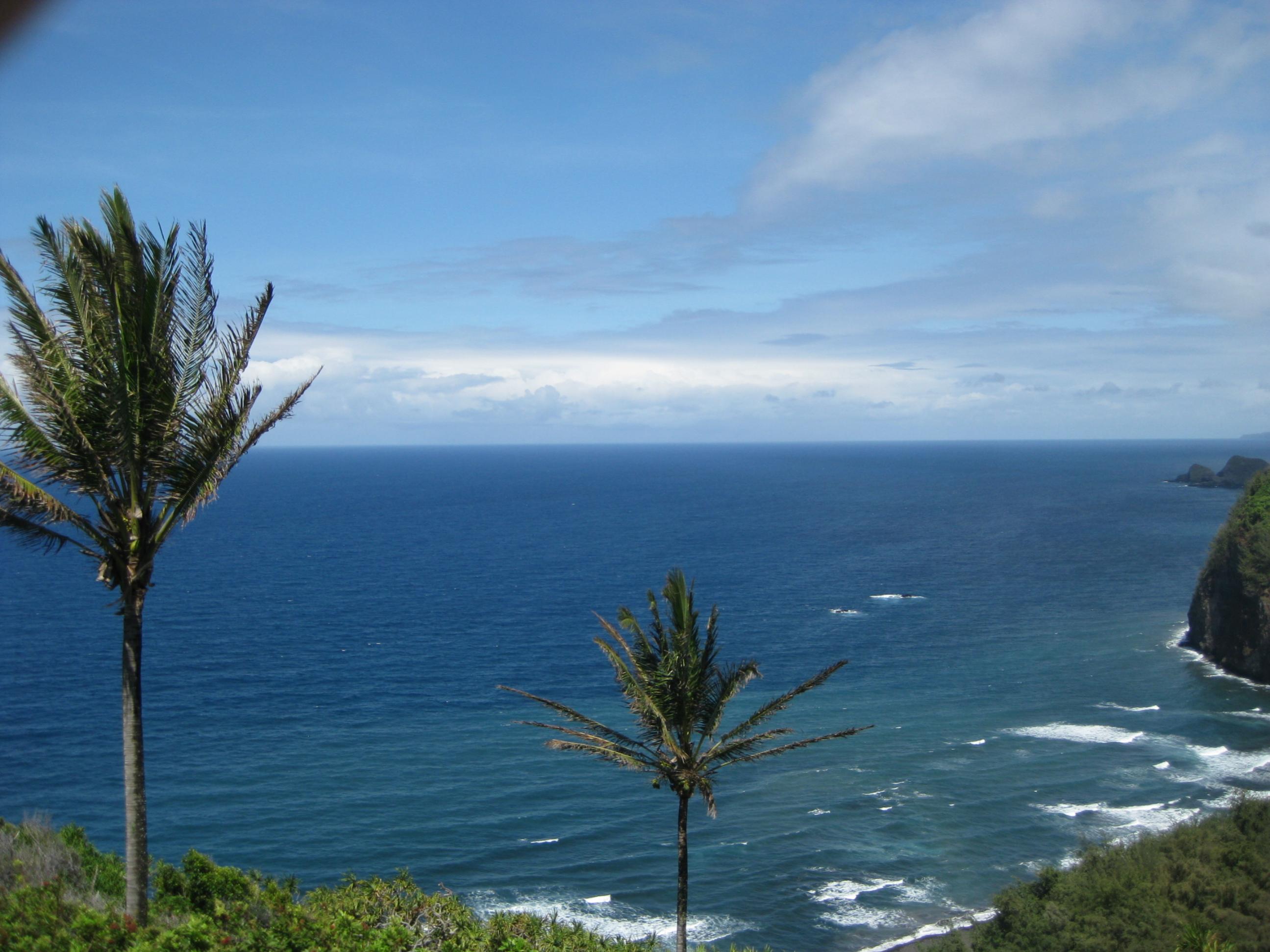
Thanks, here's what I mean:
(this was taken in Hawaii, and nothing seems interesting. The view from my eye looked AWESOME! but the picture sucks...
Attachments

fitshaced
macrumors 68000
Thanks, here's what I mean:
(this was taken in Hawaii, and nothing seems interesting. The view from my eye looked AWESOME! but the picture sucks...
Thats because of your memory of it. I see blue sky, lovely water and nice palm trees. I think a wider angle lens would have helped you and perhaps a panoramic shot. You could also add to it with a nice black border.
If you want the camera to take a picture of exactly what you see, you're essentially taking a snapshot. Your camera can do so much more.
Doylem
macrumors 68040
The view from my eye looked AWESOME! but the picture sucks...
The camera can't smell the sea, can't taste the seafood dinner in the cafe on the beach, can't walk along the sand with its shoes off, etc. It doesn't have memories; it just tries its best to make sense of whatever you point it at (and, incidentally, does a damn fine job, considering it's a mere toy compared with the human eye). Learning how to take a good photograph is the preoccupation of a lifetime: first, all the things you have to learn... second, all the things you have to let go. 😉
Thats because of your memory of it. I see blue sky, lovely water and nice palm trees. I think a wider angle lens would have helped you and perhaps a panoramic shot. You could also add to it with a nice black border.
If you want the camera to take a picture of exactly what you see, you're essentially taking a snapshot. Your camera can do so much more.
I should have done that! At that point in time, I wasn't educated on panoramas. Now, I am far, far, far away from Hawaii and not looking as if I will be going back, as it was fairly expensive. One box of Cheerios was at least $7, where as here it is WAY less that $7. I will be back in my life and will do that, if I remember. Also, this was taken with a point-and-shoot with no editing done.
you answered pretty much your own question..
Use an external editor to tweak the photos,
I set my profile settings on my t2i to zero across the board,
and use ND filters and a UV filter so i can have a longer exposure to get those deeper colors...
But that is just me,
another good way to learn is to see if the photos have EXIF data on them when they upload to the internet...Alot of them do, you can also download the image and use an offline exif viewer to get the data from the photo (iso, shutter ETC) so you can see oh ok thats how they did it...
you answered pretty much your own question..
and a UV filter so i can have a longer exposure to get those deeper colors...
Never heard of this . 😱
Phrasikleia
macrumors 601
I mentioned in my last post in this thread that light, visual hierarchy, and atmosphere are important qualities to keep in mind when shooting landscapes. Depth is another important one. I'll describe how this photo exhibits those qualities.
Light: Light can reveal textures, highlight elements, affect colors, and set a mood in a photo. This photo appears to have been taken under the light of a high sun, which is one of the most difficult types of light to work in. You have some cloud cover to soften the light a bit, so your colors aren't completely washed out (as they often get with strong sunlight), but the light isn't picking out any particular features or creating a distinct mood. It's also not creating any warm colors in the sky or on the ground to contrast with the cool blues and greens. So the light isn't doing anything special for the photograph.
Visual Hierarchy: When you put your world into the four edges of a two-dimensional frame, you have to organize it. Viewing a photo is not the same experience as viewing a scene firsthand. When the scene gets contained and flattened into an image, it registers differently to the brain, so you have to leverage the fundamentals of visual hierarchy in order to give that image some structure and impact.
The two palm trees in this photo are its most conspicuous features. They have roughly equivalent visual weight, however. One is larger (which gives it extra visual weight) but is far off to the left and therefore marginalized (which takes away from its visual weight). The other is smaller, but it's right in the vertical center of the picture, which draws a lot of attention to it. These two trees are competing with each other for dominance. The eye doesn't have a clear 'base' to land on during explorations of the frame, leaving the viewer to wonder what it is about this photograph that the photographer wanted to emphasize.
Atmosphere: Clouds, fog, and mist can add a lot to a landscape photo. They can direct and soften light, they can create leading lines and interesting patterns, and they can give a photo a distinct mood or character. The clouds in this photo help a lot to make the sky more interesting, and they form nice lines that point the eye back into the frame when it approaches the edge on the right. They also help give the photo a bit of depth because of their recession toward the horizon. That's all good. The clouds also direct the eye over to the lefthand palm tree, but as I mentioned above, its placement in the left margin suggests that it's not the 'subject' of the photo, so it's an unsatisfactory 'destination' in the viewing experience. In that regard, the clouds aren't helping.
Depth: A very important element of a landscape photograph. The 2D nature of a photo flattens out any scene, so you have to find ways to create a sense of depth for the viewer if you want to make a landscape evoke the experience of 'being there'. Leading lines that plunge the eye deep into the frame can be very effective as can anything that creates a sense of recession into the distance, from foreground to background. This photo has a distinct foreground (foliage), middle ground (sea), and background (clouds on the horizon). That's all good. It would be even better if they created more movement into the distance. The blue of the sky and the blue of the sea homogenizes those two realms quite a bit, and even the foliage is a rather cool green--that similarity of hues flattens the image somewhat. Likewise, light is hitting all of these areas evenly, and that too flattens the various planes of the photo. Also, the foliage, aside from the two big trees, is just a little fringe at the bottom and right side, so it's not doing much to direct the eye into the distance. The rocks at the right help a bit in bringing the eye from the front to the back, but they're too marginalized to have much impact.
When all of these qualities (light, hierarchy, depth, and atmosphere) come together well, the viewer gets a sense that the photographer was in the right place at the right time and looking in the right direction, and that's exciting, maybe even the best possible result for a landscape photo. I can't think of a better one.
So what overall does the viewer really 'see' here in your sample photo? Mostly a big empty space in the middle of the frame. All of the other elements act as framing devices rather than points of visual interest, leaving the viewer to look into the area they all surround: the middle--and there's no visual pay-off there. We see a pretty location, but are left to wonder if we're looking in the right direction.
I've written a lot, so I'll leave it at that. I hope what I've said will be helpful. 🙂
Last edited:
fcortese
macrumors 68020
I mentioned in my last post in this thread that light, visual hierarchy, and atmosphere are important qualities to keep in mind when shooting landscapes. Depth is another important one. I'll describe how this photo exhibits those qualities.
Light: Light can reveal textures, highlight elements, affect colors, and set a mood in a photo. This photo appears to have been taken under the light of a high sun, which is one of the most difficult types of light to work in. You have some cloud cover to soften the light a bit, so your colors aren't completely washed out (as they often get with strong sunlight), but the light isn't picking out any particular features or creating a distinct mood. It's also not creating any warm colors in the sky or on the ground to contrast with the cool blues and greens. So the light isn't doing anything special for the photograph.
Visual Hierarchy: When you put your world into the four edges of a two-dimensional frame, you have to organize it. Viewing a photo is not the same experience as viewing a scene firsthand. When the scene gets contained and flattened into an image, it registers differently to the brain, so you have to leverage the fundamentals of visual hierarchy in order to give that image some structure and impact.
The two palm trees in this photo are its most conspicuous features. They have roughly equivalent visual weight, however. One is larger (which gives it extra visual weight) but is far off to the left and therefore marginalized (which takes away from its visual weight). The other is smaller, but it's right in the vertical center of the picture, which draws a lot of attention to it. These two trees are competing with each other for dominance. The eye doesn't have a clear 'base' to land on during explorations of the frame, leaving the viewer to wonder what it is about this photograph that the photographer wanted to emphasize.
Atmosphere: Clouds, fog, and mist can add a lot to a landscape photo. They can direct and soften light, they can create leading lines and interesting patterns, and they can give a photo a distinct mood or character. The clouds in this photo help a lot to make the sky more interesting, and they form nice lines that point the eye back into the frame when it approaches the edge on the right. They also help give the photo a bit of depth because of their recession toward the horizon. That's all good. The clouds also direct the eye over to the lefthand palm tree, but as I mentioned above, its placement in the left margin suggests that it's not the 'subject' of the photo, so it's an unsatisfactory 'destination' in the viewing experience. In that regard, the clouds aren't helping.
Depth: A very important element of a landscape photograph. The 2D nature of a photo flattens out any scene, so you have to find ways to create a sense of depth for the viewer if you want to make a landscape evoke the experience of 'being there'. Leading lines that plunge the eye deep into the frame can be very effective as can anything that creates a sense of recession into the distance, from foreground to background. This photo has a distinct foreground (foliage), middle ground (sea), and background (clouds on the horizon). That's all good. It would be even better if they created more movement into the distance. The blue of the sky and the blue of the sea homogenizes those two realms quite a bit, and even the foliage is a rather cool green--that similarity of hues flattens the image somewhat. Likewise, light is hitting all of these areas evenly, and that too flattens the various planes of the photo. Also, the foliage, aside from the two big trees, is just a little fringe at the bottom and right side, so it's not doing much to direct the eye into the distance. The rocks at the right help a bit in bringing the eye from the front to the back, but they're too marginalized to have much impact.
When all of these qualities (light, hierarchy, depth, and atmosphere) come together well, the viewer gets a sense that the photographer was in the right place at the right time and looking in the right direction, and that's exciting, maybe even the best possible result for a landscape photo. I can't think of a better one.
So what overall does the viewer really 'see' here in your sample photo? Mostly a big empty space in the middle of the frame. All of the other elements act as framing devices rather than points of visual interest, leaving the viewer to look into the area they all surround: the middle--and there's no visual pay-off there. We see a pretty location, but are left to wonder if we're looking in the right direction.
I've written a lot, so I'll leave it at that. I hope what I've said will be helpful. 🙂
yep, like she said! Thanks for the tutorial!🙂
I mentioned in my last post in this thread that light, visual hierarchy, and atmosphere are important qualities to keep in mind when shooting landscapes. Depth is another important one. I'll describe how this photo exhibits those qualities.
Light: Light can reveal textures, highlight elements, affect colors, and set a mood in a photo. This photo appears to have been taken under the light of a high sun, which is one of the most difficult types of light to work in. You have some cloud cover to soften the light a bit, so your colors aren't completely washed out (as they often get with strong sunlight), but the light isn't picking out any particular features or creating a distinct mood. It's also not creating any warm colors in the sky or on the ground to contrast with the cool blues and greens. So the light isn't doing anything special for the photograph.
Visual Hierarchy: When you put your world into the four edges of a two-dimensional frame, you have to organize it. Viewing a photo is not the same experience as viewing a scene firsthand. When the scene gets contained and flattened into an image, it registers differently to the brain, so you have to leverage the fundamentals of visual hierarchy in order to give that image some structure and impact.
The two palm trees in this photo are its most conspicuous features. They have roughly equivalent visual weight, however. One is larger (which gives it extra visual weight) but is far off to the left and therefore marginalized (which takes away from its visual weight). The other is smaller, but it's right in the vertical center of the picture, which draws a lot of attention to it. These two trees are competing with each other for dominance. The eye doesn't have a clear 'base' to land on during explorations of the frame, leaving the viewer to wonder what it is about this photograph that the photographer wanted to emphasize.
Atmosphere: Clouds, fog, and mist can add a lot to a landscape photo. They can direct and soften light, they can create leading lines and interesting patterns, and they can give a photo a distinct mood or character. The clouds in this photo help a lot to make the sky more interesting, and they form nice lines that point the eye back into the frame when it approaches the edge on the right. They also help give the photo a bit of depth because of their recession toward the horizon. That's all good. The clouds also direct the eye over to the lefthand palm tree, but as I mentioned above, its placement in the left margin suggests that it's not the 'subject' of the photo, so it's an unsatisfactory 'destination' in the viewing experience. In that regard, the clouds aren't helping.
Depth: A very important element of a landscape photograph. The 2D nature of a photo flattens out any scene, so you have to find ways to create a sense of depth for the viewer if you want to make a landscape evoke the experience of 'being there'. Leading lines that plunge the eye deep into the frame can be very effective as can anything that creates a sense of recession into the distance, from foreground to background. This photo has a distinct foreground (foliage), middle ground (sea), and background (clouds on the horizon). That's all good. It would be even better if they created more movement into the distance. The blue of the sky and the blue of the sea homogenizes those two realms quite a bit, and even the foliage is a rather cool green--that similarity of hues flattens the image somewhat. Likewise, light is hitting all of these areas evenly, and that too flattens the various planes of the photo. Also, the foliage, aside from the two big trees, is just a little fringe at the bottom and right side, so it's not doing much to direct the eye into the distance. The rocks at the right help a bit in bringing the eye from the front to the back, but they're too marginalized to have much impact.
When all of these qualities (light, hierarchy, depth, and atmosphere) come together well, the viewer gets a sense that the photographer was in the right place at the right time and looking in the right direction, and that's exciting, maybe even the best possible result for a landscape photo. I can't think of a better one.
So what overall does the viewer really 'see' here in your sample photo? Mostly a big empty space in the middle of the frame. All of the other elements act as framing devices rather than points of visual interest, leaving the viewer to look into the area they all surround: the middle--and there's no visual pay-off there. We see a pretty location, but are left to wonder if we're looking in the right direction.
I've written a lot, so I'll leave it at that. I hope what I've said will be helpful. 🙂
Thats a lot of great information.
talmy
macrumors 601
I just happened to see this and feel Phrasikleia really has plenty of good pointers. It just too busy with conflicting subjects. I went and did some cropping and some slight image adjustments (with Preview!) to give what I feel are two more interesting pictures, which I have attached. I don't intent this to be a diptych (although it isn't half bad that way), look at the crops separately.
Attachments


adonisadonis
macrumors member
I mentioned in my last post in this thread that light, visual hierarchy, and atmosphere are important qualities to keep in mind when shooting landscapes. Depth is another important one. I'll describe how this photo exhibits those qualities.
Light: Light can reveal textures, highlight elements, affect colors, and set a mood in a photo. This photo appears to have been taken under the light of a high sun, which is one of the most difficult types of light to work in. You have some cloud cover to soften the light a bit, so your colors aren't completely washed out (as they often get with strong sunlight), but the light isn't picking out any particular features or creating a distinct mood. It's also not creating any warm colors in the sky or on the ground to contrast with the cool blues and greens. So the light isn't doing anything special for the photograph.
Visual Hierarchy: When you put your world into the four edges of a two-dimensional frame, you have to organize it. Viewing a photo is not the same experience as viewing a scene firsthand. When the scene gets contained and flattened into an image, it registers differently to the brain, so you have to leverage the fundamentals of visual hierarchy in order to give that image some structure and impact.
The two palm trees in this photo are its most conspicuous features. They have roughly equivalent visual weight, however. One is larger (which gives it extra visual weight) but is far off to the left and therefore marginalized (which takes away from its visual weight). The other is smaller, but it's right in the vertical center of the picture, which draws a lot of attention to it. These two trees are competing with each other for dominance. The eye doesn't have a clear 'base' to land on during explorations of the frame, leaving the viewer to wonder what it is about this photograph that the photographer wanted to emphasize.
Atmosphere: Clouds, fog, and mist can add a lot to a landscape photo. They can direct and soften light, they can create leading lines and interesting patterns, and they can give a photo a distinct mood or character. The clouds in this photo help a lot to make the sky more interesting, and they form nice lines that point the eye back into the frame when it approaches the edge on the right. They also help give the photo a bit of depth because of their recession toward the horizon. That's all good. The clouds also direct the eye over to the lefthand palm tree, but as I mentioned above, its placement in the left margin suggests that it's not the 'subject' of the photo, so it's an unsatisfactory 'destination' in the viewing experience. In that regard, the clouds aren't helping.
Depth: A very important element of a landscape photograph. The 2D nature of a photo flattens out any scene, so you have to find ways to create a sense of depth for the viewer if you want to make a landscape evoke the experience of 'being there'. Leading lines that plunge the eye deep into the frame can be very effective as can anything that creates a sense of recession into the distance, from foreground to background. This photo has a distinct foreground (foliage), middle ground (sea), and background (clouds on the horizon). That's all good. It would be even better if they created more movement into the distance. The blue of the sky and the blue of the sea homogenizes those two realms quite a bit, and even the foliage is a rather cool green--that similarity of hues flattens the image somewhat. Likewise, light is hitting all of these areas evenly, and that too flattens the various planes of the photo. Also, the foliage, aside from the two big trees, is just a little fringe at the bottom and right side, so it's not doing much to direct the eye into the distance. The rocks at the right help a bit in bringing the eye from the front to the back, but they're too marginalized to have much impact.
When all of these qualities (light, hierarchy, depth, and atmosphere) come together well, the viewer gets a sense that the photographer was in the right place at the right time and looking in the right direction, and that's exciting, maybe even the best possible result for a landscape photo. I can't think of a better one.
So what overall does the viewer really 'see' here in your sample photo? Mostly a big empty space in the middle of the frame. All of the other elements act as framing devices rather than points of visual interest, leaving the viewer to look into the area they all surround: the middle--and there's no visual pay-off there. We see a pretty location, but are left to wonder if we're looking in the right direction.
I've written a lot, so I'll leave it at that. I hope what I've said will be helpful. 🙂
Wow! I really like the way you "see" a photograph. You are very helpful for people like us who want to improve our skills. I don't mind at all if you write a lot when analysing a photo. You're amazing!
flosseR
macrumors 6502a
Polarizer.... definetly a polarizer.. I don't think a UV filter is what the poster above meant, it will not do anything. A polarizer will give you amazing blue tones.
I agree also with the composition, a lot of a little with nothing that stands out.
Kepp at it though, it will work out. Golden hour could have been spectacular there though..
Photography is also about researching the locations and figuring out when to take a photo.
But, it is a great start as you already know that your shot isn't what you wanted..
I would listen to Doylem like he would be a talking bible 🙂 His landscape shots are among the best that I have seen.
Filters will help though... Polarizer at least 🙂