Got a tip for us?
Let us know
Become a MacRumors Supporter for $50/year with no ads, ability to filter front page stories, and private forums.
How to Use the New Control Center in iOS 10
- Thread starter MacRumors
- Start date
- Sort by reaction score
You are using an out of date browser. It may not display this or other websites correctly.
You should upgrade or use an alternative browser.
You should upgrade or use an alternative browser.
DEMinSoCAL
macrumors 603
My guess why the music app fonts are so large compared to other stuff is to help out those who normally need to wear glasses to see the screen clearly due to long sightedness.
Listening to music doesn't require wearing glasses and often glasses are removed to relax. Also outdoor activities are usually done without glasses for far sighted people. And when you're moving around, it's even more difficult to squint at the screen to see it.
That's why I think the music app looks like it does. Young sharp eyed folks don't appreciate the challenges of 50+ year old eyes..... but one day they will. It's inevitable.
It's been a pet peeve of mine, over the years, that music apps on all platforms (Windows, Windows phone, Android and now iOS) have taken to using screens with lots of empty space. Lists of songs, albums and artists that used to squeeze 20+ on a screen now show 5 with lots of space between the entries. Very inefficient. Windows/Windows phone is especially guilty with Windows 8-like tiles and "big everything" throughout the UI (touch-friendly?). YUK.
jagooch
macrumors 6502a
'The CEO said he wants IOS 10 to be bigger and bigger than ios 9'It's like somebody from the design team said, "Alright, here's a list of things we need to come up with an interface for." Then they walked up to a whiteboard and wrote:
Songs
Playlists
Artists
Albums
And then they all kind of sat there fidgeting until somebody said, "okay, I'll get right on implementing this… design!"
'that's all? That's easy! I'll get right on adjusting the font. Oh, can I still put in a better camera and faster processor? Those are for the 1% who won't buy the phone for the larger fonts. '
Le Big Mac
macrumors 68030
My guess why the music app fonts are so large compared to other stuff is to help out those who normally need to wear glasses to see the screen clearly due to long sightedness.
Listening to music doesn't require wearing glasses and often glasses are removed to relax. Also outdoor activities are usually done without glasses for far sighted people. And when you're moving around, it's even more difficult to squint at the screen to see it.
That's why I think the music app looks like it does. Young sharp eyed folks don't appreciate the challenges of 50+ year old eyes..... but one day they will. It's inevitable.
Sure, but you can adjust text size in settings - why not have dynamic type in music.
(although one benefit for me, who has sharp eyes, is it's a bit easier to read when I'm in car and want to switch songs with a quick glance.)
trailrunner
macrumors member
I'm finding the same thing on most of iOS 10. "Cartoonishly large" just about everything, 5 steps to do something (as opposed to 1-2 steps in iOS 9), and other strangely confusing things (I see Donald Trump and Hillary Clinton every I open the News app, even though I just want to read about the latest baseball news). This seems like a lot of not ready and knee jerk reaction design decisions as opposed to Apple's normal quiet and simple design.Let me summarize:
iOS 9 - swipe up, touch, touch, done.
iOS 10 - swipe up, touch swipe left/right, touch, done
The controls aren't logically grouped either - splitting Airplay sound and Airplay mirroring in particular is just plain dumb.
While I appreciate larger fonts and controls, the whole OS update is cartoonishly large - one of the ugliest iOS versions of all. They've reduced information density and increased the amount of navigation required to complete a task - it's a terribly inefficient UI.
And don't get me started on the music app.
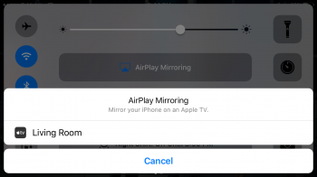
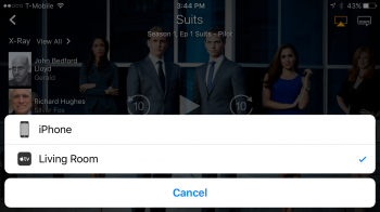
I was having some difficulty figuring out how to stream a video from my phone to the TV but still be able to navigate away from the video player on the phone with the stream remaining on the TV. This used to be accomplished in a single swipe up from the bottom of the phone, where you could choose both the target of a stream and whether to mirror the device or not.
There may be other ways to do this, but what I have discovered is that if you open an app that can stream to your TV, such as Amazon Video, you can select the target of the stream from within the app. Then, if you swipe up from the bottom of the phone, you will see that your phone is not mirroring yet the video is playing on your TV. Here are a couple of screenshots I took to illustrate this. I hope this makes sense for anyone else who has found themselves frustrated with the same thing.


There may be other ways to do this, but what I have discovered is that if you open an app that can stream to your TV, such as Amazon Video, you can select the target of the stream from within the app. Then, if you swipe up from the bottom of the phone, you will see that your phone is not mirroring yet the video is playing on your TV. Here are a couple of screenshots I took to illustrate this. I hope this makes sense for anyone else who has found themselves frustrated with the same thing.


Last edited:
abbeyroad3691
macrumors newbie
I have an Iphone 5S and can not pull up the control center from the lock screen anymore which is a horrible nuisance because i use the flashlight, calendar, and alarm short cuts every day. does anyone have a solution to this or is it possibly because of the outdated phone? I would really appreciate some insight if anyone could help me out.
Always thought 5 stars was too complicated, but Like, Love, and Hate (plus unrated and maybe Meh) make a lot of sense. That's how I used the 5 stars. Hopefully I can figure out how to convert stars to hearts.I don't really care about other stuff, but can someone please explain why the fk the ability to rate/like music was deemed "confusing" enough to be almost removed from iOS??
[doublepost=1474163012][/doublepost]Why 1/2 page?
Why isn't control panel one full configurable page? Eliminate multiple pages; maybe add some app shortcuts for things like Home,music, wifi settings.
Do you have access to control center from the lock screen enabled in settings? Aside from the camera and flashlight, would the others ask you to unlock your phone? (And what's the calendar shortcut in the control center?)I have an Iphone 5S and can not pull up the control center from the lock screen anymore which is a horrible nuisance because i use the flashlight, calendar, and alarm short cuts every day. does anyone have a solution to this or is it possibly because of the outdated phone? I would really appreciate some insight if anyone could help me out.
Register on MacRumors! This sidebar will go away, and you'll see fewer ads.

