Become a MacRumors Supporter for $50/year with no ads, ability to filter front page stories, and private forums.

Nutter

macrumors 6502
Original poster
Mar 31, 2005
432
0
London, England
I'm grapping with this, and wondering if someone who knows more about HTML and CSS can help me.

My best attempt looks like this:

Code:
<div style="margin-left:-8px;margin-right:-8px"><hr style="color:Black;background-color:Black;border:0;width:100%;height:1px;" /></div>

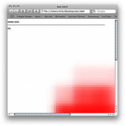
The -8px modifier for the left and right margins is to counteract the 8px margin of the <body> element. This works nicely, except when the page content is larger than the browser window — in that case, the horizontal rule goes to the window's edge, but not the page's edge.

Attached is an illustration of the problem.

Here's the full code:

Code:
<html><body style="margin:8px;">This is some text.<div style="margin-left:-8px;margin-right:-8px"><hr style="color:Black;background-color:Black;border:0;width:100%;height:1px;" /></div>More text.<br /><img src="data:image/png;base64,iVBORw0KGgoAAAANSUhEUgAAAAoAAAAKCAYAAACNMs+9AAAABGdBTUEAALGPC/xhBQAAAAlwSFlzAAALEwAACxMBAJqcGAAAAAd0SU1FB9YGARc5KB0XV+IAAAAddEVYdENvbW1lbnQAQ3JlYXRlZCB3aXRoIFRoZSBHSU1Q72QlbgAAAF1JREFUGNO9zL0NglAAxPEfdLTs4BZM4DIO4C7OwQg2JoQ9LE1exdlYvBBeZ7jqch9//q1uH4TLzw4d6+ErXMMcXuHWxId3KOETnnXXV6MJpcq2MLaI97CER3N0vr4MkhoXe0rZigAAAABJRU5ErkJggg==" style="width:1000px;height:1000px;"></body></html>

Can anyone help me out?

I originally posted this in the Programming forum, before realising this would be a more suitable forum. I apologise to those who end up seeing this twice...
 

Attachments

  • Picture 1.png
    Picture 1.png
    49.3 KB · Views: 7,121
If I'm reading you correctly, you simply want a bar to fit the entire width of the window, which expands and reduces with the width of the window?

Why use a styled HR at all? Why not just use a border-bottom in the top DIV (with absolute positioning) and add another DIV for the rest of your content?

Code:
<html>
<body>This is some text.
<div style="position: absolute; left: 0; right: 0; width: 100%; border-bottom: 1px solid #red;"></div>
<div>More text.<br /><p>removed image source for spatial purposes</p></div>
</body>
</html>

Hope that helps.
 
I agree with the above, using a border would be much better than the hr tag. Though there is a way with JavaScript to make it extend the full width. I'd have to look through some of my code to find it though and frankly is overkill since CSS can handle this with a border.
 
The problem is that the horizontal line only extends to the width of the viewport, not to the full width of the containing block. So, if the containing block is wider than the viewport and the user scrolls to the right, they can see the edge of the horizontal line, as shown in the screen shot above.

Using a border instead of a separate horizontal rule tag doesn't seem to make any difference.

Actually, an even better solution to this problem would be to simply hide any overflow on the body, and to shrink any images to the width of the viewport. I know this can be done with the "max-width" CSS property, but this only preserves the aspect ratio of the image if the "height" property of the image is set to auto. Unfortunately, I'm not generating the HTML content myself, I'm only modifying it (programmatically), so for all I know the image tags might already have "height" and even "max-width" properties set. Is there any way to automatically shrink images wider than the viewport without having to strip CSS style information which might already be attached to the image tags?
 
Here's some JavaScript that I believe does what you're wanting. I made two functions, one for making the HR the width of the page, and another for scaling the image down to fit with the viewport. There's two lines at the top of the JavaScript that have window.onload. You can uncomment the one you want to try. You can't have both uncommented because the seconds line will overwrite the first. The code isn't extensively tested, though it's only the ImageScaleDown function that I'm worried about not working as its code depends on certain factors such as a 8px margin on the page.

The outline around the image I simply added for testing purposes to see where its boundary was at. Let me know if this does what you need. It seemed to work for me in Firefox at least.

HTML:
<html>
<head>
<script type="text/javascript">
//window.onload = WiderHR;
window.onload = ScaleImageDown;

function WiderHR() {
  // width of page
  var width = self.innerWidth + window.scrollMaxX
    || document.body.scrollWidth
    || document.body.offsetHeight;
  document.getElementById('widehr').style.width = width;
}
function ScaleImageDown()
{
  // width of browser
  var width = window.innerWidth
    || document.documentElement.clientWidth
    || document.clientWidth;
  var img = document.getElementById('theimage');
  var imgX = parseInt(img.style.width);
  var imgY = parseInt(img.style.height);
  // width - 8 (for page margin) - 16 (for vertical scroll bar)
  width = width - 8 - 16;
  img.style.width = width +'px';
  img.style.height = Math.round( (width/imgX) * imgY ) +'px';
}
</script>
</head>
<body style="margin:8px;">This is some text.
<div style="">
<hr id="widehr" style="color:#000;background:#000;border:0;height:1px;" />
</div>More text.<br />
<img id="theimage" src="data:image/png;base64,iVBORw0KGgoAAAANSUhEUgAAAAoAAAAKCAYAAACNMs+9AAAABGdBTUEAALGPC/xhBQAAAAlwSFlzAAALEwAACxMBAJqcGAAAAAd0SU1FB9YGARc5KB0XV+IAAAAddEVYdENvbW1lbnQAQ3JlYXRlZCB3aXRoIFRoZSBHSU1Q72QlbgAAAF1JREFUGNO9zL0NglAAxPEfdLTs4BZM4DIO4C7OwQg2JoQ9LE1exdlYvBBeZ7jqch9//q1uH4TLzw4d6+ErXMMcXuHWxId3KOETnnXXV6MJpcq2MLaI97CER3N0vr4MkhoXe0rZigAAAABJRU5ErkJggg==" style="width:1000px;height:1000px; outline: 1px solid #f00;">
</body></html>
 
Code:
<div>text
<div style="width: 100%; height: 1px; border-bottom: 1px solid #000;"></div>
text</div>
 
angelwatt, that image resize script works beautifully, thank you!

Is there any way to get this script to operate on all <img> elements on the page, rather than just one marked with a specific id? I'll look into it myself but I have no experience with Javascript/DOM, so if you could point me in the right direct that'd be much appreciated.

I no longer need to resize the horizontal rule, because I'm styling the body element with "overflow:hidden;" to make sure that the page can never scroll horizontally.
 
I think I figured it out.

Code:
for (i=0; i < document.images.length; i++) 
		{ 
			var img = document.images[i];
			//  Etcetera...
		}
 
I think I figured it out.

Code:
for (i=0; i < document.images.length; i++) 
		{ 
			var img = document.images[i];
			//  Etcetera...
		}

Here's a slight improvement using the DOM
Code:
var imgs = document.getElementsByTagName('img');
for (var i=0, x=imgs.length; i < x; i++) {
  imgs[i] // ....
}
 
Ok, I'm almost there. This is working:

Code:
var width = window.innerWidth - 8;     //  This only needs to work in webkit anyway.
  var images = document.getElementsByTagName('img');
  for (var i = 0, x = images.length; i < x; i++)
  {
  	var imgX = parseInt(images[i].style.width);
  	var imgY = parseInt(images[i].style.height);
  	images[i].style.width = width + 'px';
  	images[i].style.height = Math.round( (width/imgX) * imgY ) + 'px';
  }

Now I'm trying to make sure that it only scales the images down, never up. This is what I'm trying:

Code:
var width = window.innerWidth - 8;     //  This only needs to work in webkit anyway.
  var images = document.getElementsByTagName('img');
  for (var i = 0, x = images.length; i < x; i++)
  {
  	var imgX = parseInt(images[i].style.width);
  	var imgY = parseInt(images[i].style.height);
  	if (imgX > width)
  	{
  		images[i].style.width = width + 'px';
  		images[i].style.height = Math.round( (width/imgX) * imgY ) + 'px';
  	}
  {

For some reason, this doesn't work at all. Any idea why? I must be missing something obvious...

By the way, is there any way to determine the original or intrinsic size of the images, so that I could potentially reverse the process with another javascript?

Thanks for all your help.
 
Try replacing these lines
Code:
  	var imgX = parseInt(images[i].style.width);
  	var imgY = parseInt(images[i].style.height);
with these
Code:
  	var imgX = parseInt(images[i].width);
  	var imgY = parseInt(images[i].height);
Getting the images height and width can depend on how they are set. The first code way is if the size is determined by CSS, while the second way is if the attributes are set on the img tag. Usually.

As far as storing image attributes, you can store them in an array before you start adjusting the sizes. Once you change them it generally can't be undone, though you might be able to set the height and width to 'auto' rather than a number to get the true size. I'd have to try it to know for sure.
 
Aha. A little digging turned up the following alternative, which works if the image size is set with HTML attributes or with CSS:

Code:
var imgX = parseInt(images[i].offsetWidth);
var imgY = parseInt(images[i].offsetHeight);

It's all working now. Thanks so much for your help, I was really pulling my hair out over this!
 
If I'm reading you correctly, you simply want a bar to fit the entire width of the window, which expands and reduces with the width of the window?

Why use a styled HR at all? Why not just use a border-bottom in the top DIV (with absolute positioning) and add another DIV for the rest of your content?

Code:
<html>
<body>This is some text.
<div style="position: absolute; left: 0; right: 0; width: 100%; border-bottom: 1px solid #red;"></div>
<div>More text.<br /><p>removed image source for spatial purposes</p></div>
</body>
</html>

Hope that helps.

<div class="line-hr"><hr></div>

.line-hr{
position: absolute;
left: 0;
right: 0;
width: 100%;
border-bottom: 1px solid #red;
}
 
Register on MacRumors! This sidebar will go away, and you'll see fewer ads.