Become a MacRumors Supporter for $50/year with no ads, ability to filter front page stories, and private forums.

1096bimu

macrumors 6502
Original poster
Nov 7, 2017
461
571
In fact I couldn't believe Apple didn't get this detail right, it's as if they're becoming Microsoft.
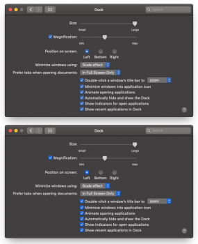
The accent colors, they are exactly the same in both light and dark mode!
But those bright accents simply don't work under dark mode, they're simply way too saturated especially with these new vibrant displays.
Untitled-1.png
All they had to do was lower the saturation and lightness a bit on the accents when in dark mode, it's like two lines of code and they didn't do it.
 
In fact I couldn't believe Apple didn't get this detail right, it's as if they're becoming Microsoft.
The accent colors, they are exactly the same in both light and dark mode!
But those bright accents simply don't work under dark mode, they're simply way too saturated especially with these new vibrant displays.
View attachment 789031
All they had to do was lower the saturation and lightness a bit on the accents when in dark mode, it's like two lines of code and they didn't do it.

You change the accent color in General prefs
 
Dark appearance is basically at version 1.0. I don't really understand your outrage with things not being 100% perfect at this point. All interfaces in the history of macOS have undergone tweaks and improvements thanks to user feedback. It's a big part of how things get improved and how Aqua changes. Playing the "They're becoming Microsoft!!111!!1" card gets really old every time a detail isn't up to someone's high personal standards.

So I suggest you file in a report at bugreport.apple.com and let them know. Who knows it'll get incorporated in a future macOS release. You don't have to be a paid developer for that. I would limit your tone a bit when addressing the macOS developers though. Being less of a drama queen tends to be more effective. You make a valid point though, your example does look better.

In the meantime you can use graphite. It's not saturated at all and blends in pretty nicely with dark appearance.
 
Last edited:
Dark appearance is basically at version 1.0. I don't really understand your outrage with things not being 100% perfect at this point. All interfaces in the history of macOS have undergone tweaks and improvements thanks to user feedback. It's a big part of how things get improved and how Aqua changes. Playing the "They're becoming Microsoft!!111!!1" card gets really old ever time a detail isn't up to someone's high standards.

So I suggest you file in a report at bugreport.apple.com and let them know. You don't have to be a paid developer for that. I would limit your tone a bit when addressing the macOS developers though. Being less of a drama queen tends to be more effective.

There are a couple of things that I'm not fond of with dark mode, namely Finder list view and Mail, but that's really not a deal-breaker. I'm guessing things will get refined with time, or I'll just get used to it. I work in the dark so it's very pleasing on the eyes to have less white on my screens...
 
There are a couple of things that I'm not fond of with dark mode, namely Finder list view and Mail, but that's really not a deal-breaker. I'm guessing things will get refined with time, or I'll just get used to it. I work in the dark so it's very pleasing on the eyes to have less white on my screens...
I tried it for a while but I just ended up going back to the light interface. I just think Dark interfaces in general look more hectic on larger screens. Especially because I have to work with a lot of content like photos and videos. Everything with color just blasts at me in a system-wide dark interface environment. Same goes for the light text everywhere. For some reason it just gets to me after a while.

I'm fine with it on smaller screens, like my iPhone, where I just see one window / app at a time. Especially at night.
 
I actually wish the red was more deep red in dark mode. A few of them are far too less saturated.
 
Yeah, they need a different accent for light and dark mode. That's a design oversight IMO. Could easily be added in an update. Switching them manually is getting old fast.
 
The pink accent color is absolutely gorgeous in dark mode, imo.

p.png


I don't think they're the same in dark mode vs. light mode by the way, which sort of invalidates your entire premise:

lightvsdark.png


lvsd2.png
 
Last edited:
Dark appearance is basically at version 1.0. I don't really understand your outrage with things not being 100% perfect at this point. All interfaces in the history of macOS have undergone tweaks and improvements thanks to user feedback. It's a big part of how things get improved and how Aqua changes. Playing the "They're becoming Microsoft!!111!!1" card gets really old ever time a detail isn't up to someone's high standards.

So I suggest you file in a report at bugreport.apple.com and let them know. Who knows it'll get incorporated in a future macOS release. You don't have to be a paid developer for that. I would limit your tone a bit when addressing the macOS developers though. Being less of a drama queen tends to be more effective. You make a valid point though, your example does look better.

In the meantime you can use graphite. It's not saturated at all and blends in pretty nicely with dark appearance.

Remember the motto: Apple knows what the user wants, Steve Jobs mentioned this in an Interview. So it's useless complaining, after all is a free operating system.
 
Remember the motto: Apple knows what the user wants, Steve Jobs mentioned this in an Interview. So it's useless complaining, after all is a free operating system.

yes, if you don't consider you bought a very expensive computer or device from Apple.....
I guess we already paid for many systems to come
 
If the color palette of Apple Computers newest color scheme offered in their newest Operating System, that appears to be quite good, is such a HUGE disappointment to you;, I think you need to take stock in life and realize, you don't have problems.

..just a little friendly advice

Mojave is nice.
 
  • Like
Reactions: Mr.Chow
...Apple is becoming Microsoft because of accent colors. Okay....

To be honest, Microsoft has change a lot in the last 10 years. A lot of new products and ideas are coming from that company. Once they finish building their Quantum programming language and solve the imperfections of the quantum computer, personally... I believe, the game will be over and Microsoft will reign. I think they bought GitHub to feed their artificial intelligence project.
 
To be honest, Microsoft has change a lot in the last 10 years. A lot of new products and ideas are coming from that company. Once they finish building their Quantum programming language and solve the imperfections of the quantum computer, personally... I believe, the game will be over and Microsoft will reign. I think they bought GitHub to feed their artificial intelligence project.
Oh I think they're night and day a different company than they were. It's blatantly obvious that Windows is no longer the core or the future for the company, hence their steamrolling ahead into making it a subscription based service.

Everything besides Windows that they do is great and personally very technologically impressive. That said, I'm the only IT guy here at work....so I have my gripes to say the least. :p
 
  • Like
Reactions: Mr.Chow
I only wish iTunes respected your choice of accent color throughout its UI instead of only in a few places... pretty inconsistent at the moment. But that's iTunes for you, I guess.

IT.png
 
Remember the motto: Apple knows what the user wants, Steve Jobs mentioned this in an Interview. So it's useless complaining, after all is a free operating system.
Not sure what your angle is here. I filled in bug reports in the past and the macOS developers always got back to me about it. In most cases things got addressed or they at least explained why it would stay a certain way.
[doublepost=1537983557][/doublepost]
I only wish iTunes respected your choice of accent color throughout its UI instead of only in a few places... pretty inconsistent at the moment. But that's iTunes for you, I guess.

View attachment 789171
Fill in a bug report if you haven’t.
 
Fill in a bug report if you haven’t.
Yeah, I might. Seems like sort of an obvious issue though that Apple should already be well aware of, unless nobody on the iTunes team or at Apple ever uses dark mode and an accent color other than the default blue.
 
Not sure what your angle is here. I filled in bug reports in the past and the macOS developers always got back to me about it. In most cases things got addressed or they at least explained why it would stay a certain way.

People want modular MacBook pros that are easy to upgrade it's parts, but what do we get? MacBooks Pros with soldered memory modules and SDD drives.
 
The accent colors, they are exactly the same in both light and dark mode!

No they're not.

GreenAccent.png

But those bright accents simply don't work under dark mode, they're simply way too saturated especially with these new vibrant displays.

The Dark Mode accent colors are, in fact, deliberately brighter.

All they had to do was lower the saturation and lightness a bit on the accents when in dark mode, it's like two lines of code and they didn't do it.
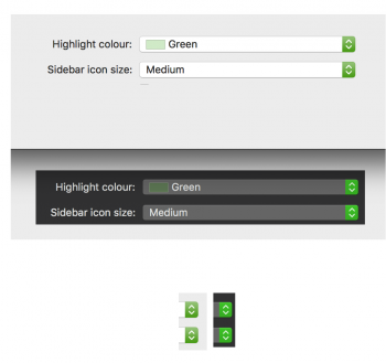
Yes, because by design, the foreground in Dark Mode is brighter. Not less bright.
 
Last edited:
  • Like
Reactions: HenryDJP
Register on MacRumors! This sidebar will go away, and you'll see fewer ads.