Become a MacRumors Supporter for $50/year with no ads, ability to filter front page stories, and private forums.

Osullivan1

macrumors 6502
Original poster
Aug 1, 2011
283
13
London
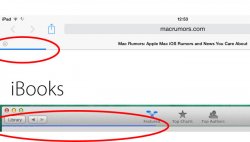
Does anyone else think that the iBooks app in Mavericks could hold some clues to a slightly updated OS X UI?

Some parts of the app look different to the usual OS X UI, and more like iOS 7 - such as the sidebar and loading graphics. Things like the tab bar just look like some older versions of OS X, which doesn't really make sense...

The fact that the icon (and all new Mavericks icons) is very flat (less shine, less skeuomorphism) could also indicate that Apple may redesign the OS X icons to become flatter at some point.

Does anyone else think that this could be the start of the iOS 7 UI being partly transferred over to OS X, or is it just the OS X UI becoming fragmented?
 

Attachments

  • 1.jpg
    1.jpg
    58.4 KB · Views: 332
  • 2.jpg
    2.jpg
    50 KB · Views: 320
  • Screen Shot 2013-08-09 at 12.42.00.png
    Screen Shot 2013-08-09 at 12.42.00.png
    19.4 KB · Views: 156
I find it strange how GUI's are getting more and more sober and 'clean' looking. It's has happened in Windows 8 and in Lion. To me, the OS X interface has gotten kind of greyish and boring since Lion. I wonder whether there's a link between economic optimism and the looks of the GUI's, like the supposedly existing link between economics and women clothing. ;)
 
Does anyone else think that this could be the start of the iOS 7 UI being partly transferred over to OS X, or is it just the OS X UI becoming fragmented?

UI fragmentation is not a new thing with OS X. See Brushed Metal and Aqua early last decade. Eventually the two concepts got merged, consolidated and turned into the standard UI components we have today.

I expect to see similar things happen with iOS 7-inspired UI choices going forward. But so far it seems like the inspiration taken is a bit more subtle. They are taking ideas and applying them in new ways with iBooks and the Maps app (and even a little in the Finder).

The progress bar for iBooks is actually interesting as it is a way to show status without using an old-style status bar at the bottom of the window, or shoving a progress bar in a weird place in the UI. It works.

The overlays in Maps are interesting as it really is an evolution of NSPopover and HUD windows. The look may borrow a bit from the new look of iOS 7, but is still has roots in existing controls.

Tables in the Finder use translucent headers, which fits in the look better than I expected.

iBooks' source list is definitely an evolution of the source list with iOS 7 cues. Not entirely sure how well that will work in other places though, as it adds a lot of whitespace if you have a lot of items in your source list. Might see an evolution of that make it into more Mac apps like Mail down the road.

But also notice that iBooks isn't bucking the OS X paradigm with a custom toolbar header or anything like that. It's pushing the boundaries in an evolutionary way, but without reinventing everything. Maps is the same way. I'm not convinced we are going to see a big overhaul, other than maybe icons. What we are going to see is Apple trying out new UI ideas that are inspired by certain visual cues in iOS 7 that make sense and seeing what works. Hopefully some of this will make it into system controls so they can be reused by 3rd party developers, but probably not until the next major release.
 
As soon as I saw the iBooks GUI I could see where Apple was going with OS X. They use/used iTunes as a OS X GUI test bed for years, why not with a completely new OS X app as well.

I understand the usefulness of a more visually basic GUI in iOS to make room for content on small screens but I don't understand why we need that on large screens. Windows 8 fails miserably because there is so much wasted space.
 
Register on MacRumors! This sidebar will go away, and you'll see fewer ads.