Become a MacRumors Supporter for $50/year with no ads, ability to filter front page stories, and private forums.

Kattkaries

macrumors newbie
Original poster
Jul 16, 2020
2
0
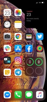
I'm really surprised that there's no buzz around the decreased icon sizes and increase in "wasted" space on the home screen in iOS 14.

Comparing screenshots from iOS 13 and 14 makes this really obvious imho, and personally I can't stand it. Am I imagining this or are the differences really there?

There are better images out there for comparison, but I'll out these here anyway:
 

Attachments

  • F06C467B-7D9F-4ED7-A141-F1DE8E01DDB7.png
    F06C467B-7D9F-4ED7-A141-F1DE8E01DDB7.png
    1.2 MB · Views: 182
  • 80A0D2A6-33D5-4010-8538-E70F382DF402.jpeg
    80A0D2A6-33D5-4010-8538-E70F382DF402.jpeg
    110.2 KB · Views: 121
The difference has been talked about on the forums. It is certainly noticeable.

I don’t really care one way or another. I mainly use my phone as a phone. If i need to open an app, I don’t care if the spacing is a little off compared to iOS 13, so long as the app works like it should.
 
I think the iPhone has always had a lot of wasted screen real estate. Lots of opportunity for improvement in that area.
 
  • Like
Reactions: Craiguyver
Wasted space up top and near the dock, could easily fit another row of apps if it wasn’t for that wasted space. 🥺
 
An option not to display app names would be great.
if you were desperate and had a lot of time, you could screenshot each of your homepages then crop to each icon, and save as an individual photo. Then create a shortcut to each of your apps and "add to homescreen" using the photo of the original app icon as the shortcut icon. Shortcuts placed on the homescreen can be done so without any text. You don't save any space though.
 
Isn't it obvious why it is like that?

Not really. There would be room enough for the widgets with the old layout as well. If you doubt it, feel free to check out just about any Android launcher.

Also, I could really do without the extra space around the dots at the bottom. They now allow for quick swiping between home screens, which kinda becomes redundant given App Gallery and the ability to remove all those extra pages of apps.
 
The difference has been talked about on the forums. It is certainly noticeable.

I don’t really care one way or another. I mainly use my phone as a phone. If i need to open an app, I don’t care if the spacing is a little off compared to iOS 13, so long as the app works like it should.

Fortunately you don’t work as an Apple designer or the iOS design will be as crap and messy as Symbian OS.
 
Fortunately you don’t work as an Apple designer or the iOS design will be as crap and messy as Symbian OS.
For me, the phone is a tool to answer calls, make calls, and the occasional text. As I said, I am not concerned with trying to impress others or have it win some kind of art award for design. If we were talking about something of more important acne, my answer would have been different, and rightfully so.

Thank you for the insult.

When you design something better and Apple hires and pays you for it, let us all know, so that we can then look to your expertise.
 
It's not really a big deal. Apple made the icons a little bit bigger with iOS 7, so they're maybe a bit closer to what it was originally.
 
For me, the phone is a tool to answer calls, make calls, and the occasional text. As I said, I am not concerned with trying to impress others or have it win some kind of art award for design. If we were talking about something of more important acne, my answer would have been different, and rightfully so.

Thank you for the insult.

When you design something better and Apple hires and pays you for it, let us all know, so that we can then look to your expertise.

I’m not here to complain about the spacing issue, I think it’s there for a reason, Apple makes the spacing bigger on the bottom so we can access widget easily on home screen.
 
For me, the phone is a tool to answer calls, make calls, and the occasional text. As I said, I am not concerned with trying to impress others or have it win some kind of art award for design. If we were talking about something of more important acne, my answer would have been different, and rightfully so.

Thank you for the insult.

When you design something better and Apple hires and pays you for it, let us all know, so that we can then look to your expertise.

Real talk: why would someone who believes above waste time in an iOS 14 forum? If you “use it as a phone and the occasional text” you seem like the type of person who would *not* be here. Why tho?
 
  • Like
Reactions: aleni
Register on MacRumors! This sidebar will go away, and you'll see fewer ads.