Got a tip for us?
Let us know
Become a MacRumors Supporter for $50/year with no ads, ability to filter front page stories, and private forums.
In case you didn't know about this.
- Thread starter FatPuppy
- Start date
- Sort by reaction score
You are using an out of date browser. It may not display this or other websites correctly.
You should upgrade or use an alternative browser.
You should upgrade or use an alternative browser.
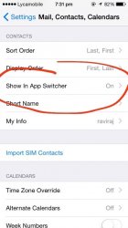
Just one of many new fesures in iOS 8 discussed in many threads and articles online.View attachment 494995
I found this screenshot on twitter in case some users don't know about this.
Thank you for telling us about this! I enjoy most of the new features of iOS 8 but the contact shortcuts above the app switcher seemed weird and out of place to me so I'm glad there is a way to turn this off and have the app switcher look just like it did in iOS 7. The clean space above and below the app previews looks much better without being cluttered with contact shortcuts if you ask me.
Thank you for telling us about this! I enjoy most of the new features of iOS 8 but the contact shortcuts above the app switcher seemed weird and out of place to me so I'm glad there is a way to turn this off and have the app switcher look just like it did in iOS 7. The clean space above and below the app previews looks much better without being cluttered with contact shortcuts if you ask me.
Yeah good thing we can revert to blank space instead of being forced to have shortcut to recent contacts.
View attachment 494995
I found this screenshot on twitter in case some users don't know about this.
Thanks! I too did not know you could turn it off. It works for me as I would keep it on on my phone but would turn it off on my iPad.
So that you can quickly contact someone wherever you are perhaps. Just bring up that screen with a double click of the home button no matter where you are and go from there. Basically a more consistent unified way of doing it. And the option to disable it is there too, so it's all good for everyone basically.I don't understand the convenience of this feature. If I want to look at my recent calls I go to the phone app, for messages I go to the messages app, etc.
For me the feature would only serve to look at my friends faces more often.
This item is discussed in many other threads already. Regardless, it would be extremely helpful to have a proper title, and not a vague one.
Register on MacRumors! This sidebar will go away, and you'll see fewer ads.


