Become a MacRumors Supporter for $50/year with no ads, ability to filter front page stories, and private forums.

840quadra

Moderator
Staff member
Feb 1, 2005
9,351
6,147
Twin Cities Minnesota
I enjoy the interface. Reminds me of the control bar on the back of the Canon EOS-R I had. Took a bit to get used to, but once I got the hang of it I really like it.

Zero issues with doing video zoom with it, FAR prefer it to touching the screen. Can actually (and finally) do vertigo or dolly zoom shots decently in the native camera app. Could for ages in 3rd party tools, but sometimes I just like the native capture modes of iPhone.
 

NikkorAIS

macrumors newbie
Feb 18, 2023
7
5
It’s in the wrong spot. Needs to be in the corner to be useful.
I’m not a fan of the placement of the button but I get that they basically split the difference for horizontal and vertical orientations. I also don’t love the sensitivity of swipes when navigating through options. The navigation just isn’t intuitive.

All that said, I still like having the button for nothing other than opening the camera and possibly taking pictures with it.
I started thinking about this a little more, and if the button was closer to the corner, I'd have a very difficult time using the camera one handed. You can get away with this with a typical camera because modern cameras have a grip for your remaining fingers. Because the button is further in, you can hold the camera using your middle finger in the area next to the button on the top and your thumb to brace underneath, then you can manipulate the controls and activate the shutter all one handed. If you're a two handed shooter, I think the button further in really shouldn't really matter.
 

TheColtr

macrumors 6502a
Feb 1, 2014
602
883
California
I started thinking about this a little more, and if the button was closer to the corner, I'd have a very difficult time using the camera one handed. You can get away with this with a typical camera because modern cameras have a grip for your remaining fingers. Because the button is further in, you can hold the camera using your middle finger in the area next to the button on the top and your thumb to brace underneath, then you can manipulate the controls and activate the shutter all one handed. If you're a two handed shooter, I think the button further in really shouldn't really matter.
Interesting. I’m normally a two handed shooter, i thought the button was too far in for my liking, however after trying it one handed I understand better. Maybe I’ll try it more one handed.
 

Pandyone

macrumors regular
Original poster
Sep 30, 2021
225
311
It’s in the wrong spot. Needs to be in the corner to be useful.

This seems to be really subjective. I like how it’s placement allows for one hand use better, if it was to the corner it would almost always need two hands holding the iPhone.
 

Pandyone

macrumors regular
Original poster
Sep 30, 2021
225
311
Because the button is further in, you can hold the camera using your middle finger in the area next to the button on the top and your thumb to brace underneath, then you can manipulate the controls and activate the shutter all one handed.

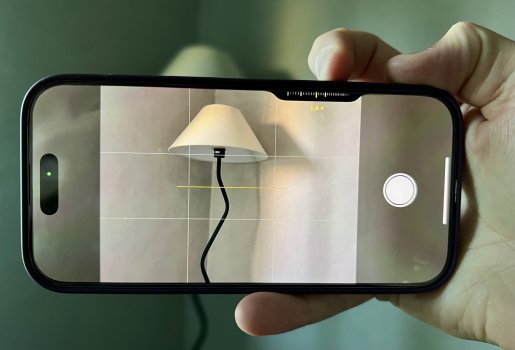
I often hold the phone like the picture below. I think it’s stable and I can control things with the button. If the button was more in the corner it would not be easy to swipe with the thumb (but would work as a shutter button).

IMG_5805.jpeg
 

i.am.lost

macrumors newbie
Sep 22, 2018
18
54
I honestly think Camera Control is the single worst feature ever added to iPhone. This is coming from someone who’s bought the top iPhone model every year since 2008. It’s even less intuitive than Force Touch (RIP).

As currently implemented, it is inferior in every way to onscreen controls when using the camera - poor button placement (somehow for both landscape and portrait!), unintuitive gestures with light tap and double tap, often compromises shot stability and adds nothing that can’t already be done more efficiently onscreen. I’m really surprised this didn’t get thrown out, or at least adjusted, by the human interface team at Apple.

Subjectively, I also dislike how the Camera Control and Action Button take us further away from the original ambition for iPhone to become only a screen (which was reinforced by the iPhone X design language). Is this a conscious new ‘maximalist’ aesthetic from Apple? Time will tell.
 

NikkorAIS

macrumors newbie
Feb 18, 2023
7
5
I honestly think Camera Control is the single worst feature ever added to iPhone. This is coming from someone who’s bought the top iPhone model every year since 2008. It’s even less intuitive than Force Touch (RIP).

As currently implemented, it is inferior in every way to onscreen controls when using the camera - poor button placement (somehow for both landscape and portrait!), unintuitive gestures with light tap and double tap, often compromises shot stability and adds nothing that can’t already be done more efficiently onscreen. I’m really surprised this didn’t get thrown out, or at least adjusted, by the human interface team at Apple.

Subjectively, I also dislike how the Camera Control and Action Button take us further away from the original ambition for iPhone to become only a screen (which was reinforced by the iPhone X design language). Is this a conscious new ‘maximalist’ aesthetic from Apple? Time will tell.
It’s interesting that I have the opposite opinion despite us probably having the same history of apple fandom. I’ve been using an iphone since the first one, not every model though. I actually think one the most regretful changes apple made was removing force touch on the iphone. Mainly because it’s replacement, “haptic touch” aka long touch, is just so freaking annoying. I feel like it activates way too easily. And when you do want to purposely activate haptic touch it takes a tiny bit too long. I think the main criticism with force touch was no one really knew it was there. I did and used it often. Deliberate gestures to open things like contextual menus, edit homescreen, and especially track pad function on keyboard came up instantly. Inadvertantly resting a finger on the screen was less likely to cause icons to wobble or focus modes to pop up. If you want to take about unintuitive, what about two, three, four finger swiping on macbook trackpads. People are more likely figure this feature out than pressing the screen harder?

The current implementation of the button could have been better. I’m on the fence on button placement. Sure like everyone else, I had hoped it was closer to the corner. Thinking about it again, I said in an earlier post it would be more difficult to hold the phone one handed if the shutter was closer to the corner, but if you rest/brace your thumb on the screen right side, it would work ok, a little slippery, but ok. I do feel like I’ll use the visual ai often though, so I’d probably be irritated that the button is so low. It’s a compromise that I’m accepting more and more each day. Heck, we’ve been tapping screens to take photos for almost two decades now. I absolutely have no problem double light pressing the camera control button. I’m actually pretty surprised so many lack the dexterity to do this. I do hope they give the option to limit what can be controlled, for instance, I’d never switch photographic styles from this button. I keep mine defaulted to aperture because accidental moving this setting can be reversed after the photo is taken. Plus, I like having depth info on my photos. Also why didn’t anyone tell me iphone 15s allowed portrait with live photo! This was a game changer for me when I found out the 16 had it.

I understand the original goal was the iphone to eventually be a slab of glass. Removing things like 3d touch takes you further away from it though because you’re losing another way to interact with it. Imagine using that with your iphone camera. Light press to focus or just rest your finger on the screen shutter button. Then hard press further to shoot. Tapping a shutter button inherently sounds bad when you want to avoid camera shake. In a way the camera control button is the spiritual successor to the dedicated silent/ring switch that went away with the action button. The switch was created because the iphone originally was primarily a phone, and that switch did one function: turn the ringer off and on. I’d argue for many the iphone has become primarily a camera, and now there is a dedicated button to activate and use that camera. The best part of it is you don’t even have to use it if you don’t want to. As far as I know you can still interact with the camera like you did before. It’s not like they removed an entire row of function keys for it and forced you to use it.
 
  • Like
Reactions: Zensō

Pandyone

macrumors regular
Original poster
Sep 30, 2021
225
311
Subjectively, I also dislike how the Camera Control and Action Button take us further away from the original ambition for iPhone to become only a screen (which was reinforced by the iPhone X design language). Is this a conscious new ‘maximalist’ aesthetic from Apple? Time will tell.

This however feels like something good for the most part? Maybe they noticed that some things simply needs to work better "as is". For example, what Apple did with Macbook ports and went all in on just a few USB-C but then back with more ports recently (nice to not use dongles).

The best part of it is you don’t even have to use it if you don’t want to. As far as I know you can still interact with the camera like you did before. It’s not like they removed an entire row of function keys for it and forced you to use it.

Exactly, I think it's harsh to say that Camera Control is the single worst feature added.
But I hope we can get more customization to the button, especially since some users don't like it at all, then giving some options would be great.
 
Register on MacRumors! This sidebar will go away, and you'll see fewer ads.