Despite copious Googling, I’m having trouble understanding some of the Intel Power Gadget v3.6.1 curves.
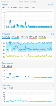
The Power, Temperature and Utilization graphs are pretty easy to figure out. But the Frequency graph — not so much. I guessing that these curves are…
GFX curve = freq of the Intel UHD Graphics 630
Straight Line = Max freq of the cores without TurboBoost
MAX curve = top of the blue shaded area
MIN curve = bottom of shaded area
AVG curve = blue curve inside the shaded area
BUT… what exactly do the MAX, MIN and AVG represent? IOW do the MAX, MIN and AVG curves represent the frequency of the fastest, slowest and median of the 6 cores at any given time? And if so, why do these curves quickly converge above the nominal core frequency even when the Utilization curve barely budges?
Thanks in Advance — GetRealBro
Attachments
Last edited:


