Become a MacRumors Supporter for $50/year with no ads, ability to filter front page stories, and private forums.

primarycolors

macrumors 6502
Original poster
Oct 17, 2015
328
527
CA
I couldn't help but gawk when seeing a friend using iOS 10 with such a cluttered lock screen...

Out of curiosity I did a test by sending multiple one-line messages back and forth between my iOS 6 iPhone 5 and his iOS 10 iPhone 6s.

Despite the iPhone 6s having extra screen size and not having the "slider" at the bottom of the screen... it fits THREE messages (plus the name of a fourth) whereas the iPhone 5 fits EIGHT.

The little rectangles in iOS 10 also make it hard to focus in on the content. Pathetic design, no?
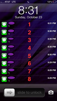
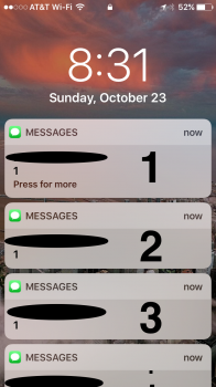
IMG_5580.PNG IMG_5581.PNG
 
  • Like
Reactions: Beeplance
You do see more messages on the left, but at the same time, I would feel more overwhelmed with the left home screen. Also, I think the space for each message is very hard to hit right when you want to interact with the icons on the left home screen. Here you have to hit the icons, while the entire block for a message on the right home screen can be interacted with.

And I also think that it makes more sense that they are using a "block" because this indicates that it can be somewhat played with and moved, while you don't really get that information on the left screen.
 
Guess I'm the minority, I like the way it looks. I can read more of the message and it feels easier to respond.
 
  • Like
Reactions: chabig
Apple is clearly focussing on 3D Touch interactivity now, rather than pure information. This is probably why I find them so repulsive, because I almost never click on them on the lock screen and prefer to have more information at a glance. I was a big fan of the continuous list of notifications in iOS 9, but I actually would prefer to see information grouped again (per app per contact would be nice), now that the density is out the window.
 
  • Like
Reactions: Beeplance
I agree that they use up too much space, but they are also easier on the eyes. If they could just shrink 'em a little, that would probably make for a happy medium.
 
I couldn't help but gawk when seeing a friend using iOS 10 with such a cluttered lock screen...

Out of curiosity I did a test by sending multiple one-line messages back and forth between my iOS 6 iPhone 5 and his iOS 10 iPhone 6s.

Despite the iPhone 6s having extra screen size and not having the "slider" at the bottom of the screen... it fits THREE messages (plus the name of a fourth) whereas the iPhone 5 fits EIGHT.

The little rectangles in iOS 10 also make it hard to focus in on the content. Pathetic design, no?

Let's not forget the fact that a 4" screen showed MORE information-at-a-glance than a 4.7" screen... Definitely a step backwards when additional screen real estate are not properly utilized.
 
  • Like
Reactions: Galacticos
This is where I like Android implementation alot. The notifications are grouped by apps, you can see a small preview, and can pull down on the notification to see all of it. Though I understand iOS allows interactions with individual notifications instead of kicking you straight to the app tho.
 
  • Like
Reactions: BeeGood and jonobin
This is where I like Android implementation alot. The notifications are grouped by apps, you can see a small preview, and can pull down on the notification to see all of it. Though I understand iOS allows interactions with individual notifications instead of kicking you straight to the app tho.
Atm the way android handles notifications is way better than iOS handles them
 
  • Like
Reactions: BeeGood
And for the love of god let us remove all apps in thr app switcher ... really basiccccccccccc stufffff Apple !!!!!!
 
This is where I like Android implementation alot. The notifications are grouped by apps, you can see a small preview, and can pull down on the notification to see all of it. Though I understand iOS allows interactions with individual notifications instead of kicking you straight to the app tho.

All of this could be implemented by developers if they wanted to. The new notification APIs of iOS 10 seem to give developers a lot of flexibility now. They can change existing notifications upon receiving new ones and should be able to collate options in a single or a few notifications. Nobody seems to do this, however.
 
If there is one thing which Android absolutely destroys iOS in its this one.Notifications on Android vs iOS are a night and day difference.The icons in the status bar dont leave me clueless on which notifications I recieved just from a glance .Notifications grouping etc
 
And for the love of god let us remove all apps in thr app switcher ... really basiccccccccccc stufffff Apple !!!!!!

we've seen Apple say that closing apps doesn't effect battery or speed. so in their eyes this one might just be a 'give the customers what they want'. Apple usually know what you want even if you don't though
 
Register on MacRumors! This sidebar will go away, and you'll see fewer ads.