Become a MacRumors Supporter for $50/year with no ads, ability to filter front page stories, and private forums.

MartinAppleGuy

macrumors 68020
Original poster
Sep 27, 2013
2,247
889
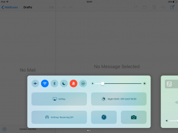
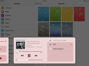
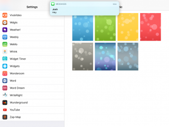
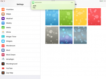
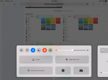
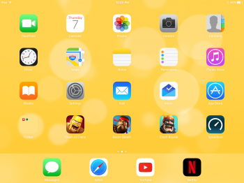
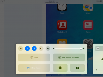
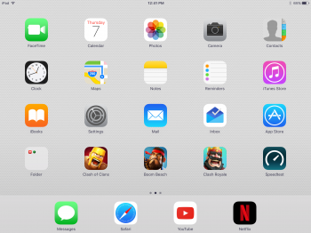
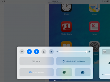
In iOS 9, the control centre would show translucency based on what was behind it. For example, if you were in the mail app ad there was photos of a green car, it would leak the green colours.

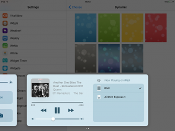
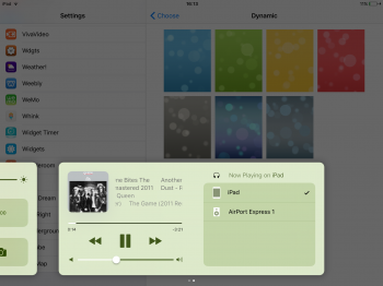
In iOS 10 however, it not only shows content beneath it such as the car example, but will also use your wallpaper as its main colour scheme. I love this change, and feel it would, if implimented more system wide (I'm thinking toggle switch colours in settings and in the keyboard), that it would make for a very personal UI for each individual user without the need for complicated settings. Is was ultimately the aim of some of the original iOS 7 UI choices in the first place.

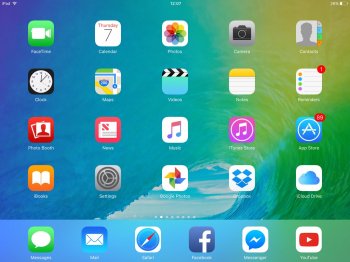
Here is some examples, note of the wallpaper change effects the hue of the control centre:
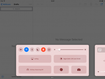
IMG_2758.PNG IMG_2759.PNG Image 10.jpg IMG_2756.PNG
 

ps3zocker

macrumors 6502
May 3, 2012
386
804
They probably do this, so the background isn't plain gray (which it would be on all light backgrounds without much color), which always looked quite bad in previous versions. Same with the Siri color blobs after presenting the results.
 
  • Like
Reactions: na1577 and warden

kmj2318

macrumors 68000
Aug 22, 2007
1,669
712
Naples, FL
This is also done is macOS. I remember right clicking in Safari and noticed that my right click menu had an orange background. I tried somewhere else on the page and it was green. Meanwhile, my safari page was all white. Turns out it was picking up the El Capitan wallpaper colors.
 

LordQ

Suspended
Sep 22, 2012
3,582
5,653
Interesting find. Looks good with light-coloured wallpaper but wow, that red looks so out of place.

Off topic: I hate those big buttons and wasted space on the iPad CC...
 
  • Like
Reactions: na1577

Feenician

macrumors 603
Jun 13, 2016
5,313
5,100
I'm not seeing this behaviour at all on either Sierra or iOS. Notifications on both and control centre on iOS show the content directly beneath them.
[doublepost=1467907861][/doublepost]By way of illustration. You can see your screenshot directly beneath my control centre
IMG_0044.PNG
 

MartinAppleGuy

macrumors 68020
Original poster
Sep 27, 2013
2,247
889
I'm not seeing this behaviour at all on either Sierra or iOS. Notifications on both and control centre on iOS show the content directly beneath them.
[doublepost=1467907861][/doublepost]By way of illustration. You can see your screenshot directly beneath my control centre
View attachment 639353
Your wallpaper must have strong colours and you must have reduce transparency off.
[doublepost=1467908769][/doublepost]
I'm not seeing this behaviour at all on either Sierra or iOS. Notifications on both and control centre on iOS show the content directly beneath them.
[doublepost=1467907861][/doublepost]By way of illustration. You can see your screenshot directly beneath my control centre
View attachment 639353
Maybe it's dependent on the device you're using?
 
  • Like
Reactions: Feenician

Feenician

macrumors 603
Jun 13, 2016
5,313
5,100
Your wallpaper must have strong colours and you must have reduce transparency off.
[doublepost=1467908769][/doublepost]
Maybe it's dependent on the device you're using?

My wallpaper is quite muted and dark. I don't use reduce transparency but you hadn't mentioned that as a pre-requisite. Wouldn't that being doing the opposite of reducing transparency in that case?
 

MartinAppleGuy

macrumors 68020
Original poster
Sep 27, 2013
2,247
889
My wallpaper is quite muted and dark. I don't use reduce transparency but you hadn't mentioned that as a pre-requisite. Wouldn't that being doing the opposite of reducing transparency in that case?
Reduce translucency , as every other version of iOS since 7, would just turn off translucency and make things grey. With your case, it's due to your wallpaper not having a lot of colour to actually seep through to the UI elements.
 
  • Like
Reactions: Feenician

XTheLancerX

macrumors 68000
Aug 20, 2014
1,911
782
NY, USA
I've noticed thi
I'm not seeing this behaviour at all on either Sierra or iOS. Notifications on both and control centre on iOS show the content directly beneath them.
[doublepost=1467907861][/doublepost]By way of illustration. You can see your screenshot directly beneath my control centre
View attachment 639353
its really faint and it takes your wallpaper AND the content below into consideration. Maybe your wallpaper isn't a strong enough color lol.

PErsonally, I hate this change. Now if your wallpaper doesn't have the "right" colors, it will look ugly everywhere, not just on the home screen because of the translucent dock like before.
 

Attachments

  • IMG_0050.PNG
    IMG_0050.PNG
    1.8 MB · Views: 200
  • IMG_0051.PNG
    IMG_0051.PNG
    1.1 MB · Views: 222
  • IMG_0049.PNG
    IMG_0049.PNG
    1.1 MB · Views: 194
  • IMG_0048.PNG
    IMG_0048.PNG
    1.1 MB · Views: 199
  • Like
Reactions: na1577 and Paddle1

Feenician

macrumors 603
Jun 13, 2016
5,313
5,100
Reduce translucency , as every other version of iOS since 7, would just turn off translucency and make things grey. With your case, it's due to your wallpaper not having a lot of colour to actually seep through to the UI elements.

Ah. Crossed wires. I read your post that said "You must have strong colours and reduced transparency off" as you saying I had it off. Instead what you were saying is that to see the effect it must be off. Sentence could be read both ways. :)

You're right - I jut tried a bright wallpaper and I can see it beneath translucent content. Not at all what I'd want in my case and I'm suddenly glad my wallpaper is normally muted
 

Jayson A

macrumors 68030
Sep 16, 2014
2,671
1,935
I think it just gets a color average from your wallpaper, then uses a ghosted back versions of that color for the control center panel but keeps the panel translucent so that other colors show through as well.

I guess it's sort of like applying a theme to your device just based on your wallpaper color.

I personally think it looks bad and I hope there's a way to turn this feature off in the future.
 

XTheLancerX

macrumors 68000
Aug 20, 2014
1,911
782
NY, USA
I think it just gets a color average from your wallpaper, then uses a ghosted back versions of that color for the control center panel but keeps the panel translucent so that other colors show through as well.

I guess it's sort of like applying a theme to your device just based on your wallpaper color.

I personally think it looks bad and I hope there's a way to turn this feature off in the future.
I think it looks horrible too. It totally violates that whole layering thing they introduced with this new UI. And just because someone, for example, wants a flashy yellow wallpaper doesn't mean they want muted nasty yellow banners and control center.
 

jonnyb098

macrumors 68040
Nov 16, 2010
3,987
5,442
Michigan
You know it could be a damn bug which will be fixed in the coming 8 weeks. Maybe flipping out is a bit premature.
 

KALLT

macrumors 603
Sep 23, 2008
5,361
3,378
It does not make any sense at all that these translucent components have shadows too. Control centre and notifications are visually very ‘heavy’ now if the backdrop is bright. This is what Google does with Material Design, only their designers seem to understand that the component itself should at least be ‘solid’ to cast a shadow.
 

Jayson A

macrumors 68030
Sep 16, 2014
2,671
1,935
You know it could be a damn bug which will be fixed in the coming 8 weeks. Maybe flipping out is a bit premature.

I doubt it's a bug since it also shows a bit of what's under it, as well as taking the average color of your wallpaper. It's like they're trying to let you theme the OS in a way to tie everything into the wallpaper color.
 

XTheLancerX

macrumors 68000
Aug 20, 2014
1,911
782
NY, USA
You know it could be a damn bug which will be fixed in the coming 8 weeks. Maybe flipping out is a bit premature.
Yeah I doubt this is a bug because this is something that would take at least some effort to implement. Somebody went out of their way to make this behave this way, so I doubt it's going away to be honest..
 
  • Like
Reactions: na1577

lagwagon

Suspended
Oct 12, 2014
3,899
2,759
Calgary, Alberta, Canada
Yeah I doubt this is a bug because this is something that would take at least some effort to implement. Somebody went out of their way to make this behave this way, so I doubt it's going away to be honest..

It's possible that code is bugged for when an app is in between the CC/pop ups and the wallpaper and isn't pulling whatever app colours and whatever. All these pop ups and CC have been redesigned, it's very possible it's bugged and only using wallpaper colours instead of what is directly behind it at the time.

So it's not entirely true someone went out of their way.
 

XTheLancerX

macrumors 68000
Aug 20, 2014
1,911
782
NY, USA
It's possible that code is bugged for when an app is in between the CC/pop ups and the wallpaper and isn't pulling whatever app colours and whatever. All these pop ups and CC have been redesigned, it's very possible it's bugged and only using wallpaper colours instead of what is directly behind it at the time.

So it's not entirely true someone went out of their way.
Okay lol I just thought it seemed like a pretty deliberate design change but I guess it's impossible to know exactly what is going on either way, we didn't write the code haha.
 
  • Like
Reactions: na1577

lagwagon

Suspended
Oct 12, 2014
3,899
2,759
Calgary, Alberta, Canada
Okay lol I just thought it seemed like a pretty deliberate design change but I guess it's impossible to know exactly what is going on either way, we didn't write the code haha.

It probably is intended, but could get tweaks just like folder translucency changed between beta 1 and 2.

I was just pointing out that it very well could be a bug. Because of its redesigning.
 

XTheLancerX

macrumors 68000
Aug 20, 2014
1,911
782
NY, USA
It probably is intended, but could get tweaks just like folder translucency changed between beta 1 and 2.

I was just pointing out that it very well could be a bug. Because of its redesigning.
Yeah it definitely could get tweaked. They obviously are paying some attention to it as they only just added a drop shadow around it in this build. I see many tweaks to control center and notifications/banners coming, they all seem quite unfinished at the moment. To be expected though, it's a beta haha. It's pretty interesting to see how much stuff gets tweaked and refined before the public release..!
 
Last edited:

lagwagon

Suspended
Oct 12, 2014
3,899
2,759
Calgary, Alberta, Canada
YEah it definitely could get tweaked. They obviously are paying some attanrtion to it as they only just added a drop showdown around it in this build. I see many tweaks to control center and notifications/banners coming, they all seem quite unfinished at the moment. To be expected though, it's a beta haha. It's pretty interesting to see how much stuff gets tweaked and refined before the public release..!

Banners had drop shadows in beta 1. Other ones could be new though.
 

XTheLancerX

macrumors 68000
Aug 20, 2014
1,911
782
NY, USA
Banners had drop shadows in beta 1. Other ones could be new though.
Ah okay I didn't notice the banners but I'm fairly positive that the control center drop shadow is new to iOS 10 beta 2. And I appologize for all the weird typos in my last post, half of the time I'm not even reading what I'm typing because of the bug that shoots you to the bottom of the page when you hit return or backspace!
 
  • Like
Reactions: Shirasaki
Register on MacRumors! This sidebar will go away, and you'll see fewer ads.