Become a MacRumors Supporter for $50/year with no ads, ability to filter front page stories, and private forums.

Joseph C

macrumors 65816
Original poster
Feb 5, 2009
1,353
2,502
Someone on Medium has posted a concept of the iOS 11 UI bringing in more News/Music/Home app UIs with the bold fonts and cards.

1*lc1YbZkZWCD621FZu2awIA.png


1*MfprL2MfKvmU0KQZsSLJcg.png


1*Ehum5QY2kN-ovbrr9QnLCA.png


1*un7-PGBgkLNO3uetb2KItw.png


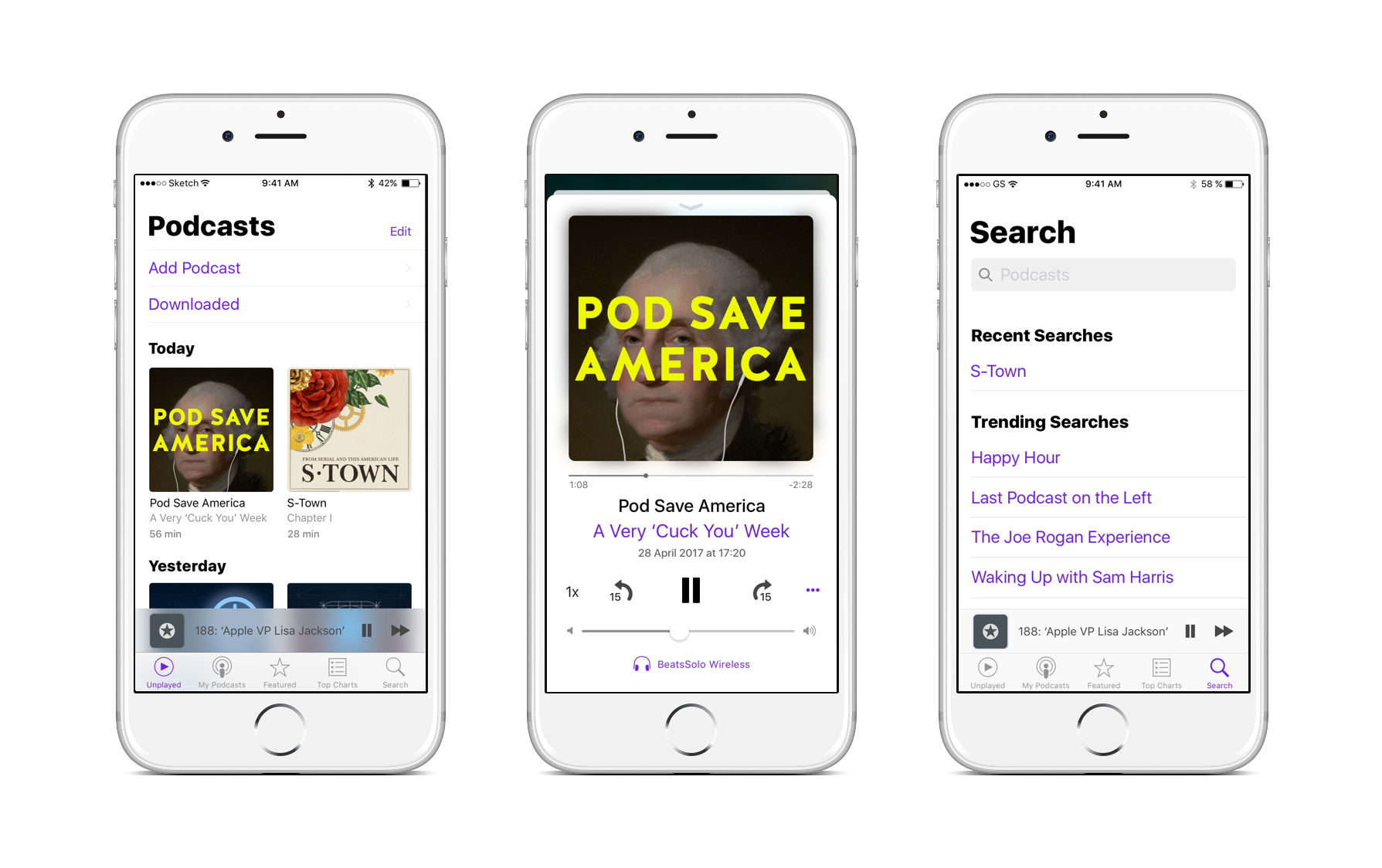
What do people think of this? I personally don't like the bold fonts on Music/News/Home because they jar with the rest of the UI - however if they brought them to the rest of the core apps I would be in favour (especially if a dark mode comes in, the move to all-white over transparency would then make more sense).

Original source + explanation of concept: https://blog.prototypr.io/ios-11-complexion-reduction-apples-new-user-interface-7a04fa46375d
 

KALLT

macrumors 603
Sep 23, 2008
5,361
3,378
Repulsive. I cannot stand space-inefficient UI design on a smartphone. It is out of balance too with the attention-grabbing headline, for absolutely no reason other than silly branding. I think “black”-faced fonts should never be used, period.
 

Joseph C

macrumors 65816
Original poster
Feb 5, 2009
1,353
2,502
I just want the UI to be consistent. We're at a OS X pre-Leopard phase right now - iOS needs its Leopard moment, unifying and consolidating the various UI styles across the board.

I can't see them changing the bold font style on Music, News and Home after one year - though I'd be happy if they did.
 

KALLT

macrumors 603
Sep 23, 2008
5,361
3,378
I just want the UI to be consistent.

Music, News and Home do not have much of a consistent style, if by consistent you mean that they have large fonts and chunky headlines. Compare this also to Maps, which has a completely novel interface. It is difficult to draw a design principle from this, also noting that some of the practices conflict with Apple’s Human Interface Guidelines presently.

Even Leopard was not that consistent. Apple did get rid of ‘brushed metal’.
 

BrettApple

macrumors 65816
Apr 3, 2010
1,137
483
Heart of the midwest
*Hugs iOS 6 running iPhone 4S*

As much as I like my iPhone 7 and iOS 10 for what its worth, I'm finding that I actually still prefer the look and feel of iOS 6 more as time goes on and things get flatter and more uninspiring.

1oewpyMh.jpg


I mean come on, it just looks so inviting! And the music app was best in class and still is IMO. iOS 10's Music app is such a pain to navigate for local libraries.

jWKNiLB.png


RFu8ZaO.png


Anyway, that's just my opinion. I've been using my 4S over the weekend and it's such a joy to use.

I'm really hoping Apple can do something special for iOS 11 and the upcoming iPhone, but we shall have to wait and see.
 

will90039

macrumors member
Oct 12, 2012
56
5
It would be nice if iOS11 supported themes. Then people can customize the fonts and sizes however they want. Android has had this ability forever.
 
  • Like
Reactions: Breezygirl

ThunderMasterMind

macrumors 6502a
Apr 29, 2016
543
521
*Hugs iOS 6 running iPhone 4S*

As much as I like my iPhone 7 and iOS 10 for what its worth, I'm finding that I actually still prefer the look and feel of iOS 6 more as time goes on and things get flatter and more uninspiring.


I mean come on, it just looks so inviting! And the music app was best in class and still is IMO. iOS 10's Music app is such a pain to navigate for local libraries.


Anyway, that's just my opinion. I've been using my 4S over the weekend and it's such a joy to use.

I'm really hoping Apple can do something special for iOS 11 and the upcoming iPhone, but we shall have to wait and see.
Without a doubt, iOS 6 still wins over for experience. iOS 6 however did have a bit of inconsistencies with UIs, but mostly it was relatively organized UIs. The stores had the matte black and grey/white UI. A lot of standard apps used the normal matte blue UI with gloss black tab-bar, camera had the gloss black tab-bar style, then a lot of apps had unique UIs. This is what made iOS 6 so special and cool. Everything you did was fresh and new compared to the other thing you were just doing. You weren't staring at the same thing over and over like you do in iOS 7-10.
 

KieranDotW

macrumors 6502a
Apr 12, 2012
623
68
Canada
*Hugs iOS 6 running iPhone 4S*

Absolutely disgusting.
I for one welcome the concept to which OP linked. Some things look very awkward (messages stands out), but overall I very much agree that iOS needs a redesign and above all a more consistent design language. Incidentally, these big bold headlines appear to be the direction in which Apple is moving (look at the Today at Apple website launched yesterday)
 
  • Like
Reactions: eyeseeyou

Threejw

macrumors member
Jul 13, 2014
75
46
They can introduce themes with limited controls, not 3rd parties required, just UI customization like picking the colors (textures and patterns too), transparency... font size and type... mabey take something from the apple watch and have live interactive backgrounds that changes with the time of day... that kind of stuff... iphone is loosing its magic...
 
  • Like
Reactions: Breezygirl

Adam Warlock

macrumors regular
Jun 22, 2016
221
1,399
Everything you did was fresh and new compared to the other thing you were just doing. You weren't staring at the same thing over and over like you do in iOS 7-10.
Spot on. All that retina-melting white in iOS7+ not only leads to eye fatigue, but is boring as Hell and makes you feel as if you're wandering through the same three hospital rooms over and over again no matter what turns you take, like some freakish iPhone version of Groundhog Day.
 

Jayson A

macrumors 68030
Sep 16, 2014
2,671
1,935
I'm sure I would get used to it like I do with everything else, but my eyes aren't bad and I don't need gigantic fonts.

Oh well. Things don't last forever and eventually you'll have to get a new device.
 

ThunderMasterMind

macrumors 6502a
Apr 29, 2016
543
521
Spot on. All that retina-melting white in iOS7+ not only leads to eye fatigue, but is boring as Hell and makes you feel as if you're wandering through the same three hospital rooms over and over again no matter what turns you take, like some freakish iPhone version of Groundhog Day.
Not only that, but do they not understand that the older design looks 10x sharper and clear on the retina displays compared to the new one? A display doesn't look good unless you present something on it that looks realistic and impressive. In my experience, the flat designs look blurry compared to the old ones and I'm not talking about the actual blurs in the system. I'm talking about normal elements that are flat colors and such. I have examined screencaps of Mavericks on my mac and compared them to the same thing in Sierra, and Mavericks looked the sharpest every time. I did this 2 times, one with my glasses and the other without them and got the same result.
Apple said that they no longer "have" to hide the beauty of the display with shadows and textures, but those things are what people actually look for in a display. A clear picture with deep shadows, wide color gamut and impressive contrast that makes the most lifelike and clearest experience. This pitiful excuse of a design completely throws those things out the window, yet the older devices on the old firmware are the ones that are looking the best. I have yet to see another iPhone that meets the sleek stealthy, and attention grabbing look and experience that the black and slate iPhone 5 did at launch. I love the iPhone 4's design too, but the faded and smaller display turn me towards the iPhone 5. iOS 7-10 doesn't and never will have the same pleasing look and experience that you get with iOS 6, and it's so sad that Apple has lost it's magic touch with this.

IMG_3577.JPG

IMG_3578.JPG
 

cambookpro

macrumors 604
Feb 3, 2010
7,189
3,321
United Kingdom
*Hugs iOS 6 running iPhone 4S*

As much as I like my iPhone 7 and iOS 10 for what its worth, I'm finding that I actually still prefer the look and feel of iOS 6 more as time goes on and things get flatter and more uninspiring.

1oewpyMh.jpg


I mean come on, it just looks so inviting! And the music app was best in class and still is IMO. iOS 10's Music app is such a pain to navigate for local libraries.

jWKNiLB.png


RFu8ZaO.png


Anyway, that's just my opinion. I've been using my 4S over the weekend and it's such a joy to use.

I'm really hoping Apple can do something special for iOS 11 and the upcoming iPhone, but we shall have to wait and see.

That volume control knob which shifts the 'shine' depending on at which angle you held the phone was a really neat touch. I don't yearn to go back to the iOS 6 design language - I, for one, prefer the vast majority of app designs in iOS 7 onwards - but my oh my, I do miss those icons. I've never quite managed to fall in love with the app icons on later versions of iOS, and just wish they'd add a bit more zest back to them. Don't necessarily have to be photorealistic, but surely there's a better alternative to a white shape on a gradient! Seemed to lurch from one extreme to the other.
 
  • Like
Reactions: Tozovac

hailhail

macrumors newbie
Jun 26, 2013
12
0
I've just saw this thread.

Actually, iOS 11 seems to have taked this into account as there are a lot of bold fonts :)
 

Tozovac

macrumors 68040
Jun 12, 2014
3,012
3,220
Absolutely disgusting.
...but overall I very much agree that iOS needs a redesign and above all a more consistent design language.

Just curious, are you suggesting you'd prefer seeing the Music app, podcast app, email, messages, notes, News, etc. apps all look alike from 10 feet?
[doublepost=1501174974][/doublepost]
Not only that, but do they not understand that the older design looks 10x sharper and clear on the retina displays compared to the new one? A display doesn't look good unless you present something on it that looks realistic and impressive. In my experience, the flat designs look blurry compared to the old ones and I'm not talking about the actual blurs in the system. I'm talking about normal elements that are flat colors and such. I have examined screencaps of Mavericks on my mac and compared them to the same thing in Sierra, and Mavericks looked the sharpest every time. I did this 2 times, one with my glasses and the other without them and got the same result.
Apple said that they no longer "have" to hide the beauty of the display with shadows and textures, but those things are what people actually look for in a display. A clear picture with deep shadows, wide color gamut and impressive contrast that makes the most lifelike and clearest experience. This pitiful excuse of a design completely throws those things out the window, yet the older devices on the old firmware are the ones that are looking the best. I have yet to see another iPhone that meets the sleek stealthy, and attention grabbing look and experience that the black and slate iPhone 5 did at launch. I love the iPhone 4's design too, but the faded and smaller display turn me towards the iPhone 5. iOS 7-10 doesn't and never will have the same pleasing look and experience that you get with iOS 6, and it's so sad that Apple has lost it's magic touch with this.

View attachment 700357

View attachment 700358

With Jony's self-mandate to un-do all that Forstall did, and with he & other Apple engineers possibly suffering from snowblindness, becoming so blind & insensitive to things right in front of their face that they no longer see the obvious, I agree it's shockingly awful how much they've veered away from something that was so good before aesthetically *and* functionally.
[doublepost=1501175137][/doublepost]

So looking at the orange & yellow font on the blinding white background...I thought readability couldn't get any worse than light grey text on white, but Jony's team has succeeded in proving me wrong. Is everyone at Apple spending too much time checking out the new building architecture to design something that doesn't look like a rough draft sketch drawn with lemon juice ink?
 
Last edited:
Register on MacRumors! This sidebar will go away, and you'll see fewer ads.