Got a tip for us?
Let us know
Become a MacRumors Supporter for $50/year with no ads, ability to filter front page stories, and private forums.
iPhone iOS 13.4 control center banner
- Thread starter ignatius345
- Start date
- Sort by reaction score
You are using an out of date browser. It may not display this or other websites correctly.
You should upgrade or use an alternative browser.
You should upgrade or use an alternative browser.
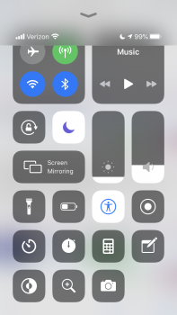
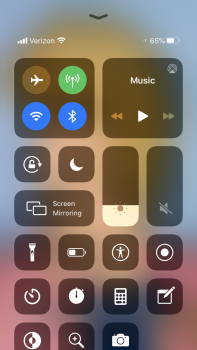
I noticed the same thing on my iPhone 7. My bottom row of shortcuts is partially cut off, I have to scroll up to completely see them. Why in the world did they add the top banner info to the control center screen? It's definitely a waste of real estate.
The only thing they changed was adding the battery and network info.
On iOS 13.3.1 it’s the same real-estate, at least it was for me. If you pull up really far it will cut off the same amount of space.
On iOS 13.3.1 it’s the same real-estate, at least it was for me. If you pull up really far it will cut off the same amount of space.
Right, and that’s enough to push the bottom row of icons down so they’re partially cut off. And if I “pull up really far I see this mess. Sloppy!The only thing they changed was adding the battery and network info.
On iOS 13.3.1 it’s the same real-estate, at least it was for me. If you pull up really far it will cut off the same amount of space.

I don't have that many icons. Just two rows and it looks fine.Right, and that’s enough to push the bottom row of icons down so they’re partially cut off. And if I “pull up really far I see this mess. Sloppy!
View attachment 901426
Ok but the UI allows the user to fill this many rows but awkwardly cuts off part of the bottom row now that that pointless banner is there. It’s very very sloppy design and just feels like a bug. Remember too, this all looked perfectly well fit until this latest addition.I don't have that many icons. Just two rows and it looks fine.
Looks like it was deliberate (#9)

 appletoolbox.com
But it definitely feels poorly done. Once you scroll down to row 3 you can no longer just tap to dismiss the panel. You have to swipe up or scroll back.
Definitely killing my third row to fix this. And wasting like a 5th of my screen!

15 new iOS 13.4 features that you should care about - AppleToolBox
Here are all the best new features you need to know about coming to your iPhone with iOS 13.4, including CarKey, over-air recovery, and more.
 appletoolbox.com
But it definitely feels poorly done. Once you scroll down to row 3 you can no longer just tap to dismiss the panel. You have to swipe up or scroll back.
Definitely killing my third row to fix this. And wasting like a 5th of my screen!
Last edited:
Register on MacRumors! This sidebar will go away, and you'll see fewer ads.


