Become a MacRumors Supporter for $50/year with no ads, ability to filter front page stories, and private forums.

bballers29

macrumors member
Original poster
Mar 10, 2014
76
93
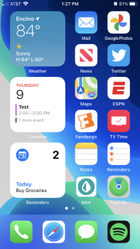
The Public Beta has been really stable for me so far and I love look of smaller widgets lining up on one side of the home screen. Now, I am not a software designer but it just seems like some widgets (calendar and reminders) can display more information than is currently allowed.

For calendar, rather than display the content for one event, it would appear that two calendar events can be shown and then maybe a third line below that specifies how many events are remaining in the day. Reminders is really bad; it can easily show three reminders in the smaller widget, not just one reminder.

I understand they don't want information to be cramped, but this just feels really unpolished.
 

Attachments

  • IMG_0171.PNG
    IMG_0171.PNG
    1.6 MB · Views: 979
I’d like a lot more variety ok content too - eg small calendar month view (I don’t care about events). I hope/expect there may be apps that solely come out to generate widgets which combine various items too (eg date+time+Weather summary)
 
  • Like
Reactions: BulkSlash
3rd party apps will probably take more risks with the information density on their widgets anyway.

I’m not so sure. Apple has been using the term ‘glancability” when talking about widgets. The focus seems to be to get a quick bite of information instead of the wldgets being mini versions of the app. I’d guess that’s the logic behind the different sizes so users can have a choice of how much they see
 
I’m not so sure. Apple has been using the term ‘glancability” when talking about widgets. The focus seems to be to get a quick bite of information instead of the wldgets being mini versions of the app. I’d guess that’s the logic behind the different sizes so users can have a choice of how much they see
That is exactly the purpose of the widgets. I think many people either don’t understand the focus or they want something Apple isn’t offering with the widgets.
 
I get the ‘it’s a beta’ comment when it comes to things that clearly are bugs but that’s not this. Yeah iOS 7 had a lot of changes during the betas but it was a completely brand new UI top to bottom. And clearly rushed at that. I watched the developer session on widget design and they were quite clear widgets are for glanceable information and not meant to be mini-apps. I don’t see Apple changing this stance during betas.
 
I get the ‘it’s a beta’ comment when it comes to things that clearly are bugs but that’s not this. Yeah iOS 7 had a lot of changes during the betas but it was a completely brand new UI top to bottom. And clearly rushed at that. I watched the developer session on widget design and they were quite clear widgets are for glanceable information and not meant to be mini-apps. I don’t see Apple changing this stance during betas.
I agree with what you are saying. I am not suggesting widgets act as mini-apps; I don't need or want to interact with them. All I am saying is that if this is Apple's vision of a final product for widgets then it leaves a lot to be desired. There is enough extra space in the Calendar and Reminders widgets for there to be more information, still be glanceable, and not cross into mini-app territory.
[automerge]1594352309[/automerge]
 
Last edited:
One thing ive noticed and submit feedback on is how super long it takes for the screen time to update. I agree with you about the mini reminders as well. Theres a ton of blank space
 
  • Like
Reactions: bballers29
The smallest battery widget should still include the percentage, it’s pretty useless otherwise

its a little ridiculous how much space those rings take - especially if you only have eg a watch so two rings to fill - and don’t have a percentage. And the old widget has gone now, so this is the only one they give you the option to use. For now its on the left ‘today’ view so its wide enough to show percentages but its still comically large
 
  • Like
Reactions: pacorob and itsmilo
Add me to the list of preferring the small widgets.

One thing I have noticed is when you have the small widgets the space between the bottom of the widget & top of the dock is larger than the space at the top of the phone. I know this seems trivial however aesthetically it just looks unbalanced. Don’t know if this is just me , but looks as though they need pushing down a tad so everything was balanced.
[automerge]1594388220[/automerge]
its a little ridiculous how much space those rings take - especially if you only have eg a watch so two rings to fill - and don’t have a percentage. And the old widget has gone now, so this is the only one they give you the option to use. For now its on the left ‘today’ view so its wide enough to show percentages but its still comically large

Totally agree. I prefer small widgets & it’s crazy the size the battery widget it. Totally agree that the % should be in the middle of the ring. I hope will be added in future betas but I’m not holding my breath.
 
I agree with what you are saying. I am not suggesting widgets act as mini-apps; I don't need or want to interact with them. All I am saying is that if this is Apple's vision of a final product for widgets then it leaves a lot to be desired. There is enough extra space in the Calendar and Reminders widgets for there to be more information, still be glanceable, and not cross into mini-app territory.
[automerge]1594352309[/automerge]
While I agree with some of your points, I don’t think anything is going to change much. The idea is to have the information displayed in a widget (for example, a calendar entry) deep-linked to the app, so that when you tap on the entry, you’re taken directly to that specific entry within the app. The guidelines say that only one tap target is allowed in a small widget. You can read more here about how Apple wants the widgets to work...
 
  • Sad
Reactions: pacorob
While I agree with some of your points, I don’t think anything is going to change much. The idea is to have the information displayed in a widget (for example, a calendar entry) deep-linked to the app, so that when you tap on the entry, you’re taken directly to that specific entry within the app. The guidelines say that only one tap target is allowed in a small widget. You can read more here about how Apple wants the widgets to work...

so that immediately rules out something relatively simple like a hue/harmony active widget. If you look at the battery 2x2 widget for example, that looks plenty large enough to have four clear touch targets that would work well as hue/smart switch shortcuts - it literally takes up more space than 4 separate touchable app icons. What an odd limitation.
 
so that immediately rules out something relatively simple like a hue/harmony active widget. If you look at the battery 2x2 widget for example, that looks plenty large enough to have four clear touch targets that would work well as hue/smart switch shortcuts - it literally takes up more space than 4 separate touchable app icons. What an odd limitation.

That makes things less good I really hope that we can keep the Today View widget in iOS14 as they are still available now in iOS14 public beta where I can still use widgets with buttons or quick contact launchers such as Launcher, Music Launcher, BeWeather 3, Forecast Bar.
 
Any chance of getting notification badges on the widgets? For now I'm using the Calendar widget as a replacements for the Calendar app icon on my home screen, but if I get a notification it goes to the app and not the widget.
 
The smallest battery widget should still include the percentage, it’s pretty useless otherwise
It's still easier to read than the little bar at the top, but mine look weird now. They are both around 94% but the rings are full as if they were 100%
 
Add me to the list of preferring the small widgets.

One thing I have noticed is when you have the small widgets the space between the bottom of the widget & top of the dock is larger than the space at the top of the phone. I know this seems trivial however aesthetically it just looks unbalanced. Don’t know if this is just me , but looks as though they need pushing down a tad so everything was balanced.
[automerge]1594388220[/automerge]
I believe that this is not due to using small widgets. It looks like the space above the dock is larger no matter what.
 
so that immediately rules out something relatively simple like a hue/harmony active widget. If you look at the battery 2x2 widget for example, that looks plenty large enough to have four clear touch targets that would work well as hue/smart switch shortcuts - it literally takes up more space than 4 separate touchable app icons. What an odd limitation.
I’d also like a harmony widget. I added my harmony hub to homekit and siri can turn stuff on for me now.
 
I agree with what you are saying. I am not suggesting widgets act as mini-apps; I don't need or want to interact with them. All I am saying is that if this is Apple's vision of a final product for widgets then it leaves a lot to be desired. There is enough extra space in the Calendar and Reminders widgets for there to be more information, still be glanceable, and not cross into mini-app territory.
[automerge]1594352309[/automerge]

I disagree, widgets should have some interaction, that's what made Android widgets so great. Some of the iOS13 3rd party widgets have interaction in them which I use all the time like Widgetcal where firstly you can see an entire week or month of appointments (which lines up with your want for more details inside a widget) and you can start a new appointment, switch weeks/months, etc right from the widget. Pcalc is another nice one, calculate right inside the widget. Even just a shortcut inside the widget is interaction so I'd argue that widgets with shortcuts to functions which open the app are mini apps. Heck just a widget with shortcuts to other apps has interaction, something like Magic Launcher.

iOS14 widgets are alarming in that it seems Apple wants to take a step BACK and further "simplify" widgets, which would be a real shame. That entire theme of making things more complex by thinking they are more "simple" is what holds back iOS in a lot of ways IMO.
 
  • Like
Reactions: pacorob
Register on MacRumors! This sidebar will go away, and you'll see fewer ads.