Become a MacRumors Supporter for $50/year with no ads, ability to filter front page stories, and private forums.
The tab/address bar on the bottom just makes sense. Pretty much from the beginning of app development, we realized putting the controls at the bottom was better. I don't know how it took this long to move the primary controls of a browser to the bottom also. This is especially better for larger devices.

Still, it's nice to have the option for those who can't handle change.

Is it just me or does having the tab/address bar at the bottom use up more vertical screen space on the iPhone?
I too think it makes more sense at the bottom, but switched back since I didn't want to sacrifice screen space even if it may be minimal.
 
people use safari?
Yes https://en.wikipedia.org/wiki/Usage_share_of_web_browsers

images
 
  • Like
Reactions: icanhazmac
Does Apple ever update Safari on Mac by itself? Like bug fixes, etc? Or is it only as part of .x OS updates like everything else?
 
Is it just me or does having the tab/address bar at the bottom use up more vertical screen space on the iPhone?
I too think it makes more sense at the bottom, but switched back since I didn't want to sacrifice screen space even if it may be minimal.
Negligible at best. The bar appears to be taller... but doesn't change much of what you can see.

safari.jpg


Either way, it still disappears the moment you scroll the page.
 
OMG, I am so glad they included the option to keep the search/URL bar at the top. The number of times I tapped on the top of a page to enter an address or search query was driving me nuts. There's years of muscle memory to unlearn, and since I have a small device, reaching the top of the screen with my thumb is not an issue. I'm not ready to change yet. I'll re-evaluate if I get a larger device, but for now, my search and address bars are at the top.

I wonder why we can't have the new-style tab bar, just relocated to the top of the screen, instead of having to default to the old style bar? I don't mind the new bar, I just can't work with the new location.
 
Negligible at best. The bar appears to be taller... but doesn't change much of what you can see.

View attachment 1841911

Either way, it still disappears the moment you scroll the page.

I should have made it clear, but I was talking about the vertical screen space when scrolling.
Like it is here (left old, right new layout).

IMG_4704.PNG
IMG_4707.PNG


Disregarding any area from where the notch starts and above, the old layout has a single horizontal bar that's not part of the web content. The new layout has two horizontal bars one at the top and one at the bottom. Not only does it have an additional bar, the one at the bottom is noticeably larger/thicker than the old single bar.

As for actual measurements for those wondering.
Old is 1/4 inch taller than the new layout.

Sure some may argue it's still negligible, but the old layout extends fully down to the bottom edge of the screen giving a more immersive feel as opposed to the boxed in look of the new layout. Personally, I find the new layout sorta defeats the purpose of having a curved screen with a thin bezel ("thin" in Apple terms).

FYI, the screenshots don't show the curved corners.
 
Last edited:
  • Like
Reactions: Phoenix1000
I should have made it clear, but I was talking about the vertical screen space when scrolling.
Like it is here (left old, right new layout).

Disregarding any area from where the notch starts and above, the old layout has a single horizontal bar that's not part of the web content. The new layout has two horizontal bars one at the top and one at the bottom. Not only does it have an additional bar, the one at the bottom is noticeably larger/thicker than the old single bar.

As for actual measurements for those wondering.
Old is 1/4 inch taller than the new layout.

Sure some may argue it's still negligible, but the old layout extends fully down to the bottom edge of the screen giving a more immersive feel as opposed to the boxed in look of the new layout. Personally, I find the new layout sorta defeats the purpose of having a curved thin bezel ("thin" in Apple terms) screen.

FYI, the screen shots don't show the curved corners.

Ahh, fair enough. There is indeed a difference there. Mostly because they made the bottom opaque in the new layout.

A bonus, however, of having the domain at the bottom is that you can use the invisible "scroll to top" button without having to expand out the bar first.

The bottom tab bar is probably taller so it's a larger target to swipe on for the tab groups. That feature alone is enough for me to switch. Swiping between tabs is great... just like swiping between apps.

To each their own though. Cheers!
 
  • Like
Reactions: iamPro
Ahh, fair enough. There is indeed a difference there. Mostly because they made the bottom opaque in the new layout.

A bonus, however, of having the domain at the bottom is that you can use the invisible "scroll to top" button without having to expand out the bar first.

The bottom tab bar is probably taller so it's a larger target to swipe on for the tab groups. That feature alone is enough for me to switch. Swiping between tabs is great... just like swiping between apps.

To each their own though. Cheers!

Yes, to each their own.

Well, I'm not set in stone on either one just yet.
Will be experimenting with both for the time being.
 
Wow, I'm completely disappointed from Apple. Just installed the new Safari release 15.0. Unintentionally I created a tab group with the windows from my three Synology NAS. Then I recognized the following behavior:
- Log into the NAS -> DSM opens up (Synology OS)
- Open a window which has s scroll bar
- Scroll down the window content right to the end
=> The whole Safari window shakes. If you scroll down a little bit further, a bar with the name of the next Synology NAS appears on the bottom of the window. Scrolling down even further brings up the the Log in screen from this NAS. What???

Because all the three windows I accidentally grouped where Synology NAS DSM screens, I first suspected Synology of having created this evil feature. But no, it was APPLE!!! I'm speechless. Apple creates such a bad and completely unusable functionality?!? I know these kind of badly designed and implemented features from Microsoft and this was one big reason for me to switch to Apple.

In the beginning, the Apple UI was very clear and stylish. Usability was perfect! Intuitive in handling with a kind of simplicity that astonished me sustainably. But today, every release puts tons of unnecessary new features on the OS to make it less and less usable. Instead of using the human resources at Apple to improve stability and performance of the OS, useless new features are designed to satisfy stupid analysts and boost share prices. For me, I don't need that! How about a new release with ZERO new features but improved stability, security and performance? Can you do that, Apple?

Sorry for me writing down the frustration from my soul, but that really shook the picture and the understanding I had from Apple since nearly ten years now. If somebody would have shown me this feature, I would have bet anything that this will never been developed from Apple. This feature would have had no chance to pass the testing at Apple. But it had. Perhaps, Apple has not enough money for proper testing left?
 
Last edited:
Wow, I'm completely disappointed from Apple. Just installed the new Safari release 15.0. Unintentionally I created a tab group with the windows from my three Synology NAS. Then I recognized the following behavior:
- Log into the NAS -> DSM opens up (Synology OS)
- Open a window which has s scroll bar
- Scroll down the window content right to the end
=> The whole Safari window shakes. If you scroll down a little bit further, a bar with the name of the next Synology NAS appears on the bottom of the window. Scrolling down even further brings up the the Log in screen from this NAS. What???

Because all the three windows I accidentally grouped where Synology NAS DSM screens, I first suspected Synology of having created this evil feature. But no, it was APPLE!!! I'm speechless. Apple creates such a bad and completely unusable functionality?!? I know these kind of badly designed and implemented features from Microsoft and this was one big reason for me to switch to Apple.

In the beginning, the Apple UI was very clear and stylish. Usability was perfect! Intuitive in handling with a kind of simplicity that astonished me sustainably. But today, every release puts tons of unnecessary new features on the OS to make it less and less usable. Instead of using the human resources at Apple to improve stability and performance of the OS, useless new features are designed to satisfy stupid analysts and boost share prices. For me, I don't need that! How about a new release with ZERO new features but improved stability, security and performance? Can you do that, Apple?

Sorry for me writing down the frustration from my soul, but that really shook the picture and the understanding I had from Apple since nearly ten years now. If somebody would have shown me this feature, I would have bet anything that this will never been developed from Apple. This feature would have had no chance to pass the testing at Apple. But it had. Perhaps, Apple has not enough money for proper testing left?

I just opened a DSM window in safari, opened the DSM Help app, scrolled both the left and right panes all the way to the bottom, and nothing weird happened at all.
 
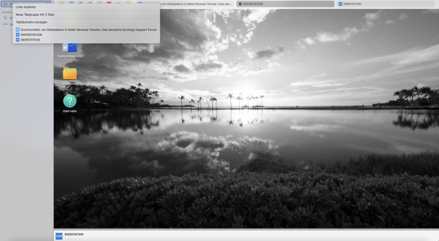
@cmaier: Thank you for your answer. Please have a look in the attached screenshot. Unfortunately it's in German, but I think, you will see, what I mean. I have opened three tabs. Two of them from my Diskstations named "RAPIDSTATION" and "SIDESTATION". If I scroll down on the DSM screen of "RAPIDSTATION", the bar on the bottom with the name of the "next" Diskstation - here "SIDESTATION" appears. I assume this is the case, because both tabs from the Diskstations and another tab are part of a tab group as you can see in the upper left corner of the screen. And that's the problem. I've found no way to deactivate these tab groups - grrrr. If I now open up a window in DSM and scroll down the window to the bottom, the same bar on the bottom of the DSM page appears. That's really annoying. So the only solution for now is using Firefox. Can you reconstruct this behavior?
 

Attachments

  • Screenshot DSM 02.png
    Screenshot DSM 02.png
    1.3 MB · Views: 62
Last edited:
@cmaier: Thank you for your answer. Please have a look in the attached screenshot. Unfortunately it's in German, but I think, you will see, what I mean. I have opened three tabs. Two of them from my Diskstations named "RAPIDSTATION" and "SIDESTATION". If I scroll down on the DSM screen of "RAPIDSTATION", the bar on the bottom with the name of the "next" Diskstation - here "SIDESTATION" appears. I assume this is the case, because both tabs from the Diskstations and another tab are part of a tab group as you can see in the upper left corner of the screen. And that's the problem. I've found no way to deactivate these tab groups - grrrr. If I now open up a window in DSM and scroll down the window to the bottom, the same bar on the bottom of the DSM page appears. That's really annoying. So the only solution for now is using Firefox. Can you reconstruct this behavior?

Ich spreche auch Deutsch. I cannot replicate this behavior.
 
Register on MacRumors! This sidebar will go away, and you'll see fewer ads.