Become a MacRumors Supporter for $50/year with no ads, ability to filter front page stories, and private forums.

MacRumors

macrumors bot
Original poster
Apr 12, 2001
65,942
34,731


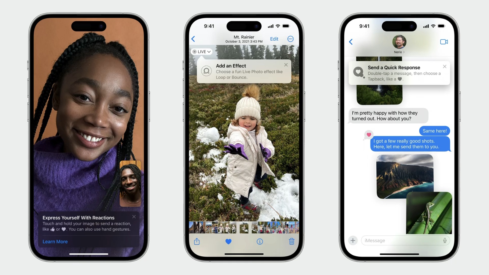
Apple at WWDC this week announced a new TipKit framework that will allow developers to offer tips in their apps on iOS 17, iPadOS 17, macOS Sonoma, watchOS 10, and tvOS 17. These tips can help to surface hidden features, highlight brand new features, show a faster method of accomplishing a task, and more.
TipKit.jpg

Tips may appear next to a button or other user interface element in an app at timely moments, providing contextual information about features. Of course, apps can already offer their own tips and helpful information, but Apple is now providing a native solution with a consistent design. Apple has a WWDC session with more details for developers interested in TipKit, but there is no documentation available yet.

iOS 17, iPadOS 17, macOS Sonoma, watchOS 10, and tvOS 17 will be released to the public later this year, and more apps should start to incorporate TipKit over the coming months. All of the updates are available in beta now for anyone with a free Apple developer account, and public betas will be available in July.

Article Link: iOS 17 Apps Can Offer Tips to Help Users Discover Hidden Features
 
Last edited:
System 7 is back, baby! This is tech from the 90’s for those of you not old enough to remember.

Sadly, it’s also a reminder that this is no longer Steve Jobs’s Apple that so many have fallen in love with. Instead, it’s the fat, lazy, bureaucratic version with some remnants of Steve’s DNA, and rather than working harder to make things easier and more intuitive, they’re reviving old ideas to mask the growing complexity of iOS.
 
Maybe Apple use it themselves, Preferences are way out of control with almost zero l explanation or descriptive labels for what each of them do.

Yeah, on one hand, it’s incredible how fast these phones have advanced, but all the features have resulted in so many settings and menus, some of them easier to decipher than others. I don’t have a good solution, but hopefully they’ll innovate simplification of settings.

On topic, I think this is a good feature and I hope Apple implements it well within their own apps and OS navigation. There’s always cool features I either forget about or didn't previously know existed.
 
  • Like
Reactions: phenste
Hopefully, unlike icloud app integration, users can globally disable this.
It’s an API app developers can use in their own apps. I don’t think it would be obvious to have a global disable.
 
I hope it can be turned off in a central location.

I noticed this creeping into iOS everywhere, it's very annoying.

Apple used to be the only company who was aware that more dialogs and more things that get between you and what you wanted to do are always a detriment to the user experience.

Now they go the way of Windows / other platforms, where more of a user's time must be spent on satisfying the needs of the computer, than the other way around.

Oh, you want to make a bank transfer - alright but before you can do that you have to click away this intro dialog, and these support info bubbles, and consent to something.... a worse user experience than letting me just do the thing I wanted to do.

So the system becomes more self-serving, and less user-serving.

Soon I am working for the machine, not the machine for me.
 
yall referencing Clippy (speaking as someone whose first real memories of computing are Windows 2000 -> XP) are hilarious…I think this is yet another of many examples in iOS 17 where they are refining the UX and making features that are only known by power users/those who keep up on the updates (e.g. us MR readers) accessible to a broader audience. when I got a tip about editing/unsending texts on the dev beta, I was just like "wow, thank God, I don't need to go around telling all of my friends that they can do this now." it's not some hidden surprise to find, like in a Mario game—it's a feature laid out, plain and simple, with an easy way to dismiss the tip.

with any luck they'll at least add a toggle (edit: for first-party apps at least, shoutout to @cyanite for mentioning that a global toggle doesn't make sense when they've added a whole API for this) for those of us that do obsessively keep up on every small detail of an OS update, lmao
 
iOS interface has always been inefficient, but it was simple to understand, so good for boomers, and why iOS dominated in the US. Now it is still inefficient yet the interface is increasingly complex and difficult to understand with each new version. GUI operations on iOS take many more presses, swipes, and digging through obscure “menus” to get simple tasks done, compared to Android. If you’ve never used a stock Android installation, find one and play with it for 15 minutes. Prepare to have your mind blown. I remember when Apple had interface guidelines. What happened?
 
  • Like
Reactions: redbeard331
Register on MacRumors! This sidebar will go away, and you'll see fewer ads.