Become a MacRumors Supporter for $50/year with no ads, ability to filter front page stories, and private forums.

MacRumors

macrumors bot
Original poster
Apr 12, 2001
67,488
37,763


Apple announced iOS 18 today with two notable changes for the Home Screen: the ability to place app icons anywhere, and a dark tint option for app icons.

iOS-18-Home-Screen.jpeg

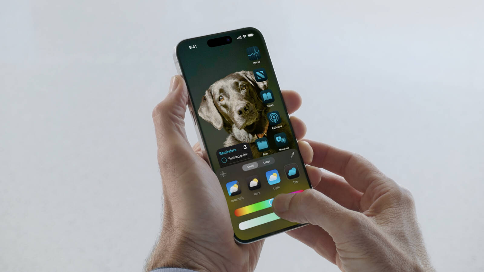
iPhone users can now place app icons anywhere on the Home Screen, although they still must conform to an invisible grid. In other words, Apple now allows blank spaces, rows, and columns between app icons, which can reveal more of the wallpaper.

App icons can now have a dark or tinted appearance, with many color options available. Icons can be manually set to appear in dark or light mode, or they can automatically switch based on whether Dark Mode is turned on or off on the iPhone.

MacRumors was first to report about the ability to place app icons anywhere on the Home Screen, and the darker tint option, prior to WWDC.

Read our iOS 18 announcement coverage for more details about the update, which is now available in beta for members of the Apple Developer Program.

Article Link: iOS 18 Home Screen: Place Apps Anywhere and Dark Mode for Icons
 
Last edited:
As a long time Android Nexus and Pixel owner, as silly as it might seem, being able to move icons in any number (within the available space) and anywhere on the screen in IOS might finally be reason I switch to an iPhone. But it is laughable that it has taken this long to get that functionality.
 
Every additional OS update there is less and less of a reason to use Android...
Translates to:
Android has had more of these features for many years and Apple has been Very slowly coping them so that poor iOS users get basic things.
I like macs and own an iPad but iOS / iPadOS is still brutally lacking.
Phone still has to be Android but it's gotten slightly better last two years or so as you say.
Might actually consider switching the whole ecosystem next year with m4 studio launch and hopefully many more improvements to phone and watch.
iPad is a toy/extra and going to be forever so whatever but the phone especially needs to be better.
 
  • Like
Reactions: jamezr
I hope that there is an option to opt out of the florescent inverted looking icons when using dark mode and that it's not an automatic thing locked to and tide to dark mode.

iOS has basically looks the same since 2013, so I was hoping for an overall design change adding subtle matte textures, shadowing and with better, more creative icons, not glyphs on tiles. Hard to believe that we are still doing the flat across the board look, but now with color tinting, 11 years later.
 
Last edited:
Are we sure we can put them... "anywhere"? Didn't they show you can snap it to edges but not really have one icon just floating detached from the others?
 
I just want to be able to have more than 4 icons in a row or in my dock is that too much of an ask?

They seem to have bigger app icons this year … what about smaller ones!
I just put a folder on the dock. Sure, adds a tap, but it's not that bad.
 
Man I was off the mark with this one! I thought Apple would never in a million year let us pick colors for ourselves but I stand corrected

Flexible layouts are also a nice addition I can’t wait to play it

Overall just back to back bangers, they really cooked with this release
 
Register on MacRumors! This sidebar will go away, and you'll see fewer ads.