Become a MacRumors Supporter for $50/year with no ads, ability to filter front page stories, and private forums.

MacRumors

macrumors bot
Original poster
Apr 12, 2001
68,574
39,430


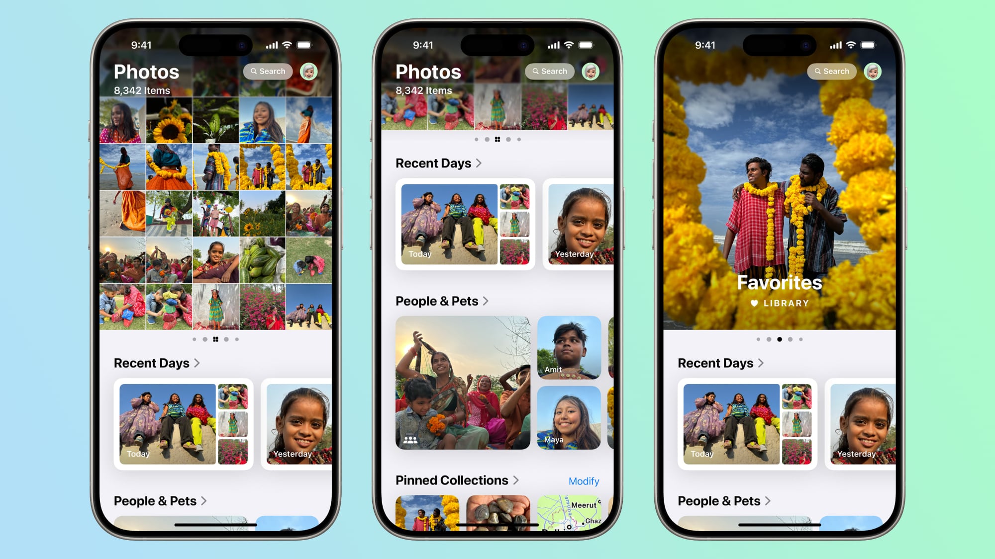
When Apple released iOS 18 in September, it introduced an overhauled Photos app, dropping on users the biggest change to photo management on iPhone since the app's introduction. MacRumors forums users have been particularly vocal about the redesign – some have praised the AI features, but others have called for a return to the simpler interface of iOS 17.
ios-18-photos-app.jpg

The company has made much of Apple Intelligence, so it's no wonder that at the center of Apple's overhaul is an attempt to leverage AI and machine learning to simplify photo organization while introducing a more modern aesthetic. The major changes include a unified scrollable interface that replaces the traditional tab system, smart collections that automatically group photos by occasions like "Recent Days" and "Trips," and significantly enhanced search capabilities that understand natural language queries.
Photos Redesign Draws Common Criticisms

These changes are supposed to accurately represent Apple's vision for a more intelligent photo management system, but reception remains decidedly mixed. Many users have found the transition jarring, with several recurring complaints emerging across social media and Apple community feedback:
  • A cluttered interface that makes finding specific photos difficult
  • Confusion from redundant auto-generated albums and collections
  • Photos and videos no longer defaulting to full-screen viewing mode
  • Removal of traditional navigation tabs like "Library" and "Albums"
  • Overemphasis on AI features at the expense of simple organization
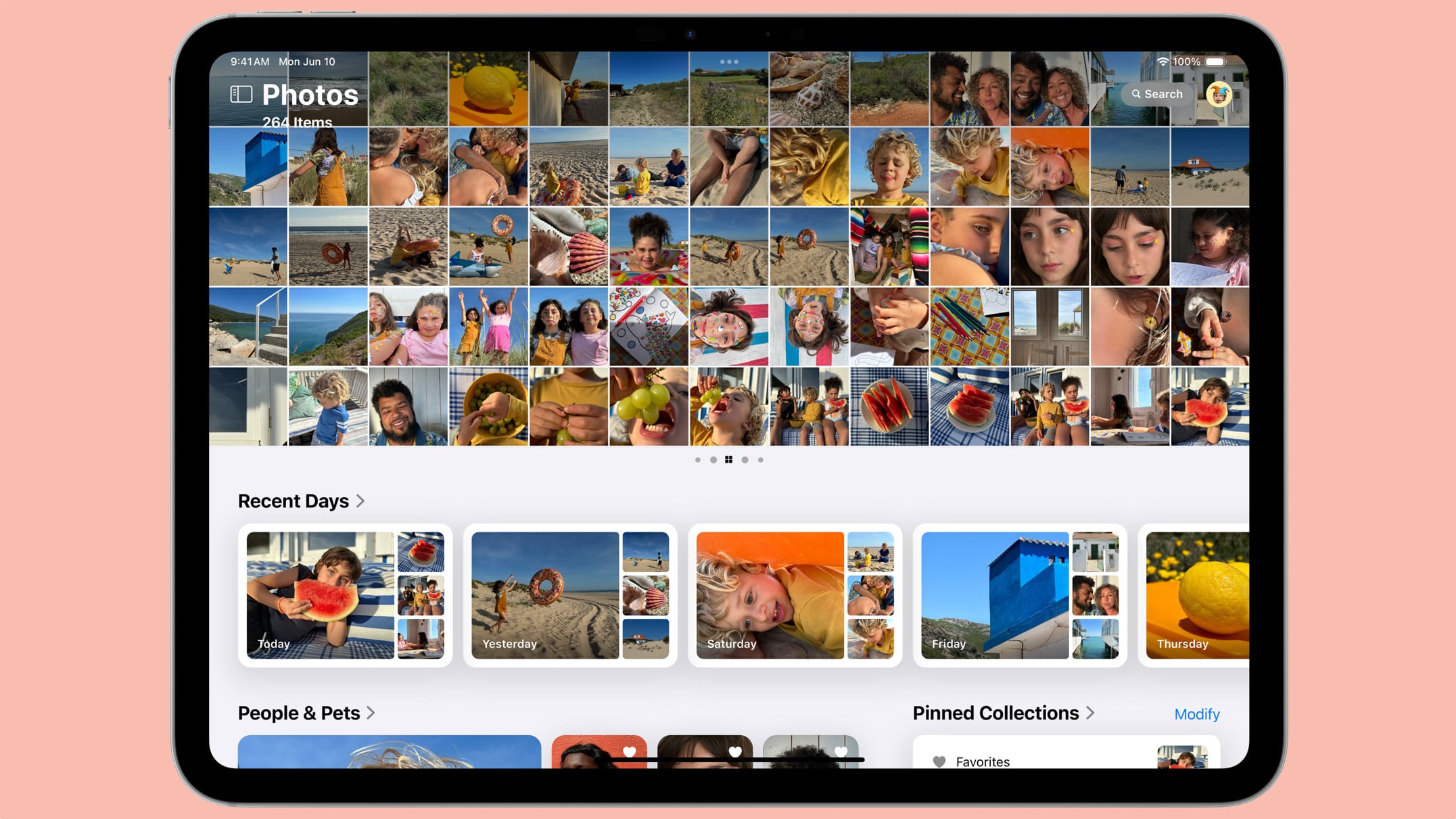
In response to both pre- and post-release feedback, Apple has implemented several updates through iOS 18 betas and point releases. For example, the company removed the controversial Carousel feature that displayed daily highlights, reintroduced the familiar pinch-to-zoom navigational gesture, and will soon improve the video player interface by removing the borders during playback. But is it enough?

ipados-18-photos-app.jpg

The Photos app represents one of the most significant overhauls to a core iOS app in recent years. Some argue it was a step in the right direction, but others see it as a regressive move prompted by Apple's rivals offering more and more AI-oriented photography features. We'd love to hear your thoughts on the Photos app redesign. Barring a complete reversion back to the original interface, what features would you like to see Apple add or remove in future updates?

Article Link: iOS 18 Photos App Redesign: Two Months Later, Users Still Divided
 
I can’t be the only one who thinks this is the best thing that’s happened to the app. You can literally set the entire bottom half to be whatever you want. You can choose what’s hidden and what’s not, and in what order everything is in. So much more visually pleasing too.
 
It is too cluttered and overwhelming for some folks. Not the best decision Apple made but a classic example of if it ain’t broke, don’t fix it.

Photos > go to the very bottom > Customise > turn all the junk off apart from utilities.

Problem somewhat solved.
 
Last edited:
I can’t be the only one who thinks this is the best thing that’s happened to the app. You can literally set the entire bottom half to be whatever you want. You can choose what’s hidden and what’s not, and in what order everything is in. So much more visually pleasing too.
The much-needed search function is still at the opposite end of the phone to my thumbs though. The rest I can live with.
 
It’s s***. So much so I’m now in the process of moving to Synology photos / Immich.

Why can’t I skip easily on a video?
Why does Photos keep going full screen then back to preview regardless of how I hold the phone or scroll through photos?

Frustrating, massively frustrating.

Where has the previously easily accessible favourites album disappeared to? I have to type favourites into the search function.
 
Me and my wife both hate it.

In the entire system the swipe from the left edge to the center of the screen results in the navigation to previous screen.

It works the same way in new Photos app in individual albums created by user. BUT, in Photo Library, which is the main area of the Photos app, the same swipe will lead to switching the view from "All" to "Months" which is VERY frustrating. It is so inconsistent and it is so inconvenient, and it drives crazy every person I asked about it. Navigation happens far more often than changing the view to Month/Year. And in the entire system you cannot find a place where navigation to previous screen happens by tapping on floating "X" button. It is either Back button on top area of the screen or the gesture.
 
On the fence. I like the customization a lot. However, the big thing that's a turn off for me, is the inconsistent interface. You think that option is under the ... NOPE, it's down below. Oh, you want to select all? Good luck seeing some of the interface buttons up top. It just isn't designed well in that respect. The old one I know and love yes, but after having the new one, it seems very dated. Fix the interface and you might have something.
 
I don't understand the Photo App honestly.
I have no idea how to move a photo to a collection/folder...

In my opinion - maybe I am getting too old for this - this is one of the least well implemented app from Apple.
Again - for me.
 
Meh. I customized it and now I don't even think about it anymore.

Then again, I do very little with the photos app in general (a place to store photos and share them), so I get that other people may have different experiences.
 
Register on MacRumors! This sidebar will go away, and you'll see fewer ads.