Become a MacRumors Supporter for $50/year with no ads, ability to filter front page stories, and private forums.
Go get an XR if you don’t like it.

You need to get with the times and move forward
I have an XR and as well as a 16 Pro Max - the former is anaesthetically more pleasing with the old interface.

Anyway, the changes I'd love to see:
  1. Fix the 🤬 keyboard bug (see MR forum link). Shame on Apple for even releasing an iOS to the consumer that can't even get typing right.
  2. Use the AI capabilities of the iPhone to make an accurate context-aware spelling and grammar checker. Text-checkers have not improved at all since the 1980's, and that's pathetic.
  3. Stop making life difficult for people with visual impairments by adopting functionally vacuous and inert style changes like liquid glass that make the user interface harder to see.
 
It seems like the cute Liquid Glass animations exist only because Apple wants to justify the GPU power that is going to waste otherwise. The animations don't really add anything desirable.
Yep, quite the opposite, in fact. Liquid Glass has been the stupidest design - change for the sake of change. Nothing is more easily legible with iOS 26. Nothing.
 
Top ten I'd like in 26
Fix battery drain on watch and phone
Make keyboard functional
Fix the workout app
Get rid of pointless animations (or make it an option)
Let us go back to iOS 18
Add the remote app like in the old days (control panel is miserable)
Get watch fitness to work with headphones
Fix the floating miserable safari bar/bookmarks fiasco
Get Siri marginal useful for even shutting off TV
Let us go back to 18

That’s my list.
One more thing: Bring back iOS 6 - the best iOS ever.
 
  • Haha
  • Love
Reactions: NetMage and B4U
Am I the only one who does not care about Liquid Glass, and all the other useless sh*t, that Apple has developed over the last five years?.

Apple, how about developing a “Siri” that actually is useful?
As poster #39, reading only a few posts ahead would answer your question
 
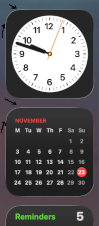
You can’t get rid of the silly borders around icons and widgets, and icons still have a fuzzy look.
What's worse is when you look at the silly white borders on elements on OS X on a large high resolution screen and see them as a mass of jaggies. Without motion sensors, and in dark mode, it's a nightmare.
 

Attachments

  • Screenshot 2025-11-23 at 09.48.03.png
    Screenshot 2025-11-23 at 09.48.03.png
    169.8 KB · Views: 9
THAT is what they're changing in Podcasts? Not an option to play the next episode in a show? Not a way to exit a podcast without playing a different one? Not a way to see my downloaded shows on the homepage? Mmkay.
Yeah. Podcasts app is really difficult to actually use. Every thing seems buried in a submenu somehow. Like many thing in ios now.
 
OS 26 looks horrible. I hope Apple will give us some options to change it back to normal look. I am so mad that I overwrited my iPhone backup from iOS 18.
 
  • Like
Reactions: TJFDenver
One more thing: Bring back iOS 6 - the best iOS ever.

No that title goes to iOS/iPadOS 15 for the best OS.

(though 3GS users were the most luckiest ones to get iOS 6 compared to the OG iPad/3rd gen touch and although the 4th gen touch got it it was so bloody slow)
 
I was excited about the Liquid Glass design when it was first announced.. but to this day, I'm still on 18.7.2 on my 14PM because Apple messed it up so bad and in the end, the liquid glass is just a cosmetic gimmick... Shame :(
 
  • Like
Reactions: VulchR
No that title goes to iOS/iPadOS 15 for the best OS.

(though 3GS users were the most luckiest ones to get iOS 6 compared to the OG iPad/3rd gen touch and although the 4th gen touch got it it was so bloody slow)
iPadOS 15 is what ruined the iPad. iPadOS 14 was the last good release.

And iOS 6 didn’t really slow down the 4th generation iPod touch that much. iOS 9 to the 5th gen on the other hand…
 
CarPlay: Please let us lock apps in the "dock" on the left.

For me personally, I want Maps, Podcasts, Messages. I never want the phone app to show up there. If the phone is there in the lowest spot, and someone texts you, you can miss the text until you go back to your home screen.

Or, on screens that are bigger, let us have more than 3 apps in the dock.
 
  • Love
Reactions: turbineseaplane
CarPlay: Please let us lock apps in the "dock" on the left.

For me personally, I want Maps, Podcasts, Messages. I never want the phone app to show up there. If the phone is there in the lowest spot, and someone texts you, you can miss the text until you go back to your home screen.

Or, on screens that are bigger, let us have more than 3 apps in the dock.

I've always hated how we can't pick what's in the CarPlay dock.
 
Seems like a simple, basic feature that should have been implemented from the beginning, doesn't it?

It drives me insane on road trips with my EV, as I like to have ABRP and Google Maps running simultaneously and I'd like both in the dock to switch back and forth.

ABRP for monitoring state of charge progress along route and GM to do prospective alternate routing as needed as I scope out potential charge stops or diversions as I go (for food or other).
 
  • Like
Reactions: DEMinSoCAL
iPadOS 15 is what ruined the iPad. iPadOS 14 was the last good release.

And iOS 6 didn’t really slow down the 4th generation iPod touch that much. iOS 9 to the 5th gen on the other hand…
iOS 6 ( and 5) did slow down the 4th gen touch. After all the OG iPad despite having the same CPU/RAM was even slower on iOS 5 because of its screen resolution and pixels

And also I owned a 4G Touch back then it would freeze at certain times on the 4G Touch. Apple should have given all A4 devices 512MB Of RAM IMO

iOS 9 on the 5th gen touch is still more stable than 4G touch

And how is it exactly that iPadOS 15 ruined the iPad?
 
Freeform table allow you to change the column widths! I wish that feature would come to Apple Notes where all columns are the same width.
 
And don’t forget Apple was forced by the EU to adopt USB-C in its lineup a few years ago.
That simply isn't true. Apple kept Lightning for ten years, as they always intended, and the same as the 30-pin port, which is why Apple grows an ecosystem of accessories like clock docks and Android did not. Apple switched to USB-C a couple of generations before the EU would have required it.
 
Unlike Apple, Android devices can look however you want them to look as they are so customizable with a plethora of launchers and UI skins.
That's not really true since Android launchers don't change app icons or app UIs. Those who customize Android extensively end up with something that looks like a ransom note.

When Apple changes the UI, all the third party companies follow and update their apps to match.
 
  • Haha
Reactions: Gypsy36
Can the hide with face ID area get an option to have it's own separate partition - or alternatively, since *that idea* got a downvote, how about -

a separate partition that's *different* from "hide with faceID"
 
Can the hide with face ID area get an option to have it's own separate partition

Can we get a separate partition option then? I type this mainly because my first thing got a downvote. so i'm curious if this idea "fixes" the first idea. i.e. "hide with faceID" would stay as-is. But we could still have a different option like pixel private space / samsung secure folder etc. I'd be curious to see apple's implementation.
 
Register on MacRumors! This sidebar will go away, and you'll see fewer ads.