Glass Mode should be disabled automatically. It’s eye-strain inducing and distracts from the app icon. Why not enhance Dark Mode instead?
Got a tip for us?
Let us know
Become a MacRumors Supporter for $50/year with no ads, ability to filter front page stories, and private forums.
iOS 26 Adds All-New 'Clear Look' Option Alongside Light and Dark Mode
- Thread starter MacRumors
- Start date
- Sort by reaction score
You are using an out of date browser. It may not display this or other websites correctly.
You should upgrade or use an alternative browser.
You should upgrade or use an alternative browser.


Royale Noir , a dark version of the Media Centre Royale theme. IMO the Embedded theme was the best XP theme, but I didn't get a copy of that until I'd already switched away from Windows.I remember having a theme on Windows XP based on the early Vista demos - can't remember if it was called Longhorn or Aero, but it was black and shiny and I loved it!
The point is that it makes the controls stand out more against the background: developers can choose whether to use the bubbles or dim the whole background, to ensure enough contrast and clear edges for the controls.This perfectly sums up the stupidity of this new design. Is there anyone who actually thinks the top picture is an improvement? All it does is obscure more of the video.
The blurry glass elements are supposed to be adaptive to the background, so if that area of the background is low-contrast and the foreground edges are easily distinguishable more of the colour will come through (the existing background tinting falls down a bit there when you use photographic wallpapers rather than bold colourful patterns), but I think they need to turn up the intensity in some contexts (the bubbles with text on that iOS control centre screenshot, for example) and down in others.
IMO, the overall style looks pretty but then I thought that after Leopard the aesthetics had been generally going downhill(apart from the font changes) until Ventura, when they started making incremental improvements. How practical it is, well, that remains to be seen.
Maybe it would be better if they kept the same style, but somehow tweaked it to be some version of the color of the background below it so that it would keep the same look, but work regardless of the background color.Looks very minimalistic and beautiful if you’re ok with sacrificing some usability.
Biggest life-hack ever is to realize not everybody thinks the way you do, and to be able to understand a mind-space you don't share (the essence of empathy, which is NOT the same as sharing a mind-space with others, that's sympathy).Clear mode looks downright stupid. I would think almost everyone identifies their icons quickly by color.
Helps with career, social interaction, romance. Helps being heard and having your opinions understood by others.
I identify my apps by colour. I use my phone screen as a quick-launch interface.
MANY people do the same as me.
MANY people do not.
God thing they have a few more months to fix/rollback/fine-tune some of the crazier stuff. I like the idea of clear, but I still would like the colors being transparent too. Not devoid of any colors. That’s how I recognize my apps on Home Screen. Not by the name/icon.
Apple in iOS 26 has introduced a third display appearance option called "Clear Look," expanding beyond the traditional Light and Dark Mode choices that have defined the iPhone experience in recent iOS versions.
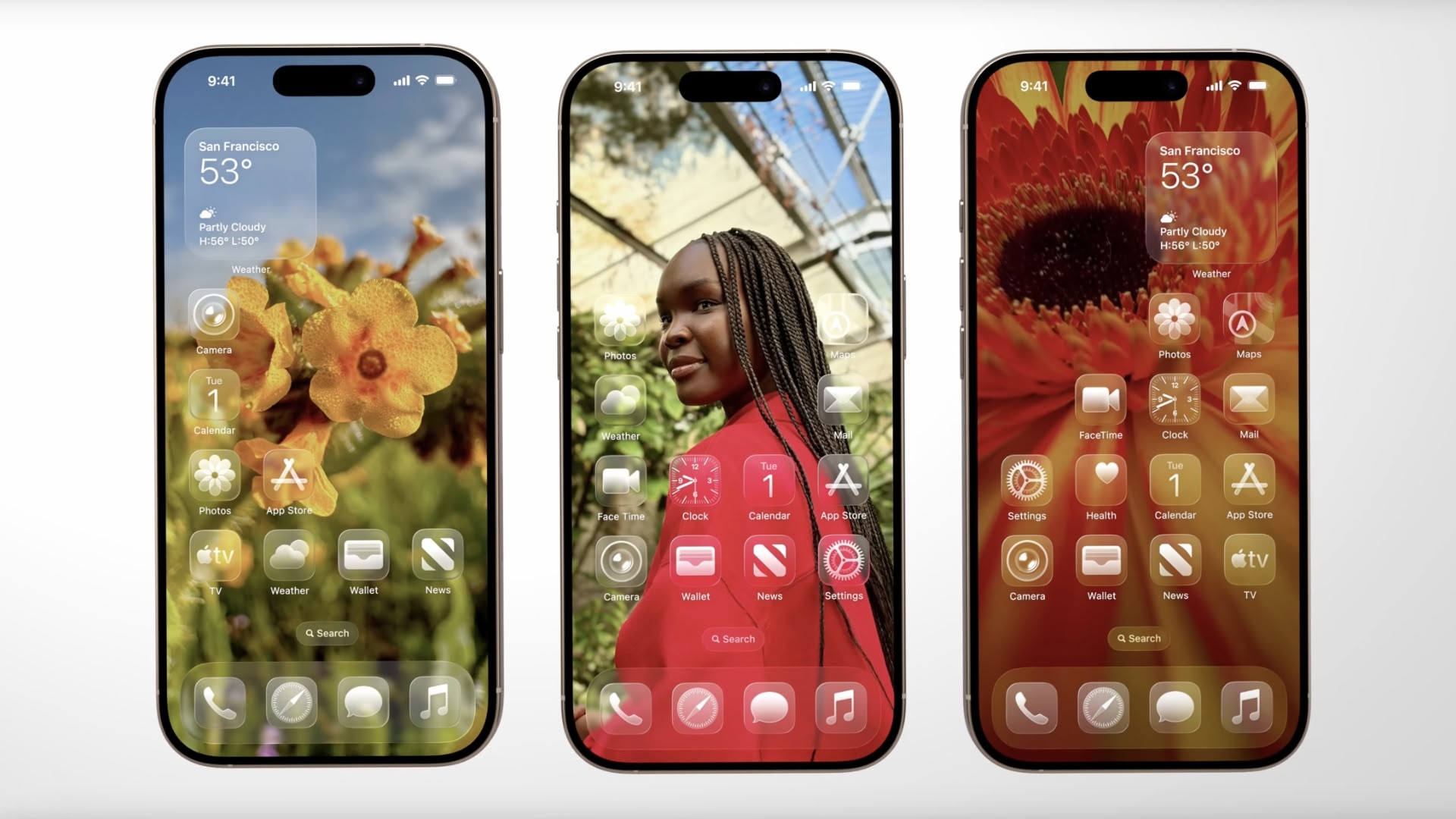
The new mode leverages Apple's "Liquid Glass" design language, unveiled as part of the company's broadest new software redesign since iOS 7. Clear Look transforms app icons using multiple layers of translucent material that dynamically responds to content and context.
Unlike Light and Dark modes, Clear Look creates a more transparent aesthetic that allows underlying content to show through interface elements. The mode works in conjunction with Apple's new universal design system, which aims to create consistency across all Apple platforms "while maintaining each device's unique characteristics," according to the company.
App icons have been redesigned to support the new appearance option, featuring the same Liquid Glass material that adapts intelligently between different lighting environments. The mode extends beyond icons to widgets and other interface elements, offering users an entirely new way to customize their iPhone's visual appearance.
The feature will be available when iOS 26 launches this fall. In the meantime, developers can grab the iOS 26 beta now, while public beta testers can get their hands on the new software from next month.
Article Link: iOS 26 Adds All-New 'Clear Look' Option Alongside Light and Dark Mode

I think Apple are struggling. I like the design overall, but there a lot of just unnecessary tweaks. It's like tweaking for the sake, it's what happens when you have design by committee, trying to please everyone because so many need ownership of a certain bit. It lacks strong design leadership, and it's a muddy concept of too many concepts. I hate to say Apple need younger innovative design leadership. I agree the previous super simple controls for full screen video absolutely didn't need everything in a bubble, it's now intrusive design. And you only get the bubble animation interaction by swiping on buttons, which who realistically does. I just tap. So actually miss a lot of their new elements.
Glad that you found it, but it might be nice to know where, because it was originally there when I installed the beta, but now it seems to have disappeared.I still only see light and dark. even on 16 pro with the ios26 beta. Might be in a future beta...
searching for "clear look" doesn't give anything.
Edit: found it. Thanks for the help!
Someone posted in page 2.Glad that you found it, but it might be nice to know where, because it was originally there when I installed the beta, but now it seems to have disappeared.
https://forums.macrumors.com/thread...ide-light-and-dark-mode.2458478/post-33947422
"ignore"Biggest life-hack ever is to realize not everybody thinks the way you do, and to be able to understand a mind-space you don't share (the essence of empathy, which is NOT the same as sharing a mind-space with others, that's sympathy).
Helps with career, social interaction, romance. Helps being heard and having your opinions understood by others.
I identify my apps by colour. I use my phone screen as a quick-launch interface.
MANY people do the same as me.
MANY people do not.
Last edited:
So do I (I didn’t at first but it grew on me) and my nearly 84 year old eyes like it just fine.Me thinks thou dost protest too much…
The visceral reactions here are surprising. It’s not like they made it the default view. You have to specifically choose it, which means “you don’t have to use it.”
And even if you do, there are an infinite number of choices you can make (solid colors, gradients or photo backgrounds and the ability to shift the tinting of what you choose) that affect how it presents.
Add to that, this is db ONE of the base OS and it’s only June. Plenty of time for tweaks and changes before we get to initial launch in September when the new devices are released.
Personally… I like it and my 58 year old eyes can read it just fine.
Register on MacRumors! This sidebar will go away, and you'll see fewer ads.